Several designy, creative people have put up some interesting side projects which revolve around pitting one thing against the other, from cute to sporty to illustrated. How do they compare and contrast? How do they get spectators to participate? Let’s find out!
Designs of the Week
Ready to go out and design your next website? Try building with the Catalyst Framework.
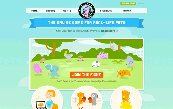
Love the cute overload on this page, both the illustrations (3 different pet logos, too) and actual pet photos. The question I would pose though is: do the former overpower the latter? Like on the homepage, you don’t see participant pictures until you scroll to the lower half. But that’s just for the front and everywhere else it’s an adventure into wonderfully laid out profiles, from polaroid stacks to trophy cases. Even the sponsor boxes have smart, enticing copy and look hardly like ads.
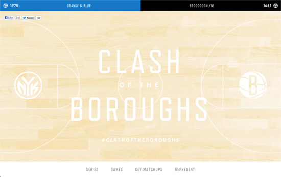
Excellent use case for a responsive site. The light hardwood background at the top makes the white a bit hard to read but the contrast on the rest of the page looks great. The photo treatment is given to the portraits, but this time in monochrome blue and black. Whereas the two other sites use the call to action keyword “Vote”, this site uses “Represent”.
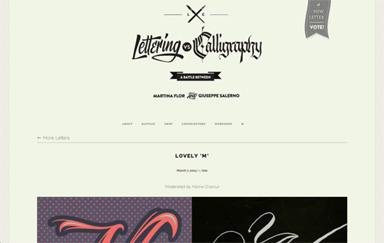
Here’s another nice framed page. The Raleway font is a little thin for my liking particularly for the footer, but the overall choice of font sizes seem to give way to the real content of the site.
Social Media Weekly
Need help in promoting your site? INeedHits has been in the search engine marketing since 1996!
User Experience – Breaking down Amazon’s mega dropdown
“The hover effects on Amazon’s big ‘ole “Shop by Department” mega dropdown are super fast. Look’it how quick each submenu fills in as your mouse moves down the list.”
Responsive Web Design – How to Optimize Responsive Design for Conversions
“Keep anything that makes it easier for mobile customers to find what they’re looking for quickly. That means maps and directions, business hours, and tap-to-call functionality that puts them in touch with a representative.”
HTML5 – HTML5 forms input types
“The best thing about all this? You can start using them now.”