Sites that offer a platform to initiate fundraising on various projects and causes. Do these designs encourage more support from potential patrons?
Designs of the Week
Get solid WordPress themes, plugins, and even design training from iThemes.
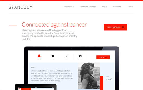
Unlike the other sites, this one uses the homepage to explain what they’re about, instead of listing all the fundraisers at once. It also seems to be the most modern- and stylish-looking. Each project, for example, displays the goal completion as a vertical red bar on the side, instead of the usual horizontal orientation. The pages are cleaner and more spacious, but it could also appear to be “colder” to some people.
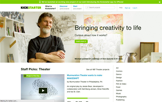
This site strikes a great balance between being informative, beautiful, and easy to read & use—I’m pretty sure other sites in the genre follow its user interface patterns closely because they work well. Using a warm palette and that peppy shade of green helps a lot, too. Something I like about their display of multimedia: the Flash-based players are laid on top of images, so those who don’t necessarily want to watch the videos don’t get a compromised large preview of the project, and is a nice progressive enhancement choice.
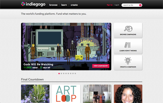
On the Browse page the categories are to your left instead of the more common right, and they are also divided into subcategories creative, cause, and entrepreneurial. A good call on this site is to add the team listing at the end of the project page, and a call to action button below it. The design needs refinement though.
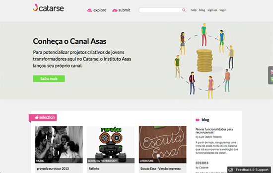
The homepage image could have been crisper, and I would have been ok with the language buttons affixed to the right side of the page were more visible. The design uses brighter icons and folded ribbons to break away from all the boxes that line up in the grid, hopefully making people notice the important elements of each page.
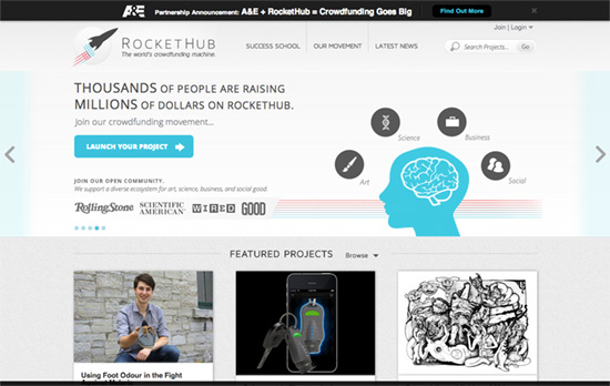
This one takes a tweaked approach to the project cards: no progress bar, only a circle with the percentage of completion; a prominent icon indicating the category the project is in; a bold, black “Fund” call to action button; and more information when you hover including the number of days left, recent activity, and the description. The cards also have different heights and don’t line up, channel Pinterest and masonry-style layouts. Categories are hidden inside dropdown menus instead of being listed all at once. On the homepage, there are sticky links for “Launch Your Project” and “Back to Top” on the bottom right, though I wish they did this on all pages too.
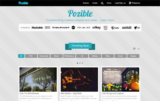
That Lobster font is a little overused these days, as with quite a few of the graphic elements on this page (ribbons, stripes, sheared borders, floating shadows). I do appreciate the custom web font and the different approach to the statistics on the top right of the project page: the charts are animated on first load, and a circular graph is used for the number of days left to distinguish from the financial backing status.
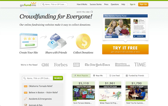
I find the palette to be pretty good, but the top area seems busy. A couple of nice ideas I noticed for browsing through content: custom ordering by location (Near Me), recency (Live Feed), and social networking (Funded by Friends). Establishing credibility also seems to be a top priority, one done by adding reputable company logos and testimonials on a number of sections on the page. On the project page, users are allowed to set the main color highlight for the title text, buttons, and donation rates—a controlled customization feature that’s a nifty idea.
Social Media Weekly
Want your site to be as good-looking and inspirational as these? Start by choosing a well-designed theme from ThemeForest.
JavaScript – date for humans
CSS – General CSS notes, advice and guidelines
“The first part of this document will deal with syntax, formatting and CSS anatomy, the second part will deal with approach, mindframe and attitude toward writing and architecting CSS. Exciting, huh?”
Design – Inside the mind of a designer: Meet Instagram’s Tim Van Damme
“Every day you learn something new. Every project you ship makes you a better designer. Every mistake you make is worth more than every problem you solve.”
Photo challenges for Instagram at Instachallenges.com
