Not many things in life are strictly black and white, but the things that are carry qualities of elegance and durability, an air and reputability you can bet your money on. Do these designs fit the bill? Let’s go find out.
Designs of the Week
Search Optimized, Turn-Key Designs, Unlimited Everything. Start building with the Genesis Framework today.
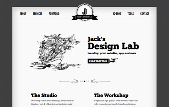
It’s easy to expect a vintage-style design when the color palette is black and white—or vice versa. The logo is lovely, although the illustrations don’t quite match in style if you look really closely. Another classic technique is to hide the colored versions of images and display them only on hover. Most of the buttons are also replaced by the manicule, another popular vintage design choice these days.
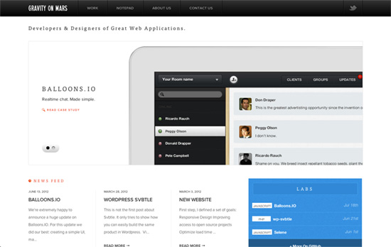
Big fan of the minimalism and restraint on this page. The images are large, the content pages are wide, but the text doesn’t have to be as huge, and that’s what reinforce that sense of quiet elegance here, along with the fading transitions, subtle gradients, and glows.
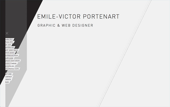
Here’s the modern, edgy side of minimalism, complete with diagonal lines from links in the background to lines and shaded patterns in the background. The animated transitions from one page to the next are also diagonal. I like how the page navigation for the pictures, which are tiny boxes of rectangles stacked one on top of the other, carry the same shape as the images they represent. That is, if the picture is taller than it is wide, you’ll see that same proportion in the navigation.
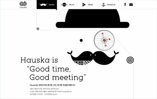
I love how each section is connected by faux reels—connected all the way to a location map in the footer, which is designed in an extremely neat grid, and how the design mixes both flat illustrations and 3-dimensional photos. Not to mention they all animate, spinning and sliding and making the site come alive like a machine. Perfect blend of fun and classic that makes quite without needing to be loud.
This one makes an impact by switching from black on white to white on black from one screenful to the next. The circular-rotating slider on the fifth screen is a great idea, styled with comic book-esque panels and slide-in information on hover. I think the only thing missing here is a way to go back up faster.
Social Media Weekly
Make Headway, make intuitive layouts, make it your WordPress theme of choice!
Design – The Shape of Design by Frank Chimero
“The Shape of Design is a map of the road where we dance rather than a blueprint of it. It strives to investigate the opportunities of exploring the terrain, and it values stepping back from the everyday concerns of designing.”
User Experience, E-Commerce – Evolving E-commerce Checkout
“Checkout is the lynchpin of e-commerce. It’s how customers buy and retailers get paid. Yet despite years of evolution, only a few changes have significantly impacted checkout conversion online. Knowing what worked, what didn’t, and what might can help improve checkout forms today and reveal what the future of digital shopping could be tomorrow.”
Typography – Type Fight
“Type Fight started as
a project to distract Drew Roper, Ryan Paule and Bryan Butler from their day-to-day grind. Each week they ask two designers to create the same letter and pin them against each other in the typographic ring to battle it out for best looking character.”
