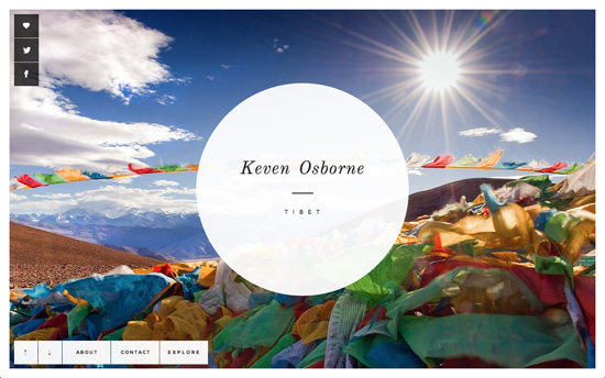
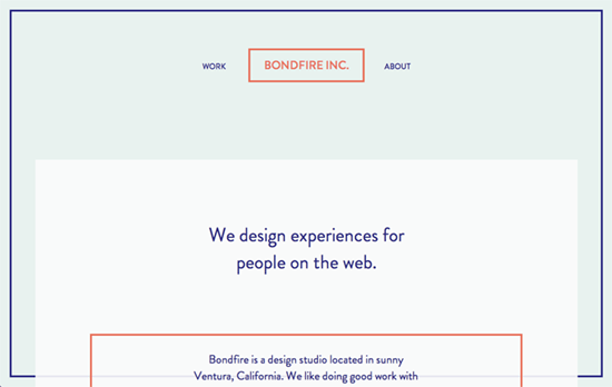
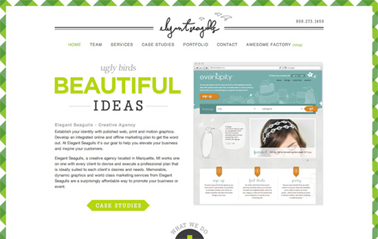
No, we’re not talking about portraits in fancy frames but subtle microtrend: adding a border that spans the height of a webpage so that it looks like its content is framed.
Designs of the Week
Need help in promoting your site? INeedHits has been in the search engine marketing since 1996!

In a word, gorgeous. All hinging on the photography and typpography, really. The use of pastel color-coded buttons and icons for each continent and their destinations provides a bit of surprising contrast to the bold, elegant magazine feel. On the article page, hovering over the previous or next arrows that lead you “somewhere” else nudges the content away and fades it out a little. This distinguishes itself from the arrows on the photo slider. A live Google Maps embed in the footer with a custom marker showing where the photos were taken is also, like always, a good idea.

There’s a striking trend to return to flat, minimal design these days and you can see it here in action. The translucent overlay where the content scrolls is an unusual approach that highlights how long a web page actually extends beyond the viewport. This is also echoed in the portfolio screens.

I like the handwritten grayscale logo that’s also echoed in the illustrations, all muted to let the lime greens shine.
Social Media Weekly
Build on DIYThemes’ Thesis Framework for rock solid SEO and great layout customization options.
CSS – Assembling SASS
“Improve your front-end CSS workflow with Sass.”
Typography – Typographic Myth Busting: What’s a Ligature, Anyway?
“Today, there are two possible ways to define a ligature and both ways can appear in connection or individually.”
HTML – Using the HTML title attribute
“If you want to hide content from mobile and tablet users as well as assistive tech users and keyboard only users, use the title attribute.”
Accessibility – How-to: Future proof your accessibility efforts.
“WCAG has 2 guidelines, Parsing and Name, role, value, for futureproofing your website.”
