I wanted to showcase some cleaner designs this week, and I hope you will like them. I also found it easier to find Digg related items this week as the design and programming community picked up over the last two weeks.
Designs of the Week

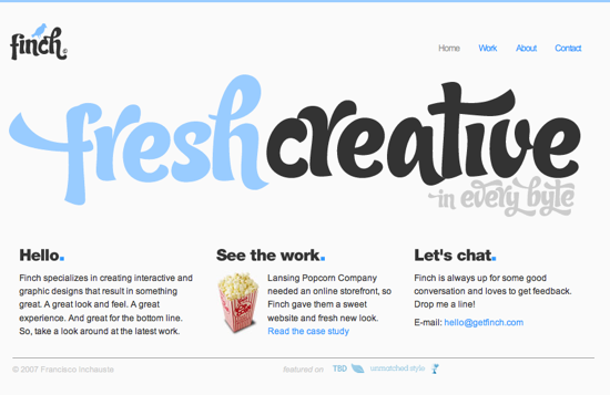
The simplicity, yet style really appealed to me, as well as the colours. This is one of those sites that doesn’t add more than it has to, but is still very visually stunning. I wish they had a contact from on their contact page, but that’s just nitpicking.

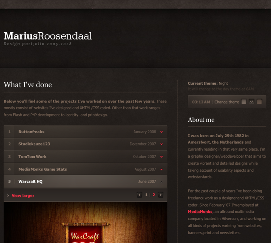
While this has a stone/grunge look to it, there is something about the whole presentation that really was striking. The darker tones create a heavy contrast to the portfolio items, which are really the main focus of the site. Very well put together in my opinion.
Digg Weekly
Design – 10 Mistakes in Icon Design
There are so many sites using horrible icons, and unfortunately operating systems aren’t much better. If you are a designer that makes icons for web designs, applications, or even operating system themes, please take a look at these ten mistakes and avoid them the best you can. I hate ugly icons.
Programming – 9 Practical Ways to Enhance your Web Development Using the Firefox Web Developer Extension
There are few Firefox extensions that make my must install list, and the Web Developer toolbar is one of them, and for good reason, its useful! The post on Six Revisions gives a great list of the stuff that can be done via this extension. Definitely worth a look, and even more so if you want to convert others to using the toolbar.
