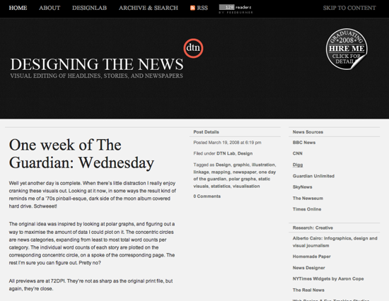
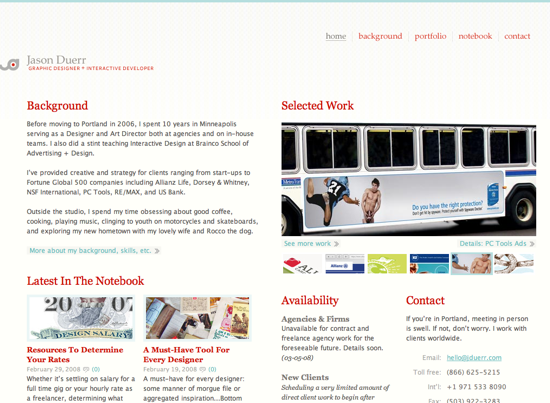
Designs of the Week
I had a hard time finding designs I enjoyed this week for the Friday Focus, but what is really strange about the two I present to you today is that I can’t put my finger on what I like about them. Usually I wouldn’t include either of these designs based on some personal issues I have with how they have spaced items, font size, and colour usage, but here they are. Feel free to let me know if you like or dislike them, and why.
Digg Weekly
Design – 16 of the Most Extreme & Modern Beds You’ll Ever See
Sure, this isn’t web design, but it proves that no matter what you want to do, thinking differently, even about the most boring of things can create stunning works of beauty. Does navigation always have to be how it is currently displayed? Try something new, push the envelope. If they can do it with beds, you can do it with design.
Programming – 10 AJAX Effects to Boost Your Website’s Fanciness Factor
I am the type of person that breaks JavaScript even when copy and pasting it directly from a working example, but I have to admit to really enjoying some of the effects that people are using on their sites, as long as they aren’t being over used. Check out these ten AJAX effects that might raise some visitor’s eyebrows.


