Designs of the Week
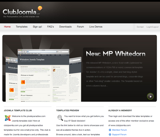
I had a harder time picking designs this week, and it isn’t because there weren’t any good ones, but none of them suited the style that I wanted to convey this week. I am on the hunt for simple designs, like the Club Joomla design I feature here today, that while simple, are actually complex when you really look closely and dissect how they were designed and coded. If you have any designs that you think fit the bill and you haven’t seen them featured here before, please let me know in the comments below.

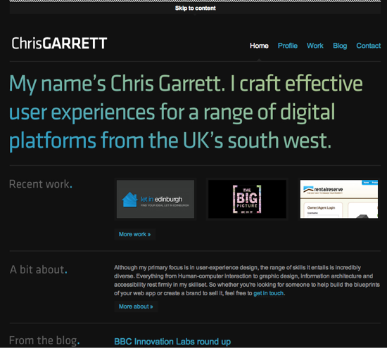
Chris is someone I know fairly well, and I have pretty much always been a fan of both his design and development work. His latest company website is a little too modern for my liking and the contrast isn’t as strong as it maybe should be, but there are some effects, and object placements on this design that I really enjoy. I would have been even more impressed if he took a page from the 9rules folks and did something similar to what was done on 3by9, where the colours transition as I am not really a fan of the default colours he chose.

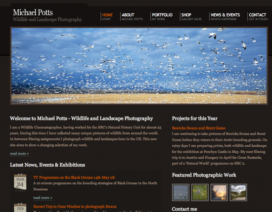
A very dark layout with good contrast and a good colour selection. I like almost everything about this design but I don’t feel like it sells his service well enough, despite the beautiful image front and center showing off the amazing things that can be captured by an expert in wildlife photography.

I love the simplicity, and style of this design. Everything is silky smooth, and very easy to read. I am impressed with how many small graphical elements are needed to make a beautiful but simple looking design. Designers have to have really good attention to detail to get a design looking so great.
Digg Weekly
I am starting to think that the Digg Weekly should be changed, and I want to know your thoughts on this. There are so many better social media sites for programming and design that we could be taking from especially since the Digg community doesn’t give these two important sections much attention. Do you have a favourite design or programming related social media site? What is it? And should I change this section to Social Media Weekly? Let me know in the comments below.
