Designs of the Week

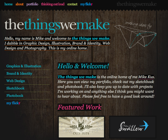
I find it difficult to read the text, I find it a bit too trendy with the wood background, bold colours, and big fonts, but there is something about the overall implementation of the design that I like.

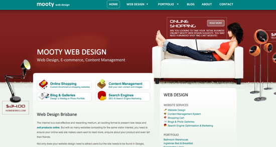
This one is easy to praise with its beautiful colour scheme, strong graphic style, and clean content area. I am very impressed with the overall energy of this design and would feel comfortable giving a company with a site like this, my business.

The smoke effect at the top is beautiful, and flows well into the rest of the site. There could be more contrast and sharpness in some areas, but overall, I think they have made another great design for their studio.
Social Media Weekly
Design – All 120 Crayon Names, Color Codes and Fun Facts
Design – Celebration Of Vintage and Retro Design
Programming – 7 Incredibly Useful Tools for Evaluating a Web Design
Programming – Build a customizable RSS feed aggregator in PHP
