• Home
  • About
  • Contact
  • Advertise

Devlounge

Design, Develop, and Grow

ateşli sevgilisi fantezisini yaşamak istediğini söyler porno ona arkadaşları varken onunla gizli saklı seks yapmak istediğini sikiş söyleyen kız hafta sonu için gelen arkadaşının görmediği bir sikiş açıdan sakso çekmeye başlayınca adamın yarağını bu altyazılı porno şekilde indiremez ve açık şekilde salonda sikişimeye sex izle başladıklarında misafir kızı da bu sekslerine rokettube konuk ederler seks yapacağını düşünmeyerek onun sex izle oyun oynadığını zanneder sabah olur ve herkes uyanır hd porno bu sırada yanında şişme mankenini de getiren sapık erotik hikayeler genç sınav haftası ders çalışan genç adam üvey annesinin sikiş eve gelmesiyle hayatının şokunu yaşar

  • Home
  • Code
  • Design
  • Design Focus
  • Interviews
  • Publishing
  • Strategy
  • Webapps
  • Extras

Friday Focus 11/12/10: Aquamarine

November 12, 2010 By Sophia Lucero

This week on Friday Focus: cool down with these lovely aquamarine designs.

Designs of the Week

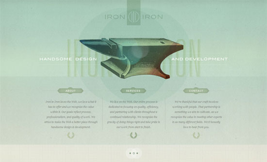
Iron to Iron

You know how a website doesn’t feel like a website because the text and images feel so well-blended? It feels like that here, although one might question if that “blended” feeling is actually lack of contrast; you decide. Still, you must check out the hover effects.

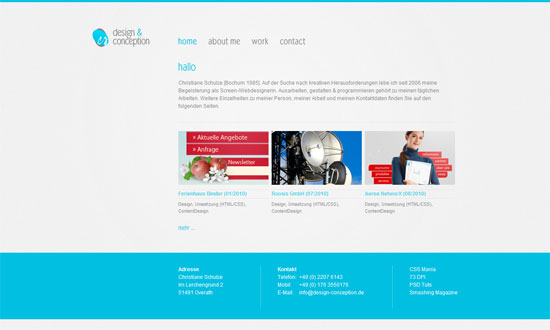
design & conception

Another quiet, refined feel here, although I think using white text on that shade of blue in the footer is not too kind on the eyes.

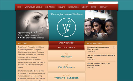
Women's Foundation of Oklahoma

The split slideshow is an interesting take on homepage slideshow pattern.

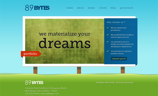
89Bytes Web Studio

I’m liking the diversity of colors on this website.

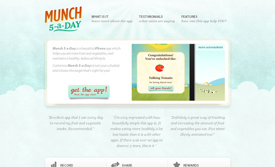
Munch-5-a-day

I think that on one page sites where you make people scroll from one section to another, you need to give each section proper headings, like the testimonials on this page.

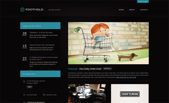
Foothold Design Studio

The illustration and and pop of blue keep this dark design cheerful. The typeface also helps but it’s a bit small.

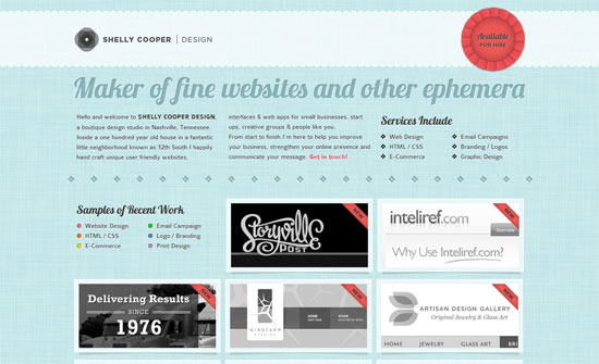
Shelly Cooper Design

The ribbons that appear on hover on the thumbnails look lovely, and so does the pointing hand in the logo area.

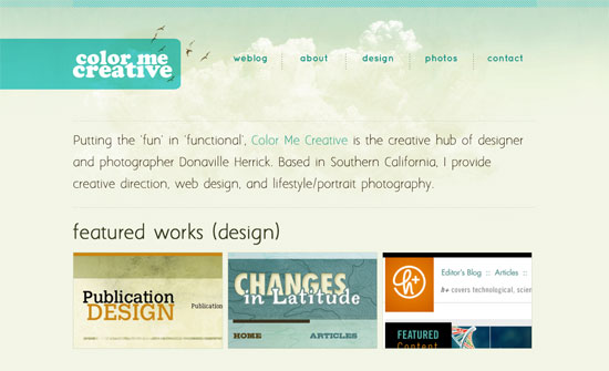
Color Me Creative

I love the combination of the background, the bar behind the logo attached stretching all the way to the left, and the whitespace in the header.

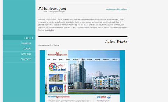
P.Manivasagam

Extremely simple looking site, but the content does the talking.

Ben Sekulowicz-Barclay

Great infographic and pictographic approach on this site, but I wish more data were clickable!

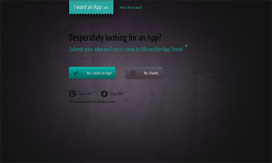
I Want an App

The buttons and animations literally give this site an “oomph” but the tiny black body text is just a no-no!

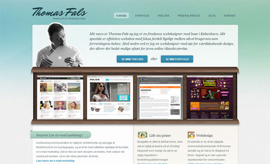
Thomas Fals

The shelf metaphor is everywhere these days, but this is the first time I’ve seen used in a portfolio.

Social Media Weekly

Design – 8 Ways to Stay Creative

Usability – The myth of the perfect website: Are you awesome?
Filed Under: Design Focus Tagged With: aquamarine, blue, usability

Code & Tutorials

Which Front-End Development Languages Will Grow in 2017?

Your Guide to Leveraging APIs as a Developer

Bitcoin Processing Website Integration For Web Developers

Website Security For 2016 That All Developers Need To Know

5 Reasons You Need to Be Using jQuery

About Devlounge

Want to read more about Devlounge, or maybe you want to contact us, or even advertise? Oh, and don't forget to subscribe to updates!

The Best of Devlounge

5 Reasons To Reconsider Hiring A Web Designer

Search