As you’ve probably noticed, there’s a bunch of funky things you can do with WordPress 2.7, due any day now. Previously, we’ve played with the new sticky post functionality, and then there’s the category styling features added with the new template tag for post CSS classes. Let’s dive a little deeper into the latter, adding an asides functionality without actually hacking the loop or using a plugin.
Requirements and Preparations
For this to work, you need the beta version of WordPress 2.7 (the third one’s the latest when I’m writing this, but do check the dev blog to make sure). You also need to use the post_class() template tag to spit out the classes in your post’s div tag, so make sure your theme is up to date with that. It is detailed in this post. You could always use the default theme with the 2.7 beta as well, and then easily add this functionality to your own theme when the full version is out.
As for preparations, you’ll need to decide on what category should be your asides one. In my Notes Blog Core theme, I call it “asides”, plain and simple. It also has “asides” as its slug, so that means that post_class() will add the CSS class category-asides to the post div, as detailed in the previous post. You can call your asides category whatever you want, just swap out the slug part in the code.
The Code
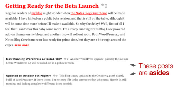
Right, so lets get this baby on the road! First of all, this is how we want it to look:

You can see this baby in action over at my Notes Blog theme site, where I’ll be offering the Core version of the theme for free at a later date. I’ve pulled this code snippet from the Notes Blog Core theme, so this is actually exactly what I’m doing in my style.css file right now:
[CSS]
#content .category-asides { margin-left: 30px; padding-left: 10px; border: 3px solid #eee; border-width: 0 0 0 3px; }
#content .category-asides span.comments { font-weight: bold; }
#content .category-asides .entry p { font-size: 12px; line-height: 18px !important; margin-bottom: 10px; }
#content .category-asides h2 { font-size: 12px; line-height: 18px; float:left; margin:0; padding: 0 8px 0 0; border:0; }
#content .category-asides h2 a { color: #333; }
#content .category-asides h2 a:hover { color: #a00; }
[/CSS]
So what’s happening here? It’s pretty straight forward. Just disregard the #content if you will, that’s the div container with the content stuff. You probably have one in your theme as well.
The .category-asides is the actual class of course. This is where we tell it how to behave. You can see the border, some padding and margins, things like that. The rest tells us how h2 tags should work and so on.
And that’s it, basically!
How to Add This to Your Theme
Naturally, you don’t want my Notes Blog Core styling on the asides your theme, unless it really fits. Luckily, it’s very easy to add this to your theme. Just add the .category-X class, where X is the slug of the category you want to be the asides one, and style it accordingly. In other words, if you want to use the category called “asides”, just add:
[CSS]
.category-asides { your custom styling }
[/CSS]
…and take it from there.
Feel free to borrow ideas, elements, or whatnot from the asides code demoed above.
