There’s several decades worth of story behind glitch art, but it’s experiencing an interactive surge in web design now that the tools and technology have finally caught up. All about the anti-slick, anti-perfectionist, these sites are the very essence of disruption.
Designs of the Week
Create unique, extraordinary websites with Squarespace. No experience necessary!
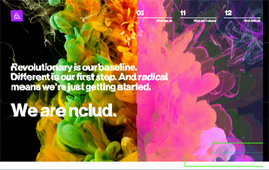
Besides the strong header photo and the glitch page transitions, there’s no letting up on the bold look in every corner: purples and greens, heavy Helvetica, and succint calls to action.
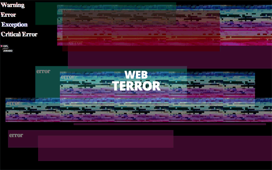
I only wish there were more related design elements to the glitch loading screen, because as you go inside it’s a pretty neutral look.
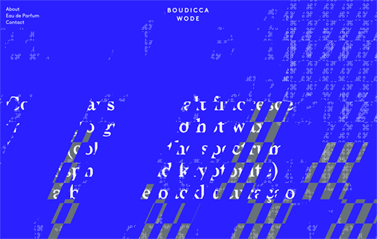
I really like the different layers of colors, patterns, and text all masked on top of the other. I keep scrolling back and forth, and the look keeps changing like a fascinating art installation where you gotta check it out from every angle. Perhaps the most surprising thing of all is this site is for a perfume product, the last thing I would think of to apply the glitch look on, yet its whole branding centers around that.
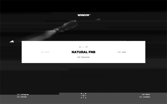
I appreciate the integration of keyboard navigation here, it just fits into the hacker-feel that goes with glitch. Inside the work pages go light gray and scroll horizontally, with the mouse cursor replaced by an ‘X’.

On this site the glitch ties in to the analog crackle of the audio clips, and that’s the central feature here. Instead of just reading about the their users’ stories, you can actually listen to them tell it to you and read it as they go.
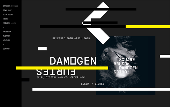
Besides the horizontal strips of color that appear as you scroll and disappear once you stop, the design also features inverted text in fixed-width fonts, sometimes laid on top of the other as graphics themselves.
Social Media Weekly
Get solid WordPress themes, plugins, and web design training from iThemes.
CSS – Glitch Effect on Text / Images / SVG
“It’s like you’re looking at some text displayed on a progressive scan monitor that has been dropped on the ground one too many times and so the alignment of the pixels is off in weirdly un-even amounts time and space.”
Email Design – Email Design Guide
“The Email Design Guide is filled with tips and advice to help you convey your message in style. Learn how to better use images, fonts, calls to action and more.”
