You’ve gotten a glimpse of infographics making their way to the web in people’s portfolios and causeworthy sites. Here, our featured designs are independent websites that put the fascinating discipline of data visualization front and center.
Designs of the Week
Create unique, extraordinary websites with Squarespace. No experience necessary!
The advantage of websites over single-image infographics is their interactivity, and this one does it better than most. It artfully blends storytelling, scrolling by animation, and important information on one page with great illustrations, scenery, and and smooth transitions. For such heavy content it’s been optimized quite well. The typography is also impeccable, although it would have been nice for the headers to use web fonts instead of images.
No charts here so these aren’t traditional “infographics” but it’s definitely informative, graphical, and well-designed.
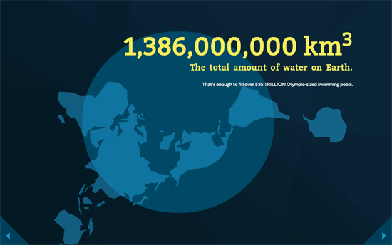
Uses keyboard navigation and some interesting perspective shifts to take you on a 3-dimensional ride, rather than just a scroll from top to bottom.
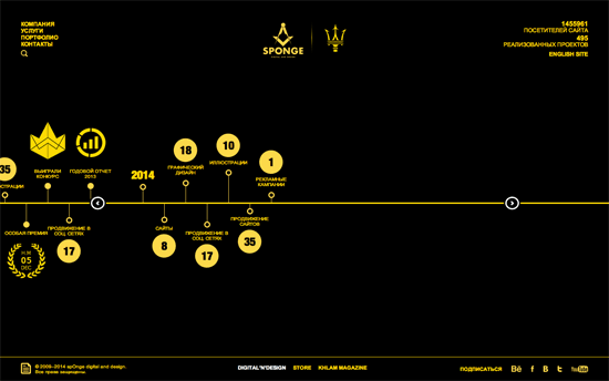
Their English site features an interesting 3D-moving graphic, while this one features a timeline format of their works. The yellow on black flips to black on yellow for inner pages, and uses this more pebble-type of shape (non completely circular but extremely rounded squares) for the images.
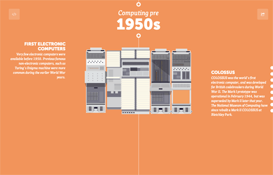
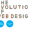
This site lets you embed its infographic as a whole image with an iframe code you can copy. The illustrations here are great, especially as you get to the older decades of computer inventions, but I really wish the first screen looked more interesting.
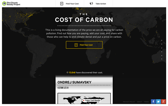
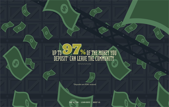
There’s a bit of a cinematic intro when the page first loads. An endless ticker tape listing the ecological risks of based on every person’s location and its carbon footprint. The small dots on the right show category icons on hover, letting you drill down on the explanations when you click. Though there’s a slight problem with the white when the graph or map is also white, doesn’t even have shadows.
Social Media Weekly
Need help in promoting your site? INeedHits has been in the search engine marketing since 1996!
Design – Responsive Design Sameness
“Design sameness fades when designers stop focusing on which solutions for their problem are out there and start focusing on the problem at hand.”
Typography – Crafting link underlines on Medium
“The perfect underline should be visible, but unobstrusive — allowing people to realize what’s clickable, but without drawing too much attention to itself.”
Web Design – Drowning in Tools in the Web Development Industry
“This is one of the great things about our industry and, unlike some business strategies, this openness and collaboration doesn’t stifle innovation; it does the opposite.”
Email Design – Some Tips for Email Layout and Responsiveness
“In this article, I’d like to present some techniques I’ve successfully used at Artsy to create emails that look good on your browser or mobile device, in some of the most popular email clients out there.”
CSS – Pesticide
“Faster CSS layout debugging.”