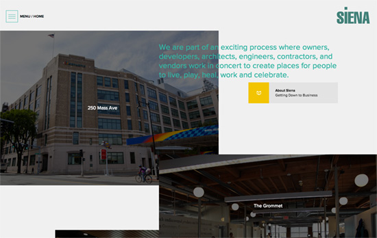
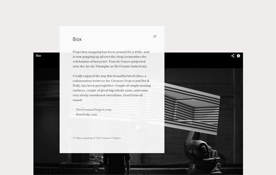
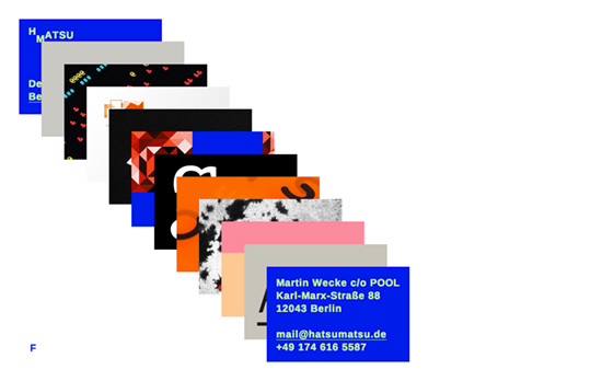
This brewing design pattern breaks out of your typical grid layouts and layers images and text on top of one another. It’s quite an interesting approach that makes website elements feel more like objects that you can more easily interact with, like stuff on your physical desk.
Designs of the Week
Make Headway, make intuitive layouts, make it your WordPress theme of choice!

Photos are littered from top to bottom floating over one another with a bit of staggered scrolling, and hovering brings them to full brightness as well as clickable links. Nice nod to the builder’s yellow in the icon boxes; if you didn’t know this was a construction company you’d think this was a design studio itself.

I like this format for a blog so much I’m almost tempted to steal it. Very minimalist though that it’s not obvious it is one. Can’t find any navigational tools or about pages either, which would have been nice to explore especially on a creative, designy site.

Scrolling down brings up the project “layers” one by one, and when you drill down into one of them, the those thumbnails conversely fly out one by one to reveal each layer. Unlike the previous featured site you can hover on the layer to bring it to the top, and scrolling is how you control that.
Social Media Weekly
Ready to go out and design your next website? Try building with the Catalyst Framework.
User Experience – A User In Total Control Is A Designer’s Nightmare
“We can guide users simply by limiting their creative control, which also makes for a simpler tool.”
Responsive Web Design – Harvard Law Review Case Study
“The design itself is both beautiful and functional. The typography is thoroughly modern while remaining firmly rooted in the publication’s history.”
