The shades of green in this week’s feature are bright, peppy, and almost too harsh on the eyes, but it seems to be all the rage these days. How does it come into play with these designs? Let’s find out:
Designs of the Week
Build on DIYThemes’ Thesis Framework for rock solid SEO and great layout customization options.

Most likely inspired by the iPhone 5c’s color options, perhaps?
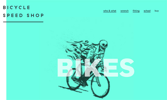
The background is animated in a familiar illustration style, and you can see the recurring choice to use black text and more rounded, geometric typefaces for a modern feel.

A similar typeface with thinner weights and a lighter touch produces this elegant, almost feathery look.
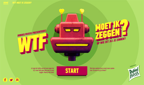
Less subtle is this color combo and retro robot motif, but still lands on that fresh look.
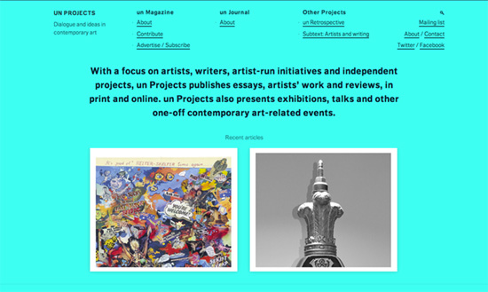
This shade almost blends into the whites and grays that bound the blocks of content. Another recent trend at play here are those rotated navigation elements on the sides.
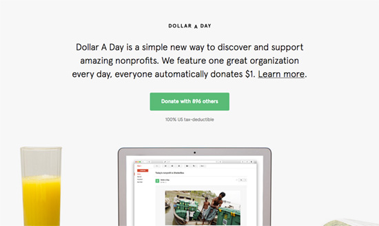
Small logo, large intro text and button. There’s less green on this page save for the accents and calls to action.
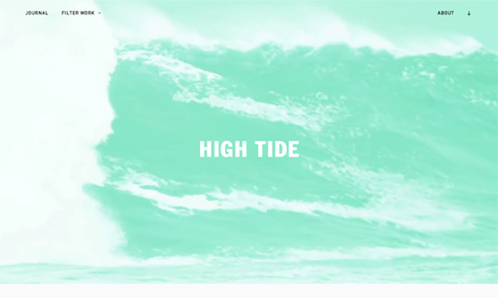
Similarly, the green-tinted video background hides as you scroll down and you only see it resurface as link hover colors and other brand elements on the site.
Social Media Weekly
Want your site to be as good-looking and inspirational as these? Start by choosing a well-designed theme from ThemeForest.
Programming – Evolving Code: From the Crust to the Core
“In the world of Object-Oriented Programming, there is a saying: “Make it work, make it small, make it fast.” This is an approach that we’re trying on for size and will hopefully create the right balance of code quality.”
Typography – On Legibility – In Typography And Type Design
“To keep it simple, while reading, factors like grammar, word expectancy, word form and so on, are not to be excluded when we think about the reading experience.”
