We’re going on a camping trip this week and exploring designs that feature beautiful scenery featuring trees.
Designs of the Week
Make Headway, make intuitive layouts, make it your WordPress theme of choice!

I like the bold and painterly strokes to the illustrations as well as the subtle texture on the ribbon navigation. The design would do a lot better if they had picked a custom font and refined their copy a bit.
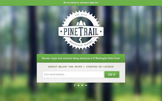
The background has a high amount of blur but even so you can tell it’s a row of trees in the forest, and the subtle motion makes it that more dynamic. Again, the subtle texture on the email form and site logo are a nice touch.
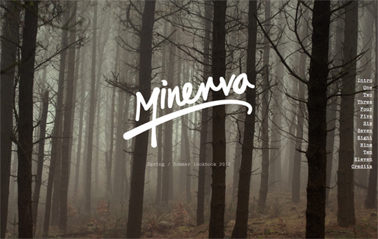
I don’t think I’ll ever be at home with the use of a typewriter font to achieve a certain look. But the scrolling and uncovering effects here are pretty interesting.
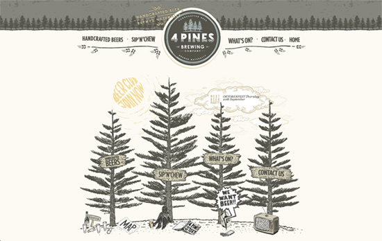
Practically everything here has a custom illustration to it, including the dropdown menus using torn old-style paper as background. Cool and quirky!

Initially it reminds me of Bing, but there’s also some subtle parallax going on here. Extremely interesting idea to put a large infographic link beside each submenu group, which helps break the large amounts of text and give a convenient overview to each content category.
Social Media Weekly
Get solid WordPress themes, plugins, and web design training from iThemes.
CSS, JavaScript – Tell CSS that JavaScript is available ASAP
“The trick is to make sure the class names are switched as early as possible during page load.”
Design – Editing tips for designers
“Just as we appreciate the power of iteration in design, we should embrace the power of editing. In essence, editing is critique for the written word: review, question, revise.”
HTML5 – Websockets 101
“The name websocket gives the impression that it’s a traditional socket. In practice it combines the parts of UDP and TCP: it’s message based like UDP, but it’s reliable like TCP.”
CSS, JavaScript – CSS3 vs jQuery Animations
“It is also worth noting that the above animations will give different test results across different browsers on different computers, but at least they provide a usable comparison.”
CSS – Using inline-block to Display a Product Grid View
“Your first inclination might be to use floats. Floating the list items works really well if each element has the exact same height. In most instances, though, that’s not the case.”
