Like the previous websites that encourage you to tilt your head, these ones featured below encourage you to rethink browsing interactions and wonder: does scrolling through a page have to happen from top to bottom only?
Designs of the Week
Get solid WordPress themes, plugins, and web design training from iThemes.

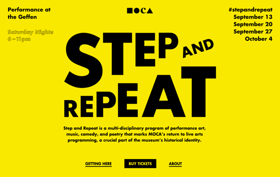
A quirkily good interaction idea for a blog (or in this case, tumblelog), where the featured acts are a stream of posts scrolling diagonally. The direction of the scrolling alternates after a certain set of posts, and the color scheme switches up too. Clicking to view the post loads the page in diagonally as well, with acommodations for keyboard navigation.

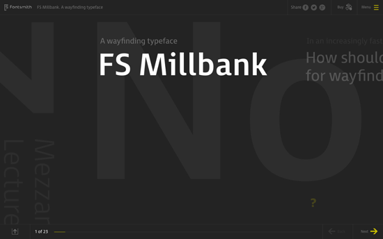
The exploratory nature of the interactions on this page is brilliant and actually quite elegantly executed. The movements of sliding, rotating, zooming, and fading all work to emulate the concept of this wayfinding typeface and exhibit its characteristics. It’s like using one of those sci-fi screens you see in the movies, inside the browser.

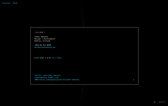
Whether you scroll to the bottom or to the top, you’ll wind up with this starter card with information about the the designer. The page is a collection of projects connected by one thin string of pixels, infinitely scrolling every which way. Clicking on an image pages through related images to the project, until your reach its description slide. It’s different, kooky take on the portfolio that’s usually laid out on a neat, predictable grid.
Social Media Weekly
Build on DIYThemes’ Thesis Framework for rock solid SEO and great layout customization options.
Accessibility, Usability – Accessibility Wins
UX, Usability – ASK DN: Do you perform user testing?
Design – Designers checklist advices
