This week’s featured designs feature rulers and ticked markers on them, both for functional navigation and decorative purposes. Happy Friday!
Designs of the Week
Build on DIYThemes’ Thesis Framework for rock solid SEO and great layout customization options.

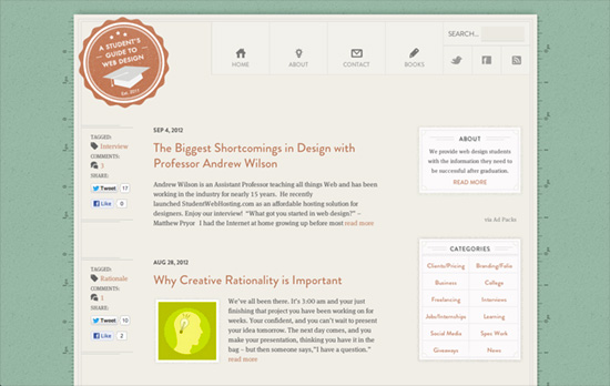
This has some touches of Retro Futura in it—from the bento navigation to the framed sidebar elements—but leans toward a more elegant and refined palette. I guess the rulers that run on both sides from top to bottom, which have pixel markers in them but not sure why they alternate between 0 and 1—add to the classroom feel on top of the green, blackboard-esque background.

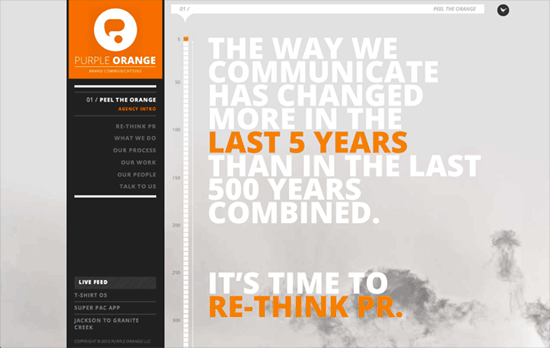
Because the ruler is part of the background it suffers in image quality, but your attention is drawn to that over the rest. Everything else looks great though: there’s subtle parallax going on and you have bold colors, illustrations, and headlines.

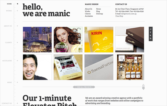
I like how the ruler navigation on the left side contracts and expands depending on how high up you are on the page, or how tall the browser window is, ensuring you can get to any section at any time and keeping the menu dynamic and noticeable. This nav also repeats for inner pages and uses their specific sections. When you get to an individual portfolio page, you can go to the next and previous items without having to go back to the whole list.
Social Media Weekly
Need help in promoting your site? INeedHits has been in the search engine marketing since 1996!
Design – Our Dilemma With Change
“The perspective on change is always clearer in hindsight, but in the moment we always think we’re right.”
Responsive Web Design – Responsive Design’s Dirty Little Secret
“Fluid grids have a dirty little secret: rounding errors. As we lay out our columns in percentages, browsers have to translate that into actual device pixels to fit in the viewport.”
HTML5, Accessibility – HTML5 autofocus Attribute
“When the autofocus attribute is present, the INPUT, TEXTAREA, or BUTTON element is automatically selected upon page load.”
Mobile Web Design – WTF Mobile Web
“This isn’t a problem that you can fix by just switching out which bit of code to use. It’s bigger than that. Content strategy, design, business all have to change. The fundamental way in which people work together to plan and coordinate the creation of a website has to change.”
CSS – A Word About CSS4
“I regularly get people asking about when “CSS4″ will be available.”
