A 2013 report by Parallels showed that 22 percent of small to mid-sized businesses use cloud-based services and infrastructure tools to manage their business. As a result, it’s more important than ever that web hosting and web development companies be aware of how to integrate the functionality of the cloud into their designs. As companies rely more on the cloud, the distinction between web hosting and cloud services will become less obvious. [Read more…]
Search Results for: wordpress
Design Focus: Where It’s Winter
This week’s designs are taking an icy turn and feature chillier landscapes throughout different subjects.
Designs of the Week
Build on DIYThemes’ Thesis Framework for rock solid SEO and great layout customization options.
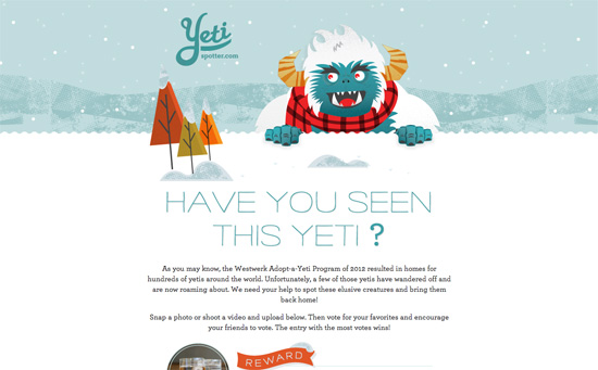
Animated falling snow is a staple of winter or holiday-themed designs, and here it’s not covering the whole page but just the header, behind the mascot monster.
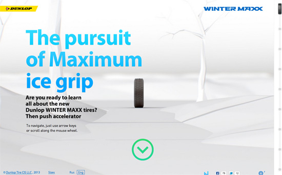
Making the tire roll down the snow-covered path by scrolling looks cool, if not a bit flickery at times. Clickable dots in the different diagrams loads extra information in a screen that slides in from the right.
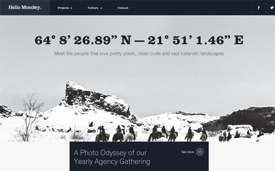
Nice little detail with the loading sprite going through days of the week until Monday, not to mention the favicon that says “I heart” beside every page title—sweet and clever. Another interesting twist is how the submenus appear on top of the primary menus, pushing the header down instead of floating over the text.
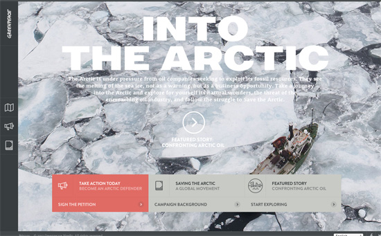
Love the 3d unfolding interaction on the overlaying links. Stories are also presented in the context of their location in the Arctic, so you’re flying around over the map a bit as it changes perspective and gets highlighted to fit the information you’re browsing at the moment.
Social Media Weekly
Pagelines lets you build WordPress websites and it’s as easy as drag and drop, go check it out!
Design – Design is the Rendering of Intent
“We’ve found this definition seems to resonate with people more than any other. People can see the relationship between the intended outcome and the process that renders it.”
Typography – The Ten Most Popular Web Fonts of 2013
“These are the ten most popular fonts I’ve noticed from analyzing font usage on Typewolf in 2013.”
Web Design – CSS Level 4 And More: What’s Coming In 2014
“At times it would be nice to stop and catch a breath, but the year ahead will offer no such opportunity: if anything, the pace of innovation will only increase.”
CSS – Animating CSS Shapes with CSS Animations & Transitions
“So the transitions on CSS shapes are really transitions on the individual points making up a shape.”
App vs. Mobile Website: What Will Help Your Audience The Most?
Many businesses that offer services online struggle with this decision eventually – should your organization offer a proprietary app or build a website optimized for mobile devices. There are many nuances to both options, when it comes to access, connectivity, and sharing capabilities. There’s no fast and easy answer to this question. You’ll need to look over the following considerations and see if your organization will benefit the most from an app or a website optimized for mobile devices. [Read more…]
Design Focus: Patch Works
Tiled, bento box, quilt, mosaic, collage…whatever you call this web design trend, these designers still keep coming up with ideas to make it interesting.
Designs of the Week
Search Optimized, Turn-Key Designs, Unlimited Everything. Start building with the Genesis Framework today.
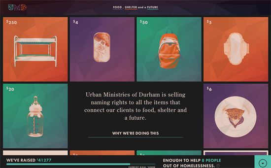
Love the color palette and color coding, the geometric logo also echoed in the backgrounds, how the squares morph into circles, the use of every-versatile Futura.
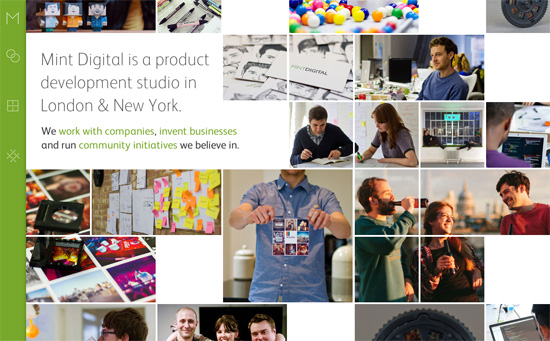
The touch of icon animation on the sliding menu to the left is a reflection of the growing popularity in dynamic interactions on webpages. I find it interesting that they’re atypical forms and the most familiar one belongs to the studio name / logo. It’s also fascinating to see how blocks of photos rearrange and collapse responsively.
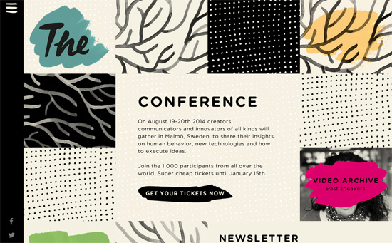
The hand-drawn or hand-painted effect is great, but I haven’t actually seen it carry over to the “hamburger” menu icon yet. Even the newsletter input field and action buttons are paint strokes.
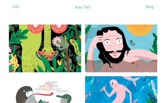
Besides the illustrations, there’s something equally quirky with the artwork title that continuously scrolls horizontally on hover. There’s also the loading animation of a melon (in reference to one of the works) whose seeds represent the familiar trailing dots.
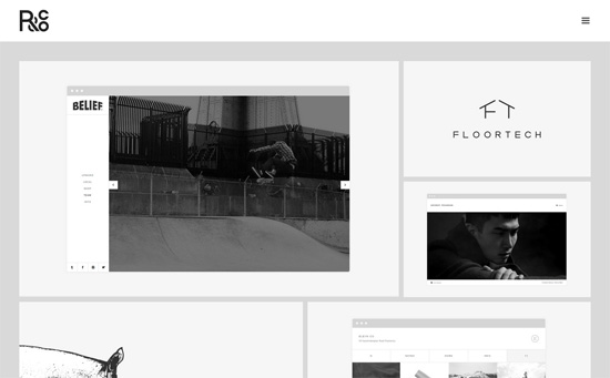
This one’s clean, classy, and quiet in black and white. I also like the bento-style footer navigation, which spaces out the icons instead of occupy as minimal space as possible just because they’re small.
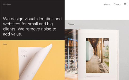
This page has an option to filter by type of work and gives you a smaller thumbnail view of all the projects for quick skimming. The layout is predominantly in two columns and is also primarily black and white save for the color photographs.
Social Media Weekly
Get solid WordPress themes, plugins, and web design training from iThemes.
CSS – Flexible CSS cover images
Web Design – (My) Best Of 2013 Conference Talks
Design Focus: Easier E-commerce
Whether you’re looking for inspiration to design that next ecommerce project, or choose a tool to sell your own products and services, these sites are definitely worth bookmarking for both reasons.
Designs of the Week
Create unique, extraordinary websites with Squarespace. No experience necessary!
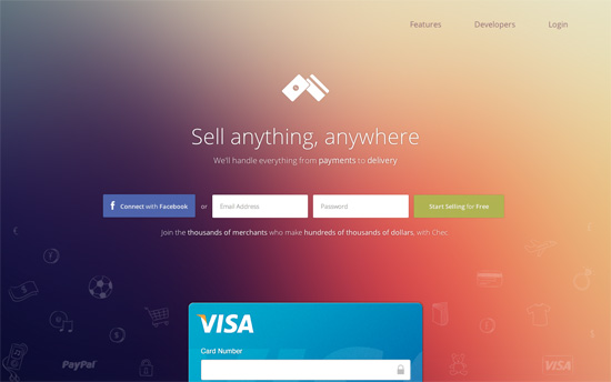
I’m a fan of that gradient style, while the hand-drawn icons give contrast to the clean look. Some blocks of text run a little too wide though.
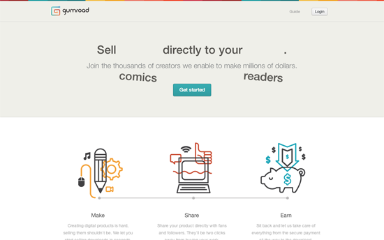
Lovely illustrations and color swatches matching the branding. I also like the animation of the hero text, which swaps out two matching words targeting different audiences.
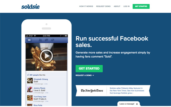
Clever move to flood almost the whole page with a solid blue background that echoes that of Facebook’s signature color.
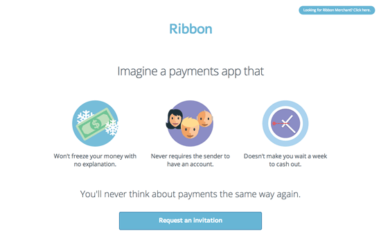
There’s a definite Layervault/Flat UI influence to the design both here and the merchant site, and by that I mean bright colors, friendly shapes, and simplified representation of interfaces.
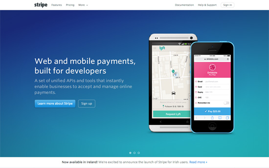
Gradients and realistic illustrations have not been completely booted out and the vibe here has a very pre-iOS 7 feel.
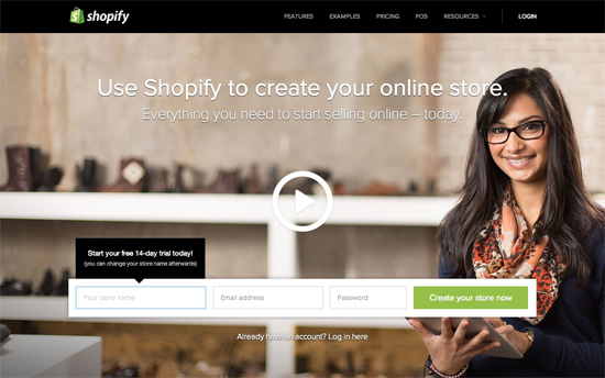
There’s ample use of black for accent but also some very refined execution of interface elements with tabs, blockquotes, and menus.
Social Media Weekly
Get solid WordPress themes, plugins, and even design training from iThemes.
Business, Design – How to Get the Work You Want
“While there’s something to be said for how designers react to the constraints of their customers, clients, or bosses, unsolicited projects can help round out the narrative of your portfolio when you don’t have client projects to fill in certain chapters.”
JavaScript – What is the DOM?
“In most simple cases, the visual representation of the DOM will be just like your simple HTML. But it’s often not the same.”
Typography – A Pocket Guide to Master Every Day’s Typographic Adventures
“This little guide is for everyone who comes across these typographic adventures or just want to do things right. Mastering the things mentioned in the short chapters below will help you get your message across more successfully.”
User Experience – Infinite Scrolling
“Maybe we should give up on the whole idea of a 'back' button. 'Show me that thing I was looking at a moment ago' might just be too complicated an idea for the modern web.”


