Our featured designs for the week focus on geometric manipulations that influence and are influenced by the content in them.
Designs of the Week
Pagelines lets you build WordPress websites and it’s as easy as drag and drop, go check it out!
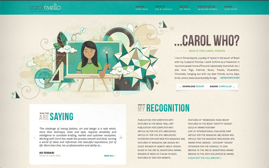
It’s quite delightful to find designs that play with shapes and mathematical proportions (golden ratio, anyone?) but still retain that warm, organic feel with textures and patterns. Other familiar techniques on this site include leather, stitching, ribbons, sheared borders, and shadow effects.
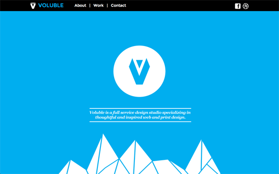
More irregular shapes at work over here, and not just for decoration but as symbols and graphs to represent the information on the page. Even the contact page, which contains a map inside thick borders, looks like a framed abstract painting.
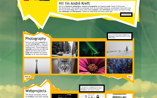
Another bold, exciting look—from the mountainous edges to the thick bright yellow borders and the abstract background.
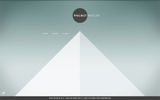
This design is the opposite of the other ones featured in this post; all we have here is a pyramid and a circle behind the logo. But the minimal look makes quite a conversation.
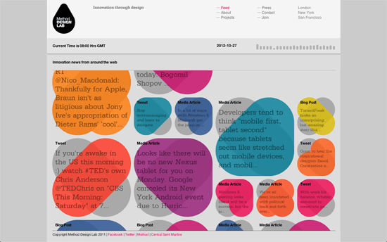
Very cool concept for the homepage: pulling feeds from around the web and color-coding them according to freshness. The rest of the site is standard fare, with grids on a gray and hot pink color scheme.
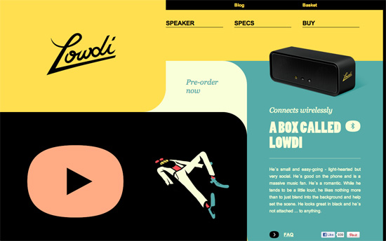
A wonderfully designed, not to mention responsive, vintage-inspired site. You gotta love the use of curved shapes here, even on the balloon tooltips.
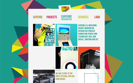
Colorful and funky but not intimidating at all. There’s a 3-column grid for photo-centric pages, while the rest follow a half and half layout.
Social Media Weekly
Get solid WordPress themes, plugins, and even design training from iThemes.
JavaScript – Webshell.io
“Discover Webshell in 3 interactive minutes and look how to combine APIs into your apps!”
Responsive Web Design – Device screen resolutions ordered by OS
“Not surprisingly, some of the more closed operating systems have tighter control and consistency potentially making them easier to support, while more open operating systems have a plethora of different resolutions and aspect ratios.”
Business – Our Ideas Are Cheap Because We Treat Them Cheaply
“A modern platform is needed for to enable writing in the same iterative, collaborative process we have for design and development.”
