• Home
  • About
  • Contact
  • Advertise

Devlounge

Design, Develop, and Grow

ateşli sevgilisi fantezisini yaşamak istediğini söyler porno ona arkadaşları varken onunla gizli saklı seks yapmak istediğini sikiş söyleyen kız hafta sonu için gelen arkadaşının görmediği bir sikiş açıdan sakso çekmeye başlayınca adamın yarağını bu altyazılı porno şekilde indiremez ve açık şekilde salonda sikişimeye sex izle başladıklarında misafir kızı da bu sekslerine rokettube konuk ederler seks yapacağını düşünmeyerek onun sex izle oyun oynadığını zanneder sabah olur ve herkes uyanır hd porno bu sırada yanında şişme mankenini de getiren sapık erotik hikayeler genç sınav haftası ders çalışan genç adam üvey annesinin sikiş eve gelmesiyle hayatının şokunu yaşar

  • Home
  • Code
  • Design
  • Design Focus
  • Interviews
  • Publishing
  • Strategy
  • Webapps
  • Extras

Design Focus: Get Some Perspective

December 29, 2015 By Sophia Lucero

As this year ends and a new one begins, it’s good to think different and look at things from a different angle. Here’s some inspiration to get you started.

Designs of the Week

Make Headway, make intuitive layouts, make it your WordPress theme of choice!

Tennent Brown Architects

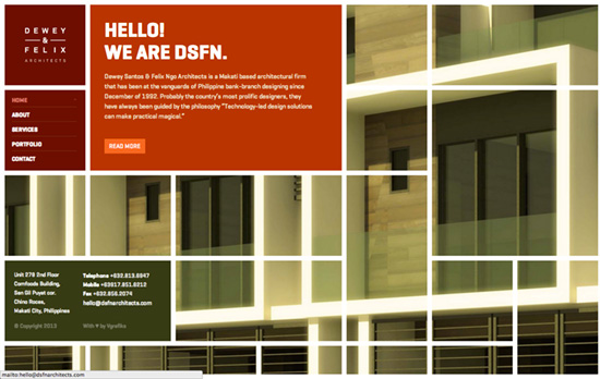
Not only is the large heading text reminiscent of the lines and shapes of buildings, it has an excellent sliding animation following the same 3-dimensional form as you scroll down.

Tapmates Inc.
Tapmates Inc.

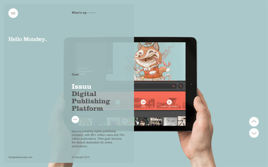
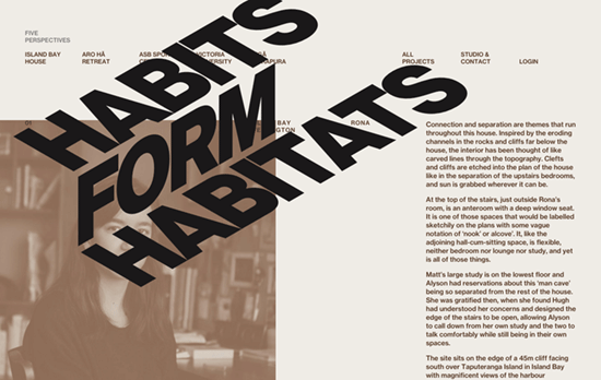
There are many different ways to show portfolio images and here it’s all about the isometric look combined with tiles of app screens sliding in and out along the same perspective lines, although with not the most readable of angles.

YES
YES

There’s something amusing about a perpetually spinning logo on a website, like an endlessly flashing sign in a busy urban area.

Leanne Bentley
Leanne Bentley

Still in the infinite loop department, this one’s a single page of works that continuously scroll up, with the upper left text using a differential blend mode making for an interesting effect.
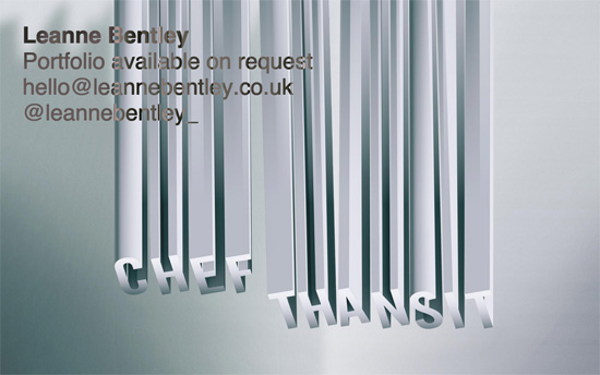
Social Media Weekly

Ready to go out and design your next website? Try building with the Catalyst Framework.

Responsive Design, Typography – A Responsive Guide to Type Sizing
“Proportions are a key ingredient to the mixture. Calibrating your type proportions for a balance of aesthetics and order can be an obsessive undertaking.”

Interface Design – How Tabs Should Work
“Sadly, most of the time I come across them, the tabs have been badly, or rather partially, implemented.”

Design Focus: In Depth

February 17, 2015 By Sophia Lucero

The sites featured this week also play with perspective & depth, prominently distinguishing between foreground & background, particularly when one moves the mouse.

Designs of the Week

Want your site to be as good-looking and inspirational as these? Start by choosing a well-designed theme from ThemeForest.

Hello Monday
Hello Monday

Each project is a screen of content with a matching color palette, with the description area acting as translucent glass overlay. There’s something quietly elegant about the details here.

Cultural Solutions
Cultural Solutions

Here it’s the layers of circles that move corresponding to the cursor, and you can see it as a repeating graphic element in other places. Unlike the previous design this is quite bold and may even come across as “young”.

2A Studio
2A Studio

All the other objects here blur out of view when you hover on something, then present extra details. It’s probably the most realistic presentation of a 3D space with its freeform images and layout.

Social Media Weekly

Pagelines lets you build WordPress websites and it’s as easy as drag and drop, go check it out!

Typography – Modular Scale

Responsive Web Design – Responsive Navigation for 73+ Languages

CSS – Easy Textures with CSS Masks

Design Focus: Interactive Music & Film

December 1, 2013 By Sophia Lucero

Enjoy the holiday season with these clever interactive music videos right in your web browser.

Designs of the Week

Search Optimized, Turn-Key Designs, Unlimited Everything. Start building with the Genesis Framework today.

Carry Me by Bombay Bicycle Club
Lights by Ellie Goulding
Neon Bible by Arcade Fire
The Wilderness Downtown: We Used To Wait by Arcade Fire
Reflektor by Arcade Fire
3 Dreams of Black by Chris Milk
I've Seen Enough by Cold War Kids
I’ve Seen Enough by Cold War Kids
Happy by Pharell Williams

Social Media Weekly

Get solid WordPress themes, plugins, and even design training from iThemes.

Programming – URL Rewriting for the Fearful
“I think it was Marilyn Monroe who said, “If you can’t handle me at my worst, please just fix these rewrite rules, I’m getting an internal server error.””

Design – My Design Principles
“In the interest of openness I thought I’d share my set of design principles that I have been experimenting with for the last few weeks.”

JavaScript – Learning jQuery with Street Fighter and Hadoukens
“You’ll learn to select elements, modify them and we’ll even get to use some really cool jQuery animations.”

Design – Updated List of The Best Black Friday Design Deals
“Keeping track of all deals going on during Black Friday and Cyber Monday can be tough, so I figured it would be handy to put together an up-to-date list of the best deals out there for designers & developers.”

Design Focus: Work is Play

October 4, 2013 By Sophia Lucero

In this limelight this week are sites whose companies develop games for a living. It’s interesting to see how varied all their styles are, as reflected in their homepage designs.

Designs of the Week

Create unique, extraordinary websites with Squarespace. No experience necessary!

BlackMoon Design
BlackMoon Design

A quintessential game site featuring pixelized art on an isometric pane and 3d parallax hover effects.

Mochi Media
Mochi Media

The site could be tweaked to the latest techniques such as web fonts instead of Cufon but the red-blue contrast, as well as the accent orange and green for the inner pages is nice.

HydraGames
HydraGames

This look hasn’t completely fallen out of favor especially in this genre though I’d like to see a more interactive twist on it.

Kalafior Games
Kalafior Games

Minimal and maybe even underdesigned, but I’m with this content-as-design approach. Letting the colorful scenery and unique shapes from each games shine.

Frostbite
Frostbite

This one has all the elements of what’s “in” today, in 2013: responsiveness, big and beautiful photographs, a good pick of typefaces—which is an elegant but edgy enough way of putting the game in this game-related site.

Social Media Weekly

Make Headway, make intuitive layouts, make it your WordPress theme of choice!

User Experience – The URL as User Interface Design Pattern
“They are easily passed around and can really help a service grow.”

CSS – How a CSS Triangle is Made

Mobile Web Design, E-Commerce – 6 Mobile Checkout Usability Considerations
“Throughout all our usability test sessions of mobile checkouts this extreme lack of page overview was observed to have severe implications on the user’s checkout experience and their ability to even complete a mobile purchase.”

Design Focus: Mosaic

July 5, 2013 By Sophia Lucero

Websites that break down their imagery into bits for a different view, a different experience.

Designs of the Week

Need help in promoting your site? INeedHits has been in the search engine marketing since 1996!

82nd & Fifth
82nd & Fifth

Beautiful large photographs from top to bottom. There’s something about the way the “mosaic wall” is slanted that blends well with the graphic on the left, like it’s part of the New York map, tying in with the name of the site as well. There are a few instances where the split layout comes into play as well.

DSFN Dewey Santos & Felix Ngo Architects

On most of the pages the sliced-up background photographs simply fade in and out, but there’s also a bento layout going on in the portfolio page.

Digital Bakery
Digital Bakery

The almost kooky-looking default view of the company’s projects actually has provisions for displaying markers on them with different classifications: type, chronology, scale, etc. Moving your mouse over the area produces effects that play with the “surface” of the graph, providing a 3rd dimension you probably wouldn’t have expected. (There’s a safer-looking grid if that’s more your speed.) What’s also cool is the images on the other pages also have irregular sides.

The Drawing Room
The Drawing Room

The recurring diamond motif remains exciting from page to page, and my favorite has to be the blog, which like the work page is laid out horizontally.

Social Media Weekly

Ready to go out and design your next website? Try building with the Catalyst Framework.

JavaScript, Optimization – Progressive enhancement is still important
“There’s a perception that progressive enhancement means building everything on the server then building it again, like for like, on the client. This is rarely the case. Lean on the server as much as possible.”

Web Standards – Native Form Elements
“This is what every HTML5 form element looks like on your current operating system and browser.”

Next Page »

Code & Tutorials

Which Front-End Development Languages Will Grow in 2017?

Your Guide to Leveraging APIs as a Developer

Bitcoin Processing Website Integration For Web Developers

Website Security For 2016 That All Developers Need To Know

5 Reasons You Need to Be Using jQuery

About Devlounge

Want to read more about Devlounge, or maybe you want to contact us, or even advertise? Oh, and don't forget to subscribe to updates!

The Best of Devlounge

Top 6 Online Resources for Designers and Creative Freelancers

Search