Site layouts are filled with boxes and corners, but not everything has to be so straight-laced. These designs feature touches of something a little more organic: animated waves and curves that soften the look and can even make things more fun. [Read more…]
Design Focus: Animate.js
Check out these dynamically designed sites that all happen to be JavaScript conferences.
Designs of the Week
Need help in promoting your site? INeedHits has been in the search engine marketing since 1996!
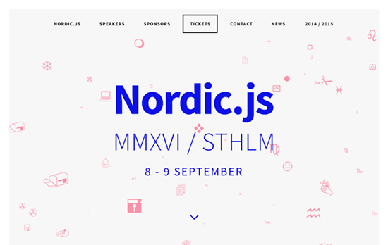
Wingdings is that you? There are a lot of “back-to-basics” making their way into website designs these days, like the bright blue and the pixelated, low-resolution images, and on top of that it’s the famous symbol font whose glyphs are gliding through a 3-dimensional stream. Even the circular shadowed bullets are used as markers for the carousel.
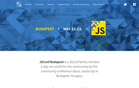
Quite the elegant triangle animation in the header that lets you interact with it too. I also like that the speaker avatars have their corners cut off in the shape of triangles too.
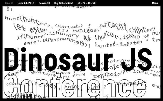
Also greets you with this cool glitchy effect applied to a block of code, this site is probably the kookiest of all with its oversized cursors and headings. I also like the black and white not just as a color scheme but as a negative filter when the text scrolls through the edges.
Social Media Weekly
Design – Design debugging
“Developers typically split the task of finding issues from building a project for wider release. These modes are often called debug and release. I think designers should take a similar approach.”
CSS – Flexbox Patterns
“Flexbox is awesome, but it introduces many new concepts that can make it difficult to use. These interactive examples will show you practical ways to use it to build UI components. They start out simple and get more complex near the end. You can start using these patterns in your own code right away, though I recommend you apply accessibility best practices to the markup (like using semantic HTML5 elements).”
Design – The Way We Build
“This process led us to the development of our new Design Language System (or DLS), as well as a suite of internal and third-party tools that allow our teams to not only work smarter, but also closer. The DLS is a collection of components defined by shared principles and patterns. This allows for rapid iteration using a shared vocabulary across design, engineering, and other disciplines. The structure of the DLS is simple and coherent, easing communication across teams.”
Build on DIYThemes’ Thesis Framework for rock solid SEO and great layout customization options.
Design Focus: Websites are Made of These
Metaphors are a cornerstone of design, but what if the design itself shows the tools and components used to build a website? The result is an interesting “x-ray” into the web design process, as seen in this week’s featured sites.
Designs of the Week
Get solid WordPress themes, plugins, and even design training from iThemes.
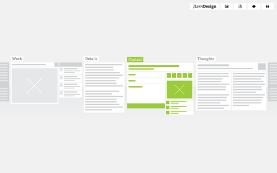
Instead of the usual links or thumbnails, this site uses website wireframes to represent the subpages, showing the actual yet abstracted layout of each page. The cool thing is the transition, where you see the wireframe “come to life” with the live content and color-coded elements. All the pages also appear side by side once you go into one of them, so it’s like you’re zooming in, almost physically exploring the website.
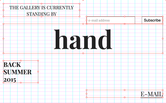
This design is reminiscent of speed painting videos, except done in the context of creating a website. You’re literally watching the site transform in terms of typography, color, and layout live. It’s probably intimidating and gimmicky for certain audiences, but being an online art gallery and still in its coming soon phase makes for an interesting art piece itself.
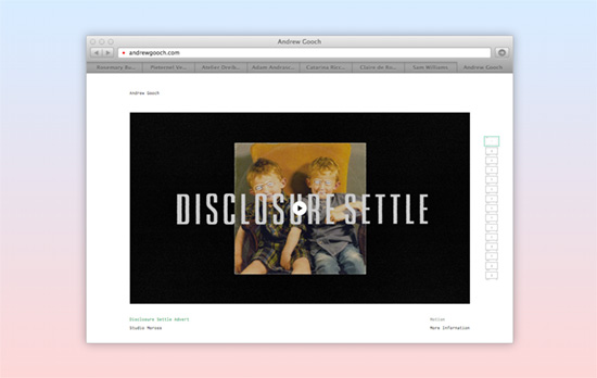
Browsing with a browser inside of a browser seems a little on the nose, but the fact that these are live sites shown in each tab speaks to the confidence of the designer in presenting the work—no pixel perfect screens here, you’re interacting with the real deal. In a smaller container of course, but you can click on the “go” icon to see it in a new window. I also like that the description above fades out and the background becomes this powder blue to light gray gradient.
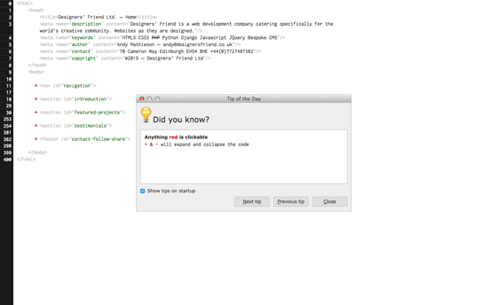
And what is a website without HTML? The page shows a Tip dialog which you can close or move out of the way, as if you’re using a Linux OS inside the browser. You can then proceed edit all the code on the page, click on the red links, and hover on the <img> tags. Again, this interface could intimidate non-techies, but that will also tell you whom this page is really for.
Social Media Weekly
Pagelines lets you build WordPress websites and it’s as easy as drag and drop, go check it out!
User Experience – Designer’s Toolkit: A Primer On Capturing Research
“A good structure is to have a moderator and a note taker, that way one practitioner can focus on conversing with the participant, while the other focuses on capturing what is occurring.”
Design – Why the Golden Ratio matters
“The visually-inclined — artists, architects and designers, historically keen observers and documentarians of both nature and the human condition and who we can thank for much of what we know about the world — have for ages incorporated this ratio into their work due to its intrinsically alluring balance between symmetry and asymmetry.”
Usability – 6 Usability tasks you haven’t tried so far, but really should!
“Below you find 6 example task that can provide new and different insights than the standard usability tasks.”
Design Focus: Animated Logos
The next avenue for interactivity are logos that look brilliant in both static and animated states. Get inspired here.
Designs of the Week
Get solid WordPress themes, plugins, and web design training from iThemes.
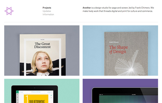
A familiar typographic layout whose minimal looks is broken by a colorful dance of shapes. One takeaway from this portfolio would be: it’s a good idea to screencast website design work along with screenshots.
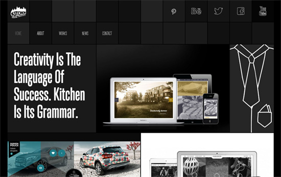
I enjoy the touch of quirk brought by the hand-drawn icons and words, which are wiggling like the logo. Clicking on the portfolio image once shows the name of of the project and a short description; clicking on it for the second time loads more information about it. Content blocks load asynchronously with a swinging animation.
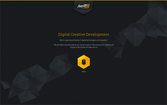
This logo suffers a little from getting blurried with native CSS transformations that animate the canvas element into a wavy banner. Softening it up, however, is an interesting contrast to the hexagon/polygon theme. Is it overkill? I like that arranging the images in a non-linear way following the shape edges makes the top-to-bottom scrolling more interesting.
Social Media Weekly
Pagelines lets you build WordPress websites and it’s as easy as drag and drop, go check it out!
Web Design, User Experience – Design principles for a payments experience
“Technology will change. People will want new features. Design for the unknown future.”
Interaction Design, User Interface Design, User Experience – The Scroll Up Bar
“Less annoying than bars that just sit there as you scroll down, and makes the menu easy to access without having to scroll up to the top of the page.”
HTML, CSS – Adaptive Placeholders
“The person who enters a value first isn’t always the same person who sees it later. To solve this problem I tried making the placeholder persist through the typing.”
