Site layouts are filled with boxes and corners, but not everything has to be so straight-laced. These designs feature touches of something a little more organic: animated waves and curves that soften the look and can even make things more fun. [Read more…]
6 Key Techniques for Improving UX With Animation Design
When designing websites and apps, user experience should be the primary concern. If your product isn’t user-friendly your audience is going to move on and find something easier to use. It’s as simple as that. [Read more…]
Design Focus: Animate.js
Check out these dynamically designed sites that all happen to be JavaScript conferences.
Designs of the Week
Need help in promoting your site? INeedHits has been in the search engine marketing since 1996!
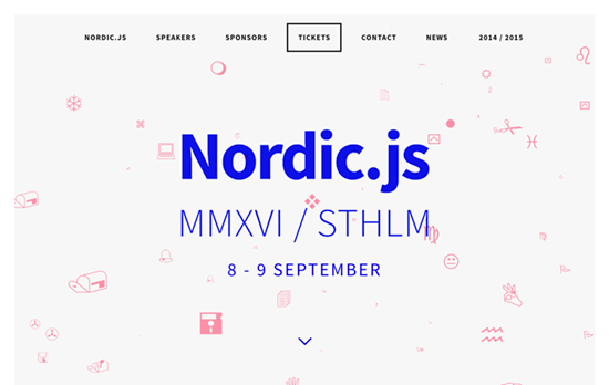
Wingdings is that you? There are a lot of “back-to-basics” making their way into website designs these days, like the bright blue and the pixelated, low-resolution images, and on top of that it’s the famous symbol font whose glyphs are gliding through a 3-dimensional stream. Even the circular shadowed bullets are used as markers for the carousel.
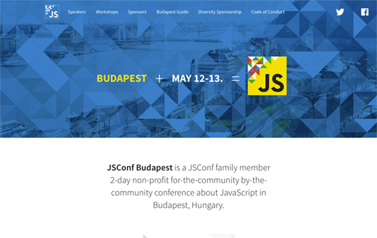
Quite the elegant triangle animation in the header that lets you interact with it too. I also like that the speaker avatars have their corners cut off in the shape of triangles too.
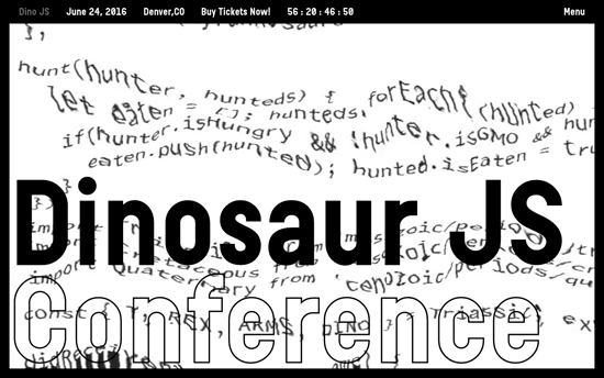
Also greets you with this cool glitchy effect applied to a block of code, this site is probably the kookiest of all with its oversized cursors and headings. I also like the black and white not just as a color scheme but as a negative filter when the text scrolls through the edges.
Social Media Weekly
Design – Design debugging
“Developers typically split the task of finding issues from building a project for wider release. These modes are often called debug and release. I think designers should take a similar approach.”
CSS – Flexbox Patterns
“Flexbox is awesome, but it introduces many new concepts that can make it difficult to use. These interactive examples will show you practical ways to use it to build UI components. They start out simple and get more complex near the end. You can start using these patterns in your own code right away, though I recommend you apply accessibility best practices to the markup (like using semantic HTML5 elements).”
Design – The Way We Build
“This process led us to the development of our new Design Language System (or DLS), as well as a suite of internal and third-party tools that allow our teams to not only work smarter, but also closer. The DLS is a collection of components defined by shared principles and patterns. This allows for rapid iteration using a shared vocabulary across design, engineering, and other disciplines. The structure of the DLS is simple and coherent, easing communication across teams.”
Build on DIYThemes’ Thesis Framework for rock solid SEO and great layout customization options.
Design Focus: Scroll Control
The interactive highlights of these designs are controlled by how much you want to scroll, so instead of just passively “watching” the animation go by, you say stop and go to experience the sites as you please.
Designs of the Week
Get solid WordPress themes, plugins, and even design training from iThemes.
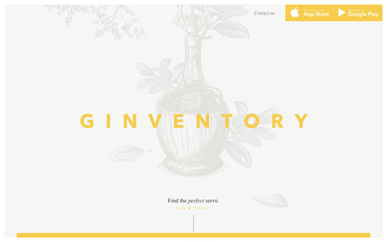
I wish this weren’t “scroll-jacked” but everything else is just lovely. Definitely not the usual website featuring a mobile app.
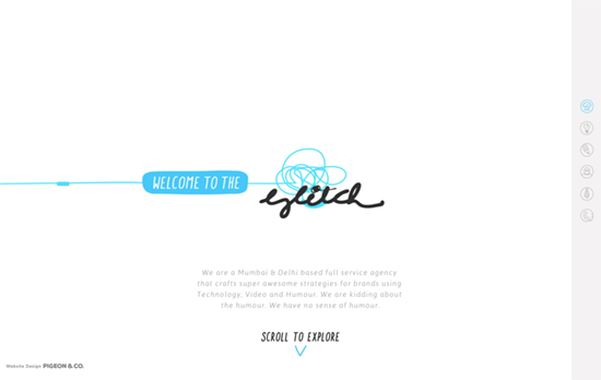
Such a fun idea to do stop-motion animation by going around the agency’s office and do all sorts of quirky twists. The weird thing is if you use the right-side navigation it moves too quickly, so definitely scrub through by scrolling.
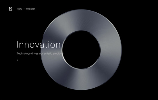
The whole site uses a various animations on its elements as you scroll down, but it’s the Innovation page in particular where you get this satisfying experience of rotating an object mid-air by your scrolling back and forth. I also like the rectangular animation that overlays the menu.
Social Media Weekly
Create unique, extraordinary websites with Squarespace. No experience necessary!
Design – Why Bother Making Beautiful Team Pages?
“There’s no one right way to design a team page, but I think it says so much about the company’s respect for an employee when it’s willing to pay for the cost of high quality photos of its team.”
CSS – REM vs EM – The Great Debate
“Turns out, rem and em have their strengths and weaknesses. They should be used differently, depending on the circumstances.”
Design Focus: Dots & Circles
Emulating the circular form is always an intriguing exercise because of its technical and aesthetic challenges, especially on the Web. So every year it’s a delight to see designs that explore the “perfect shape” and take it to the next level.
Designs of the Week
Get solid WordPress themes, plugins, and web design training from iThemes.
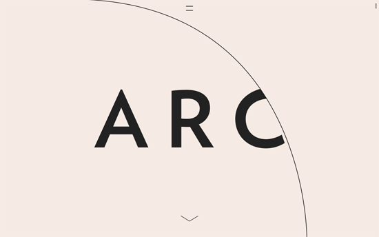
I love the way the arc of the circles shift as you scroll down and the text comes in, which are also laid out in a quietly elegant way. The “hamburger menu” does not sport 3 lines but two, which morph into a an “x” or close button once opened.
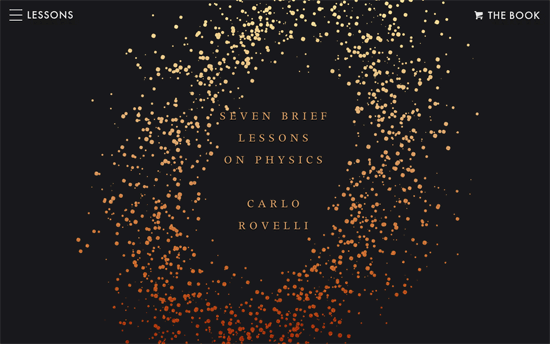
I don’t know if the book cover inspired the site design, or it was planned in sync, but this site is the perfect digital companion that interprets the scientific lessons in a dynamic, interactive way, from the illustrations & animations to the audio excerpts.
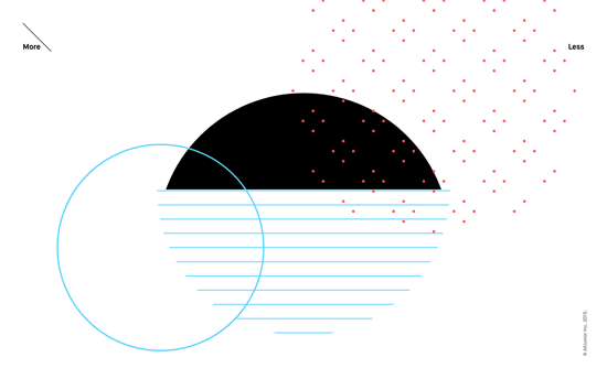
More mesmerizing animations in between messages the company believes in—interestingly this is the focus of the site, instead of the common sections like work and people. For the most part it’s black and white, with sprinkles of thin lines and small dots of light colors. Click “More” to dive into their background, or “Less” for the contact info.
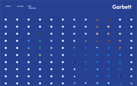
A sheet of transparent dots that slides up when you click, revealing two main sections: their selected work, and their studio. Bright, solid blocks of color match their geometric aesthetic in their portfolio. This site also also bucks the trend of placing their contact/social links at the bottom, and instead are readily visible at the top.
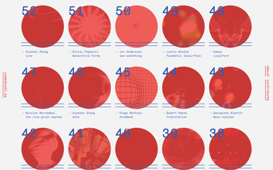
Hovering on the red circles transform them into diamonds and animates the thumbnails of the code experiments. The text blocks on the page also change into random character strings for the “Matrix”-y effect.
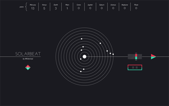
Another beautiful experiment combining science, visualization, and also music. The concentric circles represent both the paths of the planets and a vinyl record playing the notes based on the speed of their revolutions around the sun, with several parameters you can tweak.
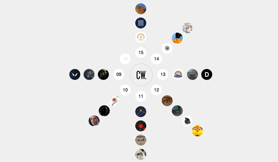
Icons of the designers’ projects are arranged radially around his initials and load in an overlay when clicked. What I find interesting is the NDA projects are also displayed—although the images are pixelated, some details about the work is still given so it’s a good approach to add it to one’s body of work.
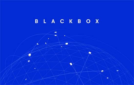
Beautiful animation of a 3D globe with animated “boxes”, representing their product, flying all over. This is contrasted with friendly drawings of their team in the bottom half of the page.
Social Media Weekly
Pagelines lets you build WordPress websites and it’s as easy as drag and drop, go check it out!
User Experience – How to Run an Unmoderated Remote Usability Test (URUT)
“Usability testing is a super flexible technique that allows for the assessment of a variety of aspects of an interface including the broad product concept, interaction design, visual design, content, labels, calls-to-action, search and information architecture.”
CSS – Animation Advice from a CSS Master
“By using CSS for animation and transitions, you’re moving those tasks from the JavaScript thread to the graphics processing thread. When using JavaScript for animation, you run the risk of other JS operations being held up until the animation completes. With CSS, the JavaScript portion of your pages remain available.”
Design – The Salesforce Team Model for Scaling a Design System
“I believe that even the best systems need human guidance to succeed and survive. For us, that means helping and empowering designers to produce high-quality, brand-aligned, system-minded work.”
