Say goodbye to 2014 on a musical note: here are some beautifully crafted pages about artists, songs, albums, and lyrics that made their mark this year.
Designs of the Week
Need help in promoting your site? INeedHits has been in the search engine marketing since 1996!
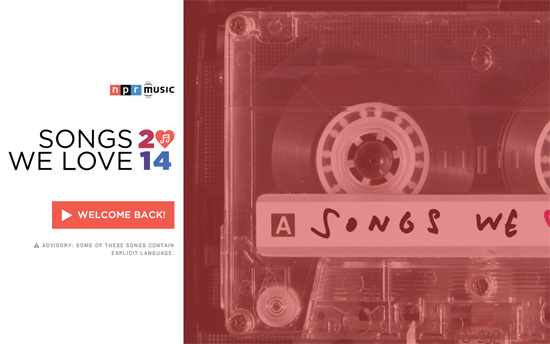
Love the cassette tape of course, and its pretty immersive layout. It’s all about listening to the playlists and seeing what the NPR writers had to say about each song. This isn’t just a list-type microsite, but a mini webapp itself, remembering your listening history and welcoming you back as you resume.
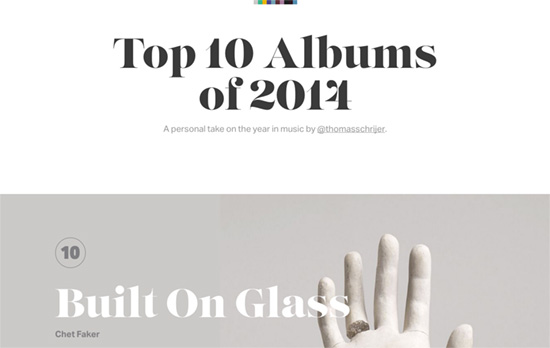
The small squares of at the top and center are actually minified quick links to each album, whose art inspire the color scheme for each section. It’s a good example of a web design side project you can do, and the result is lovely.
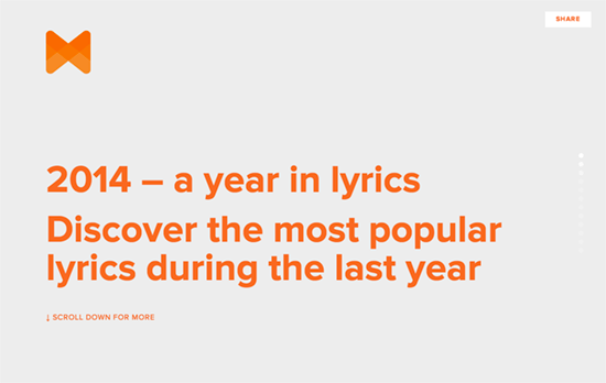
Musician photos are framed in bubbles that “fizz up” as you scroll down, presumably the larger ones being the more popular. While they’re still tiny though, it’s not very obvious who they are due to the way they’re cropped. Clicking shows the full image and the key verse.
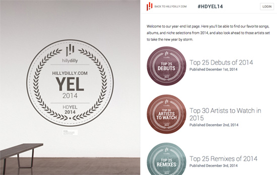
I appreciate the pages on this list that carefully considered how the music player would be set up on the page. In this case, the split panel layout places the player interface on the left half, while the navigation and description happens on the right. I like that there’s keyboard controls that slides the song or artist in from right to left, with a nice transition that seems to “pass on” the information on the right half to “hang” it in the “gallery” of the left half.
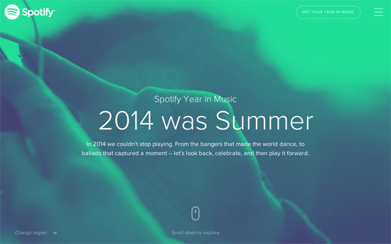
Spotify fine tunes the storytelling aspect of the musical year in review, putting songs into seasonal, activity, cultural, and regional contexts.
Social Media Weekly
Create unique, extraordinary websites with Squarespace. No experience necessary!
Design, Branding – The Best and Worst Identities of 2014, Part 1: The Best Reviewed
“Although this is probably one of the “smallest” clients on this list, the resulting identity is the best example of the year of a smart, relevant concept that has been perfectly executed in an unexpected visual direction.”
Accessibility, HTML – The Art of alt: Writing Great Descriptive Text For Images
“In the majority of cases, the easiest way to compose alt text is to write as if you’re trying to describe the image to someone.”
Design – Leading Designers Share Their New Year’s Resolutions for 2015
“What we do can be confusing at times and clients may need extra assistance in understand what we do and why we do it.”
