This week on Friday Focus: websites that will make you want to get in the car or on a plane and head to these exquisite destinations. At least we can enjoy their views from within our own browsers!
Designs of the Week
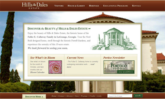
I really like are the way the popup menus are designed. Even better is the way the background images load first, and then the content area fades into view.
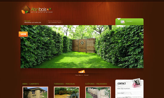
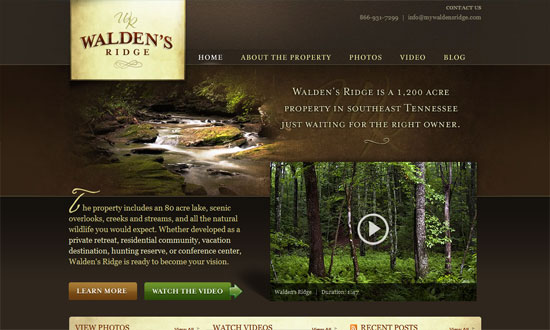
Great lighting in the header, and the way the color of the wood background makes the photos pop.
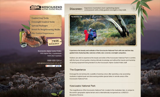
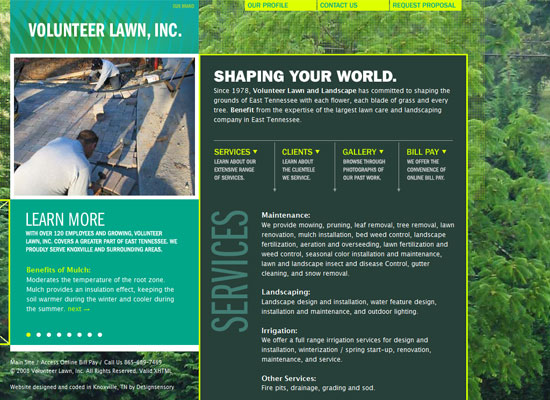
You don’t have to pepper your site with concrete representations of what your site is all about, and this is a good example of that. Makes for an elegant yet still outdoorsy look.
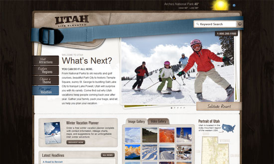
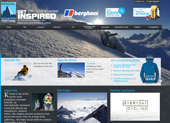
I’m not sure exactly why you’d use a strap in such a prominent place such a header but it certainly looks different. Love the interactivity of the menus on the left. Another brilliant feature: the execution of the map menu on the right side.
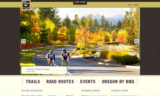
Huge photos. Excellent typography. I’m just not sure about the wallpaper background.
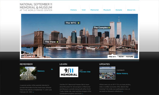
Clean and modern. The labels on the photo itself are a great and necessary touch.
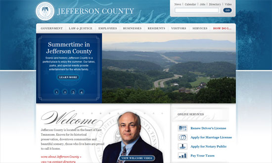
This design reminds me of Obama’s online branding, and it looks so elegant. This isn’t even a travel destination site, but it definitely makes you want to go there.
I like the textured background in the logo, and the way the photos fade at the edges.
Social Media Weekly
Design – 404 Error Page – Don’t Get the Page Itself to Be Even a Bigger Error
Programming – HTML, CSS, and Web Development Practices: Past, Present, and Future
