The sites featured this week also play with perspective & depth, prominently distinguishing between foreground & background, particularly when one moves the mouse.
Designs of the Week
Want your site to be as good-looking and inspirational as these? Start by choosing a well-designed theme from ThemeForest.
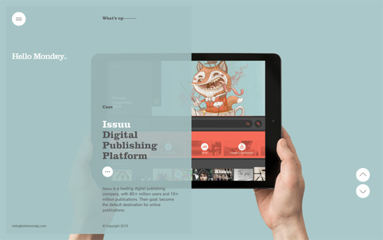
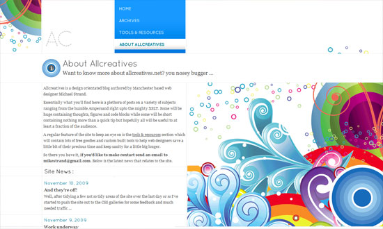
Each project is a screen of content with a matching color palette, with the description area acting as translucent glass overlay. There’s something quietly elegant about the details here.
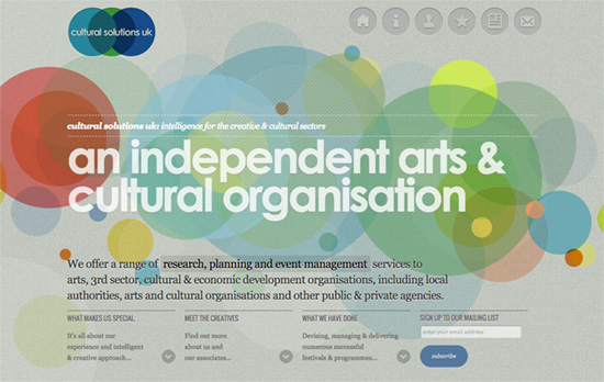
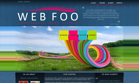
Here it’s the layers of circles that move corresponding to the cursor, and you can see it as a repeating graphic element in other places. Unlike the previous design this is quite bold and may even come across as “young”.
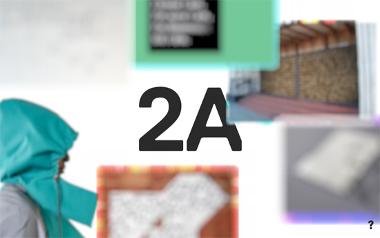
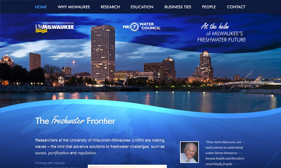
All the other objects here blur out of view when you hover on something, then present extra details. It’s probably the most realistic presentation of a 3D space with its freeform images and layout.
Social Media Weekly
Pagelines lets you build WordPress websites and it’s as easy as drag and drop, go check it out!
Typography – Modular Scale
Responsive Web Design – Responsive Navigation for 73+ Languages