Let’s take a look at websites that look like they were built with stuff found in your office stationery. Welcome to this week’s edition of Friday Focus!
Designs of the Week
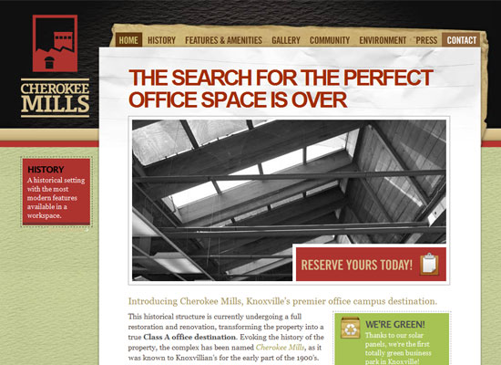
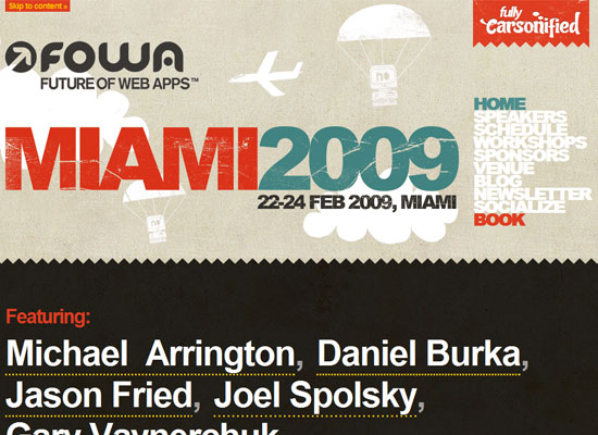
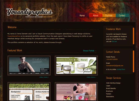
A good combination of the elegant and the industrial feel. The “paper” aspect does not look overdone (to the point of looking almost like a scrapbook), which fits the content and purpose of the website.
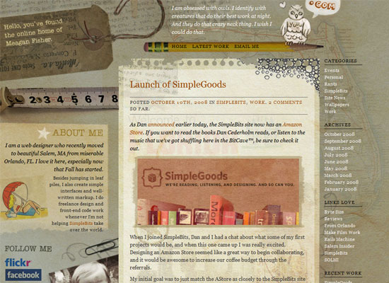
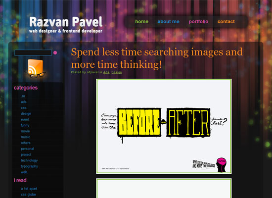
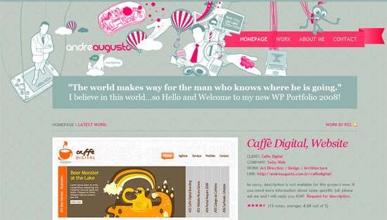
Now here’s a site that leans toward the crafty, scrapbooky look, made for a personal blog. I like that the graphics may look dark, but the doesn’t feel glum.
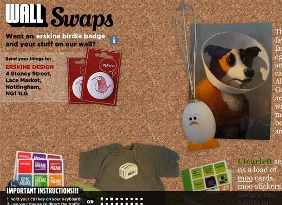
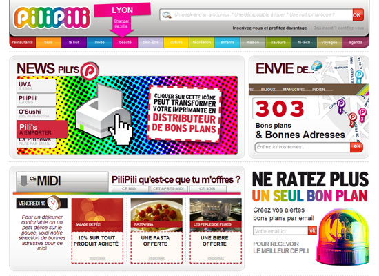
A huge site whose content is presented mainly in images. The downside is you need instructions to be able to navigate it; and the clickable squares aren’t even descriptive. The upside is once you figure it out, you’ll enjoy browsing around.
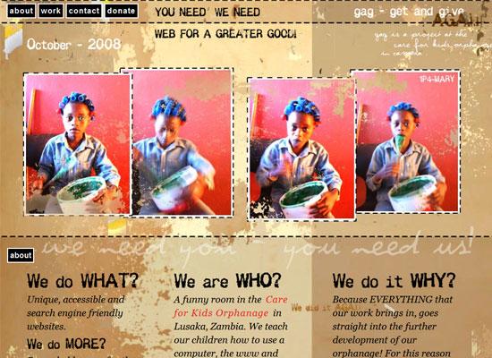
This site makes me feel like I’ve been taken back to the turn of the new millennium. It’s pretty different from the grunge styles we see today. It feels much more genuine.
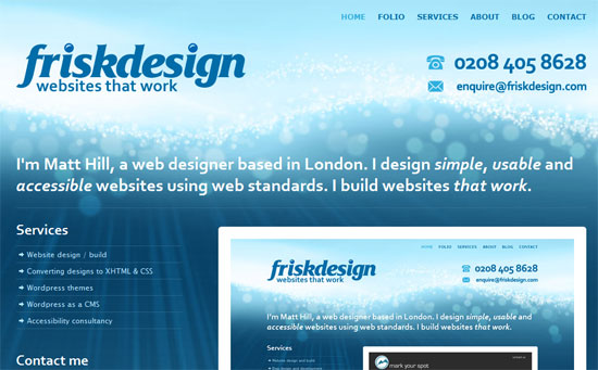
How do you organize a site with lots of content to digest? Try horizontal sections that vary in background styles. Keep them fixed and use transparent illustrations for an interesting scrolling effect.
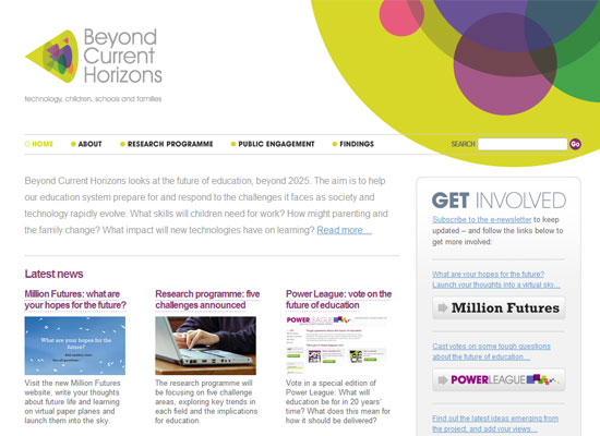
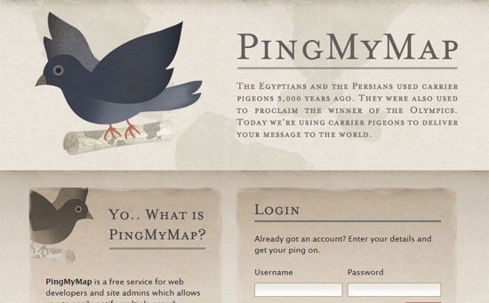
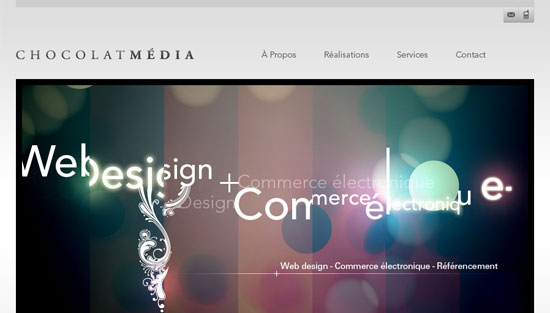
This site looks completely different from the other ones above. It’s the classier side of our office stationery suite, mostly because the designer avoided rough textures.
Social Media Weekly
Design – 23 Awesome Examples of Design as a Force For Good
A great inspirational article just in time for Blog Action Day (October 15).
Design/Programming – 10 Easy Steps to Great Website Optimization
Best practices to optimize websites for speedy and efficient loading.
