The featured sites this week know how to use lighter, lower contrast hues of brown to evoke a professional, comforting mood.
Designs of the Week
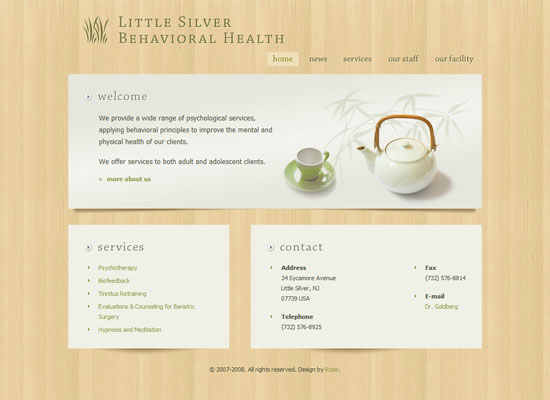
I love how calming this site looks. The light colored wood, the etched/letterpressed text, the shadows underneath the paper, and of course, the tea!
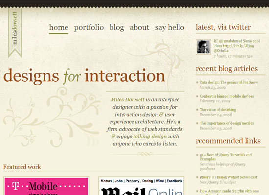
When I first saw this site I thought, “he makes Georgia look so good”. Really, the typography here is inspiring. I also like the ample use of whitespace and ornaments for the welcome blurb.
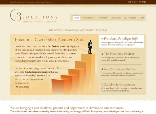
I know that company sites tend to stay away from serifs because they’ll come off as too stiff and old, but this site looks striking exactly because every other company is using sans serif text these days. I also like that instead of stock photography, nicely shaded illustrations were used (except for the inner pages, sadly).
Social Media Weekly
Design – 42 Pagination Design Inspiration
Design – 17 Adobe AIR Apps That Can Save Your Time
Programming – Safari’s text-shadow anti-aliasing CSS hack Revision
Programming – 10 Creative & Rich UI & How to Create Them


