No, these websites aren’t just for the little ones, but their designs certainly have a child-focused appeal to them. Check out the elements that make up a Kid-Friendly look on this week’s Friday Focus.
Designs of the Week
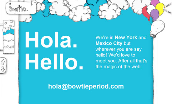
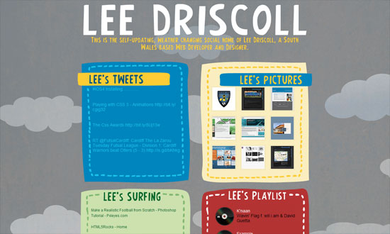
One page sites usually employ a storybook approach to the design and content, and this is a perfect example: playful hand-drawn illustrations, bright colors, large text, and animations.
Kids prefer books with lots of pictures in them. Never skimp on illustrations, even with icons; it’s so much easier to skim a site than a book and those will hold your visitors’ attention.
This may or may not be intentional, but the ruler in the background and the giraffe instantly remind me of those height measurement charts. Clever and refreshingly unique metaphor.
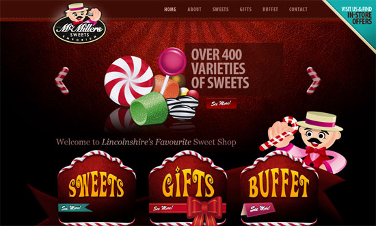
My favorite part? The candy cane style arrows!
A little too wide for my screen, but all the details are stunning, especially the buttons.
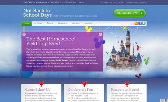
An otherwise straight-laced gets a touch of whimsy with some Disney pixie dust. Still looks professional, but with a more interesting color palette.
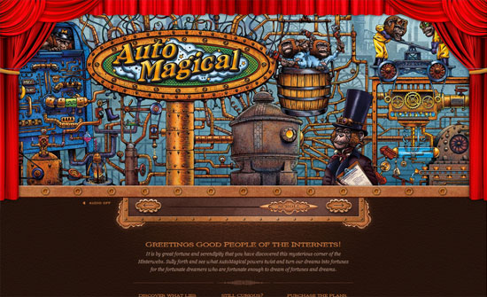
I like how practically everything in this design is custom, and it’s just the body text that needs a little tweaking. The moving background gives depth.
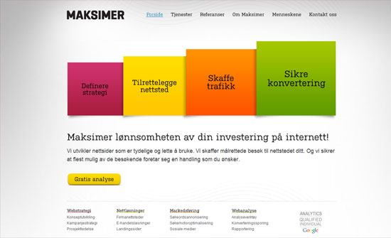
An abstracted version of building blocks that behave like sheets of paper when hovered over.
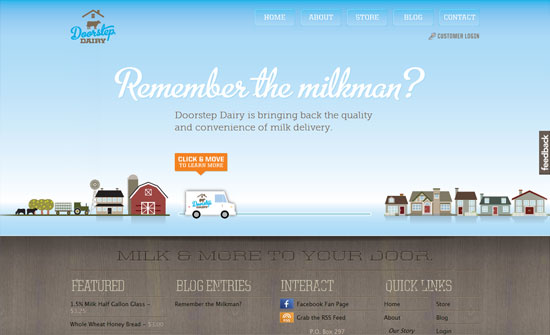
There are different kinds of interactivity, but this is probably the most fun: letting you scroll through content using the milk delivery truck. Excellent typography and other detail.
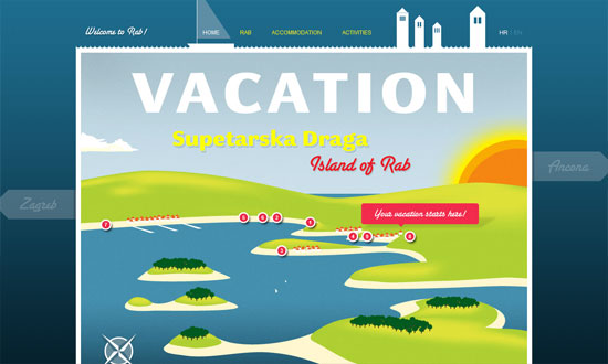
This reminds me of those video game maps where you move from one location to another each level. Using sailboats as navigation markers is utterly brilliant!
Social Media Weekly
Design – Graphic Design Theory: 50 Resources and Articles
HTML – HTML5Rocks
CSS – CSS3 Animations, the Power Back to CSS Part 1: Transitions
