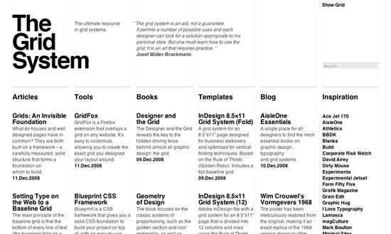
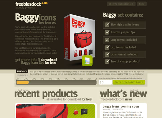
This week’s Friday Focus features different institutions of society as design inspiration for the featured websites. Did they make you do a double-take too?
Designs of the Week
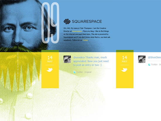
Very interesting use of these halftone patterns and fine line art juxtaposed against bright, summery colors. I’m not to thrilled I have to scroll horizontally manually (where’s JavaScript scrolling when you need it?) but other than that, fascinating concept.
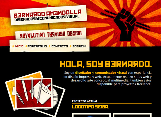
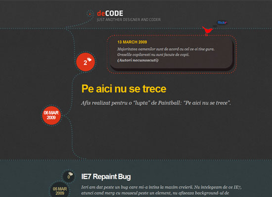
Now this is like the exact opposite of the previous one: bold, dark, warm, gritty. Good execution all the way to the footer.
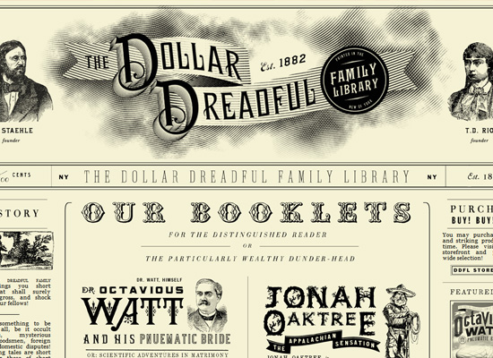
If there were an award for the “closest imitation of an ancient publication”, this site would probably win it. The staggering amount of old typefaces and illustrations keep the site interesting despite its stark black and white appearance. Lovely and amusing at the same time.
Social Media Weekly
Design – Negative Space
Photoshop – Make High-Impact Backgrounds for Your Designs with Photoshop
Typography – Illiterate Typography by Simon Page
CSS – Vertically Center Multi-Lined Text
CSS – Styling your Lists: 20+ Brilliant How to’s and Best Practices
