• Home
  • About
  • Contact
  • Advertise

Devlounge

Design, Develop, and Grow

ateşli sevgilisi fantezisini yaşamak istediğini söyler porno ona arkadaşları varken onunla gizli saklı seks yapmak istediğini sikiş söyleyen kız hafta sonu için gelen arkadaşının görmediği bir sikiş açıdan sakso çekmeye başlayınca adamın yarağını bu altyazılı porno şekilde indiremez ve açık şekilde salonda sikişimeye sex izle başladıklarında misafir kızı da bu sekslerine rokettube konuk ederler seks yapacağını düşünmeyerek onun sex izle oyun oynadığını zanneder sabah olur ve herkes uyanır hd porno bu sırada yanında şişme mankenini de getiren sapık erotik hikayeler genç sınav haftası ders çalışan genç adam üvey annesinin sikiş eve gelmesiyle hayatının şokunu yaşar

  • Home
  • Code
  • Design
  • Design Focus
  • Interviews
  • Publishing
  • Strategy
  • Webapps
  • Extras

Friday Focus 12/18/09: Blueprints

December 18, 2009 By Sophia Lucero

Here’s another interesting look that’s being used in websites lately: blueprints. See how they’re translated into this week’s featured websites on Friday Focus.

Designs of the Week

Alex Swanson

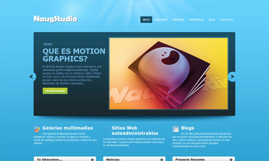
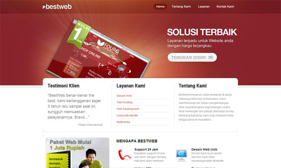
I have some issues with the spacing in the footer boxes but other than that, good site.

Blueprint Design Studio

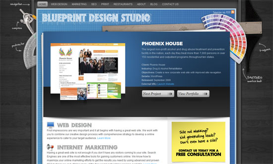
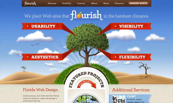
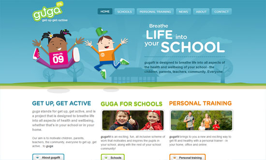
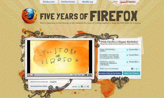
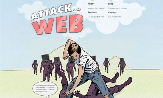
It’s a good idea to add real elements to reinforce the blueprint feel. I also like the animation when you hit the “Next Project” button.

Creative Joomla Design

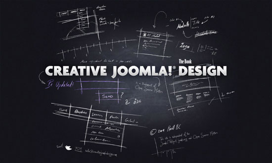
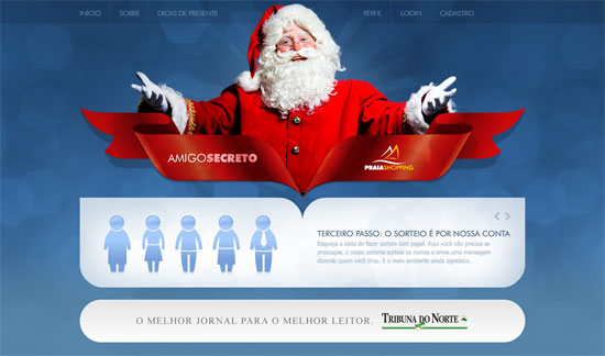
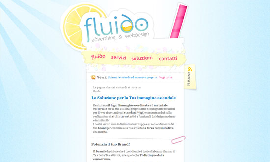
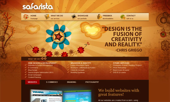
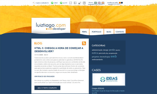
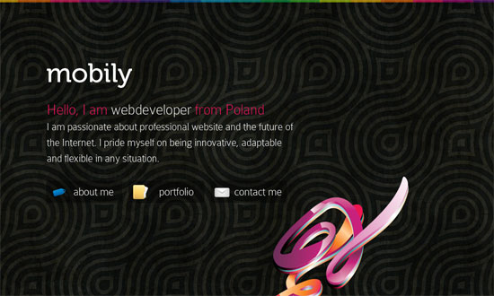
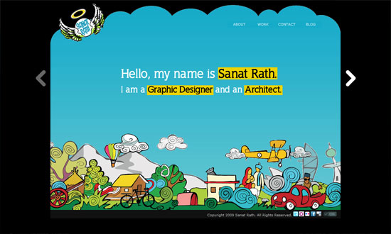
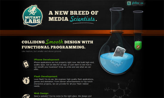
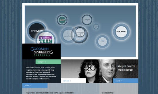
More of chalkboard doodles than a blueprint imitation, but it fits. I really like that the email subscription form blends in, but it’s a little too blended in. Overall that’s the main issue with this site: everything looks the same, it’s hard to tell that there are actually links and clickable elements in it.

Pat Dryburgh

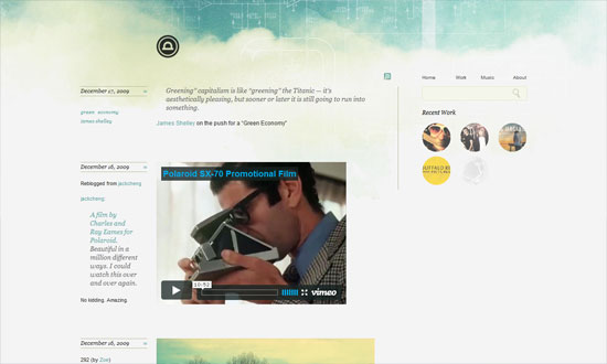
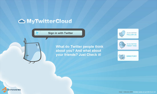
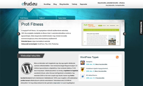
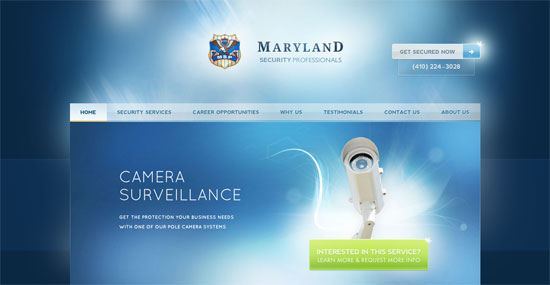
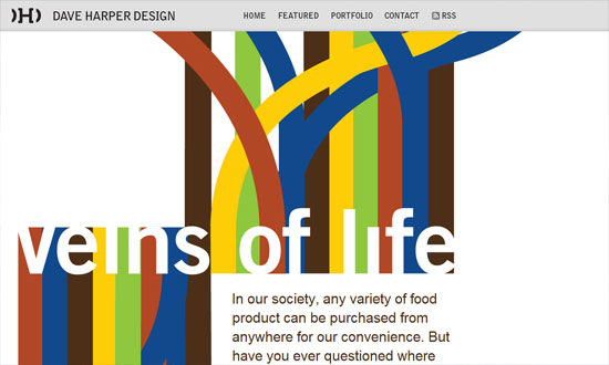
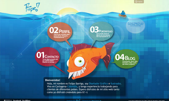
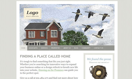
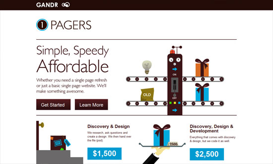
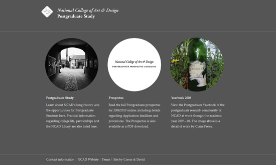
Here’s one going for the clean, subtle look. With blueprints it usually means white on blue, or light on dark in general, but it doesn’t have to be that way all the time, as this site demonstrates.

Alcomi iPhone Game Development Company

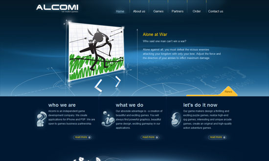
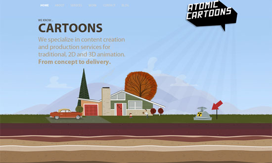
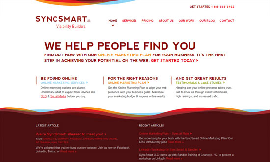
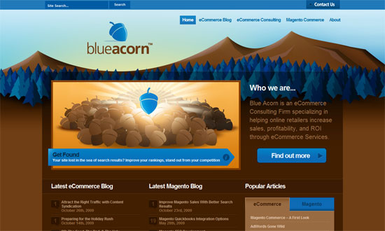
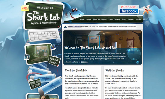
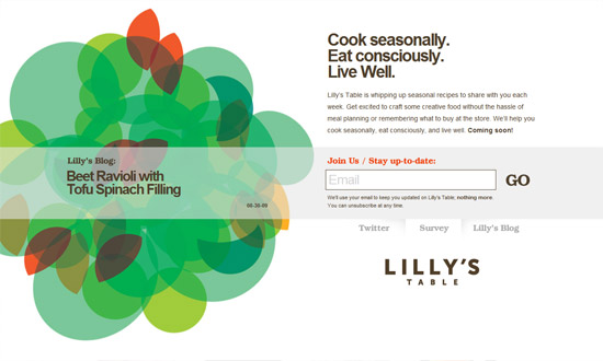
Taking the blueprint look to the third dimension is another great idea. Also, although not shown in full here: I like that the social media icons in the footer are flowing to the left (whooshes and all) instead of lined up side by side.

Social Media Weekly

Project Management – Biz Ladies 09: Project Management
“Today’s Biz Ladies post comes from Tiffani Jones of Second and Park. Tiffani runs a copywriting and content strategy business as well as a web design agency and is here today to share the ins and outs of successful project management.”

Programming – jQuery Masonry
“Masonry is a layout plugin for jQuery. Think of it as the flip side of CSS floats.”

Friday Focus 12/11/09: Sunbursts

December 11, 2009 By Sophia Lucero

This week, I’ve come across a lot of sites with sunbursts, a specific type of lighting that’s popular with not just the Web 2.0 look anymore. You decide if they’re crucial to the design or not.

Designs of the Week

Amigo Secreto Virtual

Love the way the shape of the ribbon creates a similar cut for the rounded box below it. Everything in here is so chic, but it makes me wonder if to the ordinary visitor it’s Christmas-y enough.

My Twitter Cloud

I don’t get tired of seeing 3rd-party bird mascots for Twitter apps, but people could be a little more creative with their “cute” typefaces.

MediaLoot

Overall, it’s a good look. But the treasure chest could’ve been more refined, and I’m not too keen about the inner shadow effect on the logo.

Flourish Web Design

I could waste so much time telling you every bit of awesomeness on this site, or I could just tell you to go visit it and see for yourself. Perhaps the one worth mentioning here is the Featured Projects section, which looks pretty different compared to the other carousel designs we see. Also: respect to the tree!

The Press Box

The way the polaroid-style photos shuffle from front to back is topnotch.

Atomic Cartoons Inc.

The only thing that disappoints me here is that the blog is not as well designed as this site!

Naugstudio

The sunburst is so subtle you’ll barely miss it. It’s practically design with the rest of the design. Lots of icons!

gugafit

Excellent details here, from the illustrations to the framed photos to the type—the rounded font works so well here.

Fluido

Sometimes a narrow, low-contrast site is the way to go, and that doesn’t mean you have to skimp on the details. I’m not sure the graphics are at the footer, but it definitely reinforces the scrapbook/collage look but doesn’t look heavy at all.

Weather Maps

The last thing that appears on the page is the sun, which rises from behind the clouds. Good morning to you too!

LightCMS

Love the rainbow-colored navigation bar at the very top. The subdued blending is like the color palette for the whole site.

Maxvoltar

People should be more creative with the shape of their sunbursts, like this one. Love the fixed navigation on the rightmost column.

Studio dentistico associato Lombardo

The color matches the dentists scrubs! I also like the arrow treatment—a great way to build to your branding, although I’m not sure if it does match theirs.

Efrud.eu

A nicely textured sunburst.

Five Years of Firefox

I love the splashes of orange watercolor mixed with the ornamental line art. But most of all, I love how all the user-generated photos are laid out on the page.

Safarista Design

Some things need to be tweaked to work better but overall, the warm and playful nature-loving look is a welcome one.

Love Freelancing

The stark type in black combined with the two shades of blue is a nice departure from typographic sites that are usually black and white.

BestWeb

Needs a bit more color below the fold, but this site has its type and graphic details down pat.

Luiz Tiago

I like the boxiness against the painterly header.

Maryland Security

The amount of shine on this site is staggering, you’d think it were the set of Twilight (so I hear). But I like it. The links have large clickable areas, custom fonts are used everywhere, and they know their whitespace (though in this case it’s bluespace).

Social Media Weekly

Design – When Minimalism Backfires: When Too Little Is Not Enough
“This article explores some of the potentially negative side-effects of minimalist designs and the consequences of implementing one incorrectly.”

Typography – The Rhetoric Of Typography
“A functioning message is one that succeeds in connecting with the habits and expectations of its audience.”

Web Design – 10 short ‘n’ sweet tips on how to design for web
“This article will quickly run you through some of the greatest issues with design for web and hopefully give you something to think about when you start your next web design.”

Friday Focus 12/04/09: Swashes, stripes, swirls

December 4, 2009 By Sophia Lucero

This week on Friday Focus: websites adorned with colorful, abstract flourishes that give movement and energy to the designs.

Designs of the Week

SyncSmart

No boxes, barely any straight lines. Just areas of content and the graphics to distinguish the header and footer areas.

Dave Harper Design

The striking graphics here aren’t really part of the overall design but of a specific featured article, and you can expect things to change when the site author publishes a new one. This “art direction” trend/idea is really popular now and a great source of new, ever-changing site designs.

Webfoo

The design needs just a little bit of refining but overall, fun to look at! Check out the icons in the inner pages.

At the Helm of Milwaukee's Freshwater Future

A great photo, a color you can’t go wrong with, and some wavy silhouettes to soften things up, and voila. Stunning.

Pixelbleed

What I really love here is the way the right-side menu was designed. Which is why I’m disappointed the left-side menu doesn’t match. Or why there are two menus on either side like that. Also, there are several fonts used on the site; it can stand to be a little more consistent.

allcreatives.net

The spacing is a little too tight, and the custom font in the pullquote is not very readable, but other than that I like it.

Marcin Dziewulski

I love how there’s exactly one decorative graphic in the foreground, like a sculpture of sorts. The background pattern is strong too, but not to the point that it’s distracting.

Social Media Weekly

Design – Oldest Design Galleries

Optimization – The real world costs of an heavy website

Business – Contracts 101 – Part 1: Outline

Friday Focus 11/13/09: Illustrious Illustrations

November 13, 2009 By Sophia Lucero

Another dose of great sites with great illustrations that carry the design. Happy Friday the 13th Focus!

Designs of the Week

Blue Acorn

The blue and brown looks stunning. Everything’s so tidy and well-arranged.

Mark Forrester

This design conveys playfulness but in a subtle way. Beautiful borders on the boxes.

Piipe

I adore the navigation. And the Twitter bird floating on the log!

Sanat Rath

I like how the designer used both the carousel and parallax effects on one page.

Attack of the Web

Would’ve liked a bit more of the comic book look in other parts of the site, but I enjoy the concept.

The Shark Lab Aquarium and Research Facility, Mossel Bay

Fantastic concept and detail.

Logo Realty Associates

Beautiful use of classic illustrations to support that warm, homey look.

Mutant Labs

Chalkboard effect!

GANDR Web

A fun way to illustrate the “refresh” services they’re offering.

Social Media Weekly

Design – Web Typography: Font Embedding Services

Programming – Is HTML5 good for application developers?

Typography – Legibility

Friday Focus 09/25/09: Circles

September 25, 2009 By Sophia Lucero

This week on Friday Focus, we have websites that feature circular shapes prominently in their designs. Time to break out of the boxiness and round things up!

Designs of the Week

Nora Rose Travis

Excellent concept and presentation, I love it! The only problem here is the way the site was coded: old-school mouseovers and preloaders.

Hello

I like that instead of the usual rounded-corner buttons we have circular buttons here. Another freeform layout.

Goodman Marketing Partners

I really like the navigation boxes right below the header, and how everything’s side by side, without borders. I also like the color palette here. It’s very professional, but not your cliche combination of hues.

NCAD Postgraduate Study

Another pro site, but this time the circular photos give just a touch of hip. I just wish the elements were repeated in the inner pages.

CSScake

How often do you see galleries with images masked by circular borders? It changes things up quite a bit, doesn’t it? I would have liked a bit more detail here, but since it’s a showcase site anyway, putting the focus on the featured sites is fine.

Lilly's Table

I really wish this were more than a landing page, because I’m curious how they’d implement the design on a full site, which unfortunately doesn’t carry over to the blog. Maybe next time.

Chance Graham

So well done. The grungy details don’t look tiresome; the circles inside boxes makes everything look different; and the orange and gray combination just leaps out at you.

Social Media Weekly

Design – 16 Great Photoshop Light Effect Tutorials

Typography – 10 Great Font Resources

Programming – Best CAPTCHA Solutions

Programming – 10 Top-Notch CSS Editors

« Previous Page
Next Page »

Code & Tutorials

Which Front-End Development Languages Will Grow in 2017?

Your Guide to Leveraging APIs as a Developer

Bitcoin Processing Website Integration For Web Developers

Website Security For 2016 That All Developers Need To Know

5 Reasons You Need to Be Using jQuery

About Devlounge

Want to read more about Devlounge, or maybe you want to contact us, or even advertise? Oh, and don't forget to subscribe to updates!

The Best of Devlounge

Cool Tools for Creative Blog Content

Search