Here’s another new trend to investigate: the evolution of bookmarking into curated and frictionless user experiences.
Designs of the Week
Get solid WordPress themes, plugins, and even design training from iThemes.

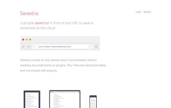
So simple and clever, I’m surprised godfather of modern online bookmarks, Delicious, didn’t come up with it. Here the design to praise is not just its thin, light colors and lines, but a design of a process that makes bookmarking dead-easy: just append “saved.io” in front of a URL to save it. Then to add it to a list, just use “listname.saved.io” instead.

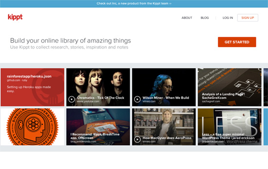
On othe other side of the spectrum, we have more visually-oriented interfaces. So you save not just a link, a description, and a tag, but also a snapshot of the page or content. It’s useful because majority of our interactions (with the world around us, really) are estabished through our vision. If you ever had that problem of remembering which bookmark you needed when you returned to your cache of link, a visual cue might jog your memory better. Additionally, you can follow fellow bookmarkers and see their saves in your feed. If you like one of them, you can just re-save to yours as well.

On this site the goal is to compile a bundle of links under a specific learning theme, so the focus should be on browsing through the links in a more optimized way. I like that instead of the expected meta data, there’s also information about reading time as well as who completed reading the link.

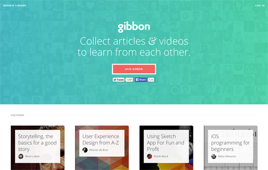
This one also takes a similar approach to bundled, themed links, and even beautiful imagery to convey them. The format is more of the firehose feed, where you subscribe and once those bundles are updated, they will show up reverse-chronologically on your account.
Social Media Weekly
Pagelines lets you build WordPress websites and it’s as easy as drag and drop, go check it out!
Email Design – Antwort
“Originally made for transactional Emails with dynamic content so the layouts are thoroughly tested – in live environments with real data and edge cases.”
Web Development, Product Design – How are apps made?
“There is a method to making an app. Iterative ceremony. Successive refinement not unlike in other crafts. App making as pottery? Place each button atop your bench wheel, sling your mud, refine the reactions on screen to touch, to sound, refine the movement of text, the size of text, the placement of text, typography macro and micro, to hyphenate or not (and if not, why, dear god, why), consider the images, to full-bleed or not to full-bleed, how to dismiss the images — a swipe or a tap or a dreadful [×].”
Web Design – Designing with Dynamic Content
“The Web is dynamic, so it’s essential for us to design with these important “what if” questions in mind. We must move away from leaving those questions to the very end of our process if we want to create more thoughtful, realistic, resilient designs.”
