Designs of the Week
Get solid WordPress themes, plugins, and even design training from iThemes.
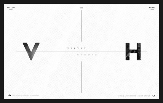
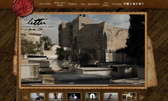
There’s a nice mix between a modern feel and subtle grunge touches here, which sort of represents both the music management and artist aspects to their company. The page scrolls inside the box and there are three menus which overlay on the area once clicked: social media, music, and the main menu.
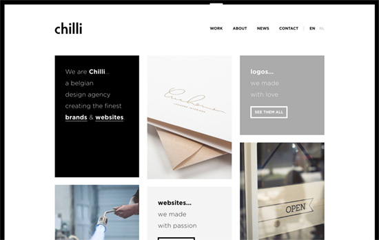
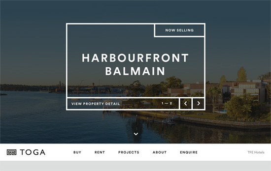
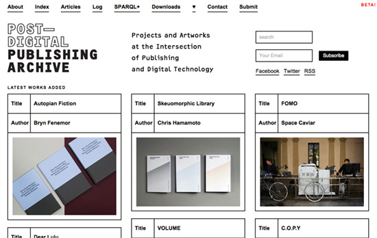
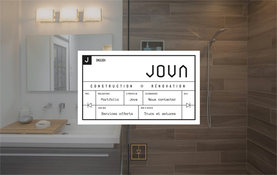
A clean, simple, predominantly black-and-white site with a boxy, bento-style layout.
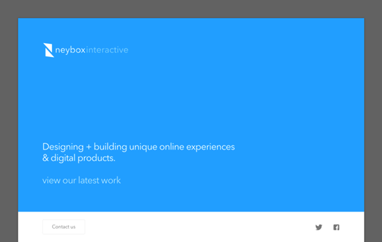
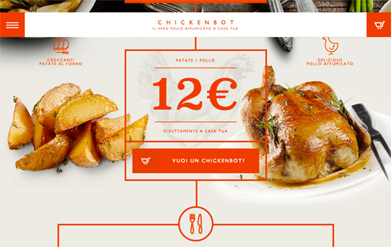
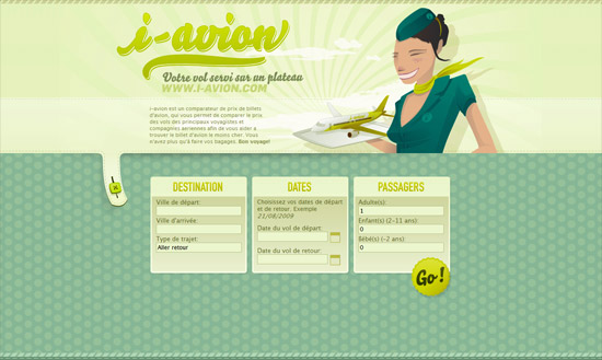
Nice bright colors marking each section and product of the homepage. The large imagery and small descriptions are a familiar pattern in websites these days, but the fact that the layout doesn’t span the entire width of the browser instantly makes it look different from the rest that’s out there, not to mention the treatment of the above-the-fold block.
Social Media Weekly
Search Optimized, Turn-Key Designs, Unlimited Everything. Start building with the Genesis Framework today.
CSS – Ways You Need To Tell The Browser How To Optimize
“Rather than the presumed “browsers will get faster at running my code”, there is a little more “I need to change the way I code for browsers to get faster.””
Typopgraphy – glyphdiff
“Glyphdiff is a simple tool comparing the differences of two fonts on given glyphs.”
JavaScript – JavaScript for Designers
“Rather than sit, and try to digest boring definitions, we’ll dive right into building an interactive HTML prototype, and have fun learning JS together along the way.”
