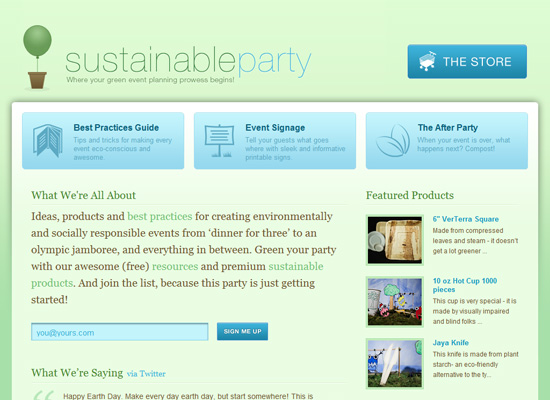
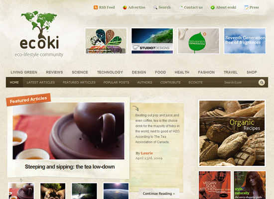
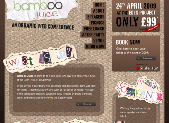
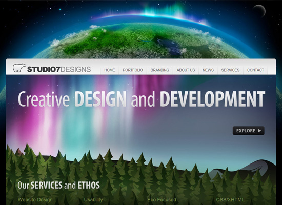
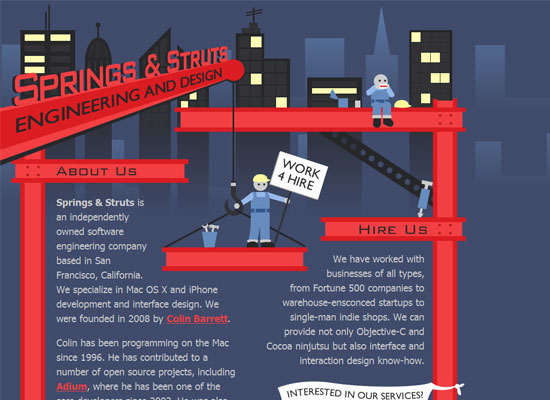
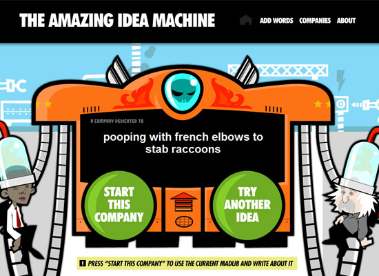
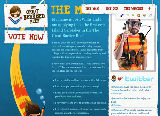
This week on Friday Focus, we celebrate great icon design which carries the overall look of our featured websites.
Designs of the Week
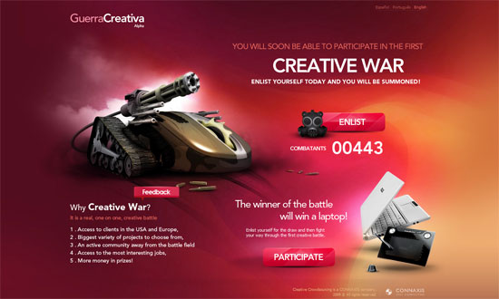
Perhaps what I love most about this site, aside from the kickass image mouse-tank to the left, is how the fuchsia blends into yellow with all the subtle lines and textures, including that cloud slash smoke slash fog. The forms are neatly done too.
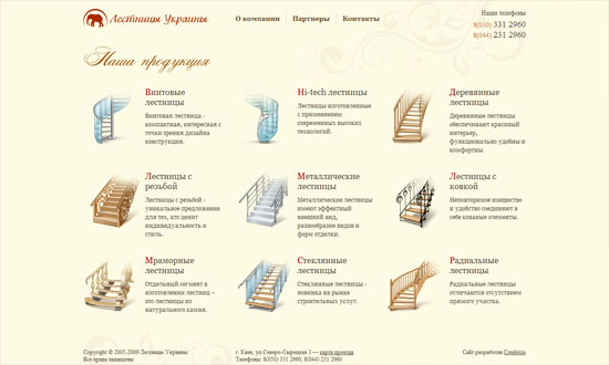
I don’t know about you but when I saw this design, I was absolutely delighted by how the stairs were iconized. Icons of stairs! Inside you’ll find real pictures of them, but the style and detail of the icons on the front page is a brilliant idea. It keeps things elegant and uniform while focusing on the actual product—because unlike shoes or mobile phones, you can’t photograph unattached staircases on a white background!
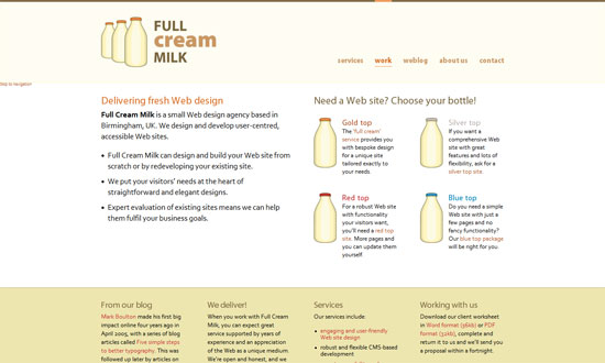
Here’s another spin on the same-icon-types-on-the-frontpage pattern. Although I would say this is a little less effective than the previous site because for starters, you’re depending on the color of the mlik bottle top to differentiate their services. Not a very good idea for accessibility reasons; it might have been better if the bottles had different shapes or adornments. Still, I like how clean this site looks and the general “milk” branding and metaphor.
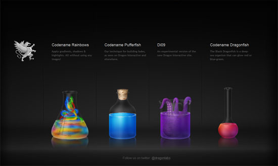
Two awesome things here: first, the icons actually have animations when you hover over them. Second, the animals and substances are all in laboratory containers (beakers, gradiated cynlinders, etc.)—this was the unity-in-diversity thing I was talking about. These, plus the dramatic dark background as well as the “labs” branding, make you absolutely curious about what the codenames and experiments all mean.
Social Media Weekly
CSS – A Detailed Look at the Z-Index CSS Property
Behold the bane of most front end developers!
Design – 10 Web Design Rules That You Can Break
Rule #10 is the best.
Usability – Stop Counting Clicks
Here’s another myth busted.
