Last week I mentioned a site that uses a shelf as a nice metaphor for holding content, so let’s look at several more in this week’s Friday Focus.
Designs of the Week
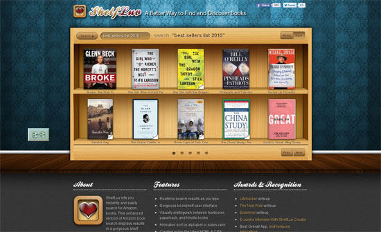
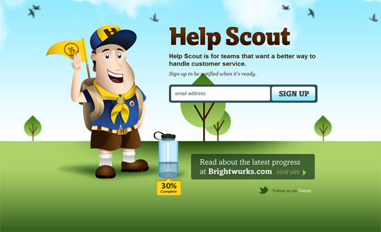
Big, bright, and shiny. This is a flawless design basically. My favorite part is the Twitter icon also getting the same tag treatment.
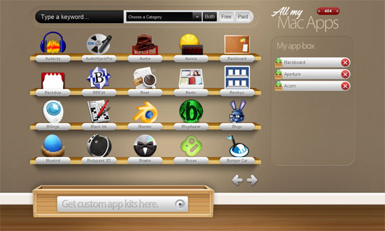
Love the contrast between the old style glass jars and the new media stickers and trinkets inside them. I think the only missing part here is better typography.
The book titles and shelf height could be bigger. I like the addition of the electrical outlet to the side even if it doesn’t really add much to the design. The browsing and sorting animations look great.
I would really love it if sites using the shelf metaphor take it all the way and support drag-and-drop, and other AJAX interactions.
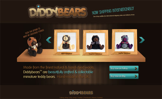
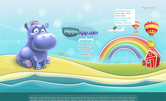
The colors and details here are great, but I have to wonder if a kids-oriented site should use a lighter color palette. What’s stopping shelf designs from being pastel-colored instead of literally brown because of the wood? Is it the lighting?
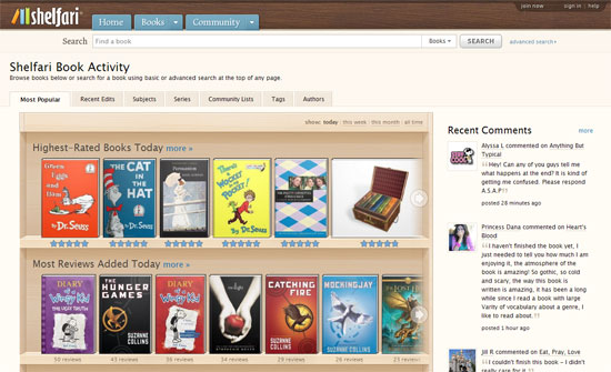
It’s nice to see shelves on a more popular site such as Shelfari (the name begs that I guess). It’s probably the most well-done too: no skimping on features and the look blends well with the rest of the interface elements (tabs, buttons).
Social Media Weekly
HTML – Exploring Markup for Breadcrumbs
“So where are we at on this? I’d say that there is no super-ultimate best-possible-way to handle breadcrumb markup yet.”
Design – The Three Threats to Creativity
“Creativity depends on the right people working in the right environment. Too often these days, the people come ill-equipped, and their work environments stink.”
Accessibility – Accessibility myths in 2010
” Early this year, Ian Pouncey posted a few other Web accessibility myths. Here is a quick roundup of the myths from these two articles.”
HTML5 – HTML5 Outliner

