It’s eye-catching headers this week on Friday Focus. Whether you believe in making the most of the content above the fold or not, it pays to make the top part of your websites extra beautiful because it’s the first thing people see.
Designs of the Week
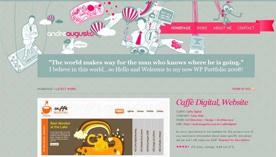
Let’s start off with a blog and portfolio which reflects the owner’s signature look. I personally love that shade of reddish-fuchsia-pink ever since Last.fm popularized it during early Web 2.0. Here, it stands strongly against shades of gray.
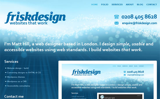
Now aside from a large, chunky logotype that’s hard to miss, you can create a striking header with a bright graphical background. Of course be sure to check if all the text in that area is readable first. In this case, it clearly is as the designers made sure to use light colors where the text was dark blue, and vice versa.
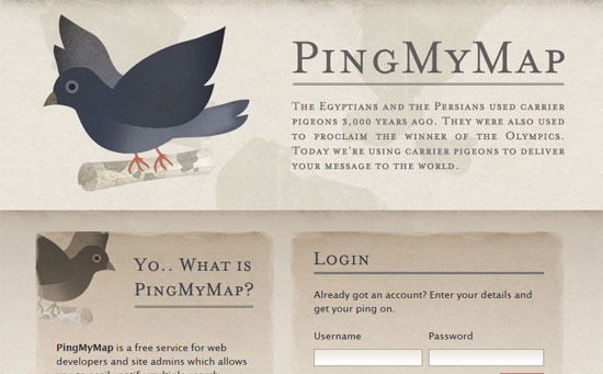
Now here’s proof you don’t need candy colors to call attention to your site. All you need is good contrast, large title text (be reasonable though!), and a lovable mascot. Preferably a bird. Seriously though, if you want to introduce a new product to the masses via a website, say everything you want to in the quickest way possible. The header of the page is the most convenient place to do that.
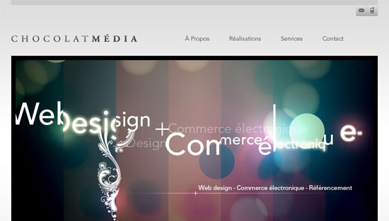
This is another site that uses more subdued hues compared to our 2 earlier examples, but the callout image is a bit more abstract and at the same time typographical. It also summarizes the services offered by the company. I sure hope they put in some good alt text in there!
Social Media Weekly
Design – Adobe Photoshop: 50+ High Quality .PSD Files and Tutorials
Rev up your Photoshop program and try out all these tutorials and graphics on for size.
Programming – 8 Innovative Design & UI Elements That Make Sites Better
Great ideas for communicating with your audience more easily.


