Metaphors are a cornerstone of design, but what if the design itself shows the tools and components used to build a website? The result is an interesting “x-ray” into the web design process, as seen in this week’s featured sites.
Designs of the Week
Get solid WordPress themes, plugins, and even design training from iThemes.

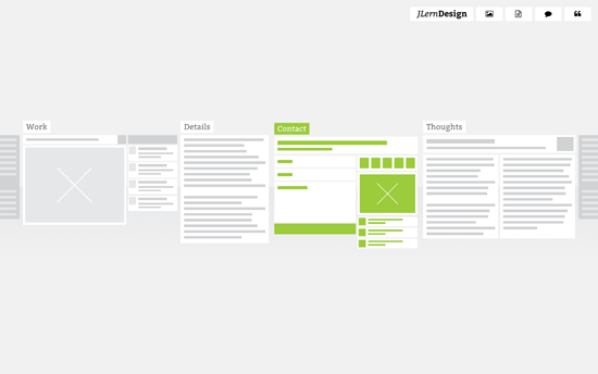
Instead of the usual links or thumbnails, this site uses website wireframes to represent the subpages, showing the actual yet abstracted layout of each page. The cool thing is the transition, where you see the wireframe “come to life” with the live content and color-coded elements. All the pages also appear side by side once you go into one of them, so it’s like you’re zooming in, almost physically exploring the website.

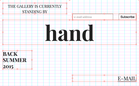
This design is reminiscent of speed painting videos, except done in the context of creating a website. You’re literally watching the site transform in terms of typography, color, and layout live. It’s probably intimidating and gimmicky for certain audiences, but being an online art gallery and still in its coming soon phase makes for an interesting art piece itself.

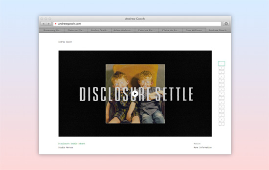
Browsing with a browser inside of a browser seems a little on the nose, but the fact that these are live sites shown in each tab speaks to the confidence of the designer in presenting the work—no pixel perfect screens here, you’re interacting with the real deal. In a smaller container of course, but you can click on the “go” icon to see it in a new window. I also like that the description above fades out and the background becomes this powder blue to light gray gradient.

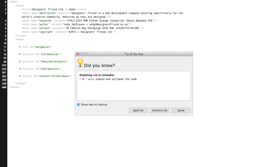
And what is a website without HTML? The page shows a Tip dialog which you can close or move out of the way, as if you’re using a Linux OS inside the browser. You can then proceed edit all the code on the page, click on the red links, and hover on the <img> tags. Again, this interface could intimidate non-techies, but that will also tell you whom this page is really for.
Social Media Weekly
Pagelines lets you build WordPress websites and it’s as easy as drag and drop, go check it out!
User Experience – Designer’s Toolkit: A Primer On Capturing Research
“A good structure is to have a moderator and a note taker, that way one practitioner can focus on conversing with the participant, while the other focuses on capturing what is occurring.”
Design – Why the Golden Ratio matters
“The visually-inclined — artists, architects and designers, historically keen observers and documentarians of both nature and the human condition and who we can thank for much of what we know about the world — have for ages incorporated this ratio into their work due to its intrinsically alluring balance between symmetry and asymmetry.”
Usability – 6 Usability tasks you haven’t tried so far, but really should!
“Below you find 6 example task that can provide new and different insights than the standard usability tasks.”
