• Home
  • About
  • Contact
  • Advertise

Devlounge

Design, Develop, and Grow

ateşli sevgilisi fantezisini yaşamak istediğini söyler porno ona arkadaşları varken onunla gizli saklı seks yapmak istediğini sikiş söyleyen kız hafta sonu için gelen arkadaşının görmediği bir sikiş açıdan sakso çekmeye başlayınca adamın yarağını bu altyazılı porno şekilde indiremez ve açık şekilde salonda sikişimeye sex izle başladıklarında misafir kızı da bu sekslerine rokettube konuk ederler seks yapacağını düşünmeyerek onun sex izle oyun oynadığını zanneder sabah olur ve herkes uyanır hd porno bu sırada yanında şişme mankenini de getiren sapık erotik hikayeler genç sınav haftası ders çalışan genç adam üvey annesinin sikiş eve gelmesiyle hayatının şokunu yaşar

  • Home
  • Code
  • Design
  • Design Focus
  • Interviews
  • Publishing
  • Strategy
  • Webapps
  • Extras

Friday Focus 07/29/11: Triangles

July 29, 2011 By Sophia Lucero

We’ve looked at designs with irregular shapes and circles before (twice, even), and this week we’re adding triangles to that list. Time for this week’s Friday Focus!

Designs of the Week
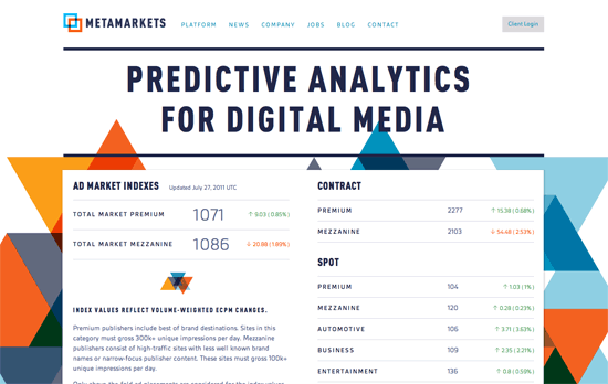
Metamarkets website
Metamarkets

It’s probably a minor thing but the logo colors don’t seem to match the shades of blue and orange used in the background, although they do have translucency and overlapping shapes in common. The look is colorful, light, and very readable. I think the triangles are there to break the text-dominated pages a bit. I find it interesting that in the Platform page, the sidebar is used as the location for the diagram, instead of above or mixed in content, whereas the Blog is a one-column layout and has no sidebars.
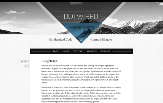
dotwired.de website
dotwired.de

Remember those centered seals? This reminds me of that, but with a triangle. Looks like a well-tailored site mixing light textures and transparency, but minus points for not putting in any content in the Portfolio and Project pages.

The Fashion Sketchpad website
The Fashion Sketchpad

There’s one really nifty effect here: if your internet connection is fast enough, a “dressed up” sketch fades over an “undressed” one like a virtual paper doll. It’s not complicated or flashy (imagine how you can take things further), but it drives the fashion concept all the way home! There’s also a fabric swatch feel between the triangular shapes, bright colors, and subtle patterns.

Maxi Moda 2011 website
Maxi Moda 2011

Again with the pattern mixing plus translucent images, some of which should be better off as inline text replacements. The lightbox could have been customized further.

Cappen website
Cappen

First of all, I’m stunned by how bright the green is, which is good, except for the area where it’s used as background for white text—not recommended! The circular slideshow is definitely catchy, especially with transparent images being used. There’s another projects list at the bottom right in addition to that. Lastly, I love the use of a triangle content area for the footer.
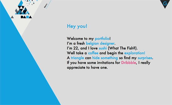
Henrotte Julien's website
Henrotte Julien

You know how people are using circles everywhere these days, including framing content, because of border-radius? This site is like that, but with triangles. It’s not even remotely half-assed though. In the Work section, images and captions are cropped in skewed boxes. Clicking on the G at the top right displays the underlying grid. The code is a little messy in some places but overall, an outstanding job.

Social Media Weekly

Mobile Web Design – Introduction to W3C Mobile Web and Application Best Practices
Learn how to work on the mobile web with an 8-week short course created by the W3C.

Business, HTML, CSS – Dear Clients, The Web Has Changed. It’s Time To Use CSS3 and HTML5 Now.
Help educate your clients with the latest concept in web design and development.

Design – The Auteur vs. the Committee
AKA design according to Apple vs. Google.

User Experience, Design – Visual Designers Are Just As Important As UX Designers
With UX being the second hottest buzzword in the industry today (HTML5 is the first), how do they fit in alongside visual designers?
Friday Focus 07/01/11: Exploded Views

July 1, 2011 By Sophia Lucero

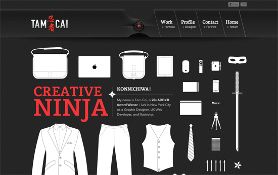
This week’s Friday Focus features designs that utilize the exploded view diagram technique. You could say this a more controlled approach to chaotic designs.

Designs of the Week

Tam Cai website
Tam Cai

The first thing that strikes me here is that pinstripe look combined with the stylish header background: like a long swatch of fabric held together by a black button and red thread. This look repeats as you scroll below, and the background now looks like it’s the bottom of a tailored vest or jacket. While the white illustrations of the designer’s clothes and things aren’t as detailed and use only thin outlines, it actually provides a nice contrast to the more realistic and relatively heavier interface. Even the contrast between the “suit” and the “ninja” personas adds another layer of interest to the concept.

Another feature you have to check out on this one-page portfolio is the profile section, which uses concentric open rings to represent the designer’s skill levels. This just fits, if not enhances, the Japanese graphic details on the site. Using ninja stars as bullet points is another.

One last note about the Facebook like button: this designer’s technique was to lower the opacity so it wouldn’t stick out so much. I’d say it looks a little better this way, but I’m still hoping for a more flexible solution from the social network site itself.

LightCMS website
LightCMS

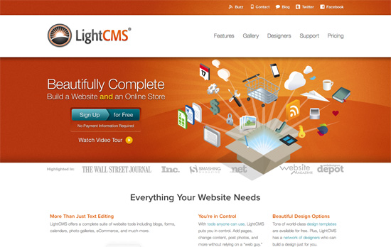
The “sign up for free” button has quite a different design for sure, although I don’t know if it adds any meaning with the split colors and the arrow pointing to the right, because on some level it looks more similar to the slider buttons popular on mobile interfaces nowadays, implying a choice between the two. The rest of the site displays impeccable typography and care with the product feature illustrations.

Nizo for iPhone website
Nizo for iPhone

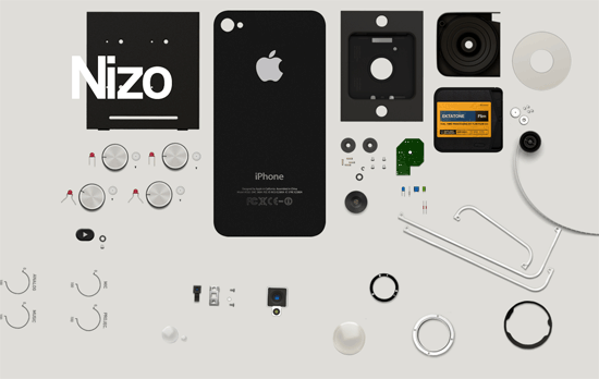
I guess sites that haven’t launched their products carry more pressure in keeping people interested with few details to give away, and this design solves the problem brilliantly with an out-of-the-box approach. What I assume to be user interface components of this mobile app fly into the screen and sit next to one another as you scroll downward. The reverse happens as you scroll back up. Then as a final touch, the email notification form pops up from below once the scroll completes. Next to it are completely unassuming Facebook and Twitter sharing buttons, which turn from squares into circles upon hover. It’s flashy without being flashy.

Social Media Weekly

JavaScript – Paper.js
“Paper.js is an open source vector graphics scripting framework that runs on top of the HTML5 Canvas.”

Mobile – Mobilizer
“Preview mobile websites, design mockups, and local HTML on Mac or PC.”

HTML – Simple Semantics With Microformats, Part 1
“What microformats are, their benefits and how to implement both rel-tag and XFN.”

Business – A website can’t be measured in pages
“Selling page-based website packages isn’t just an inaccurate way to gauge project scope, it is a questionable way to turn a profit.”

Tools – One Page Apps I Actually Use
“Of the probably-hundreds of these one-page apps that I’ve seen over the years, there are only a handful that find myself using on a regular basis. I thought I’d share those”

Friday Focus 01/21/11: Four Ninjas & a Samurai

January 21, 2011 By Sophia Lucero

These Japanese warriors seem to be very popular figures in design and tech companies, so let’s see how these websites take off on the concept. Welcome to this week’s Friday Focus!

Designs of the Week

Ninja Support Services

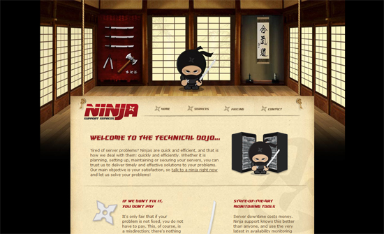
Clearly the header image is too narrow for wider screen resolutions but it doesn’t look bad like this. Love the hanging look of the content and the weapons as icons everywhere.

CSS Chopper

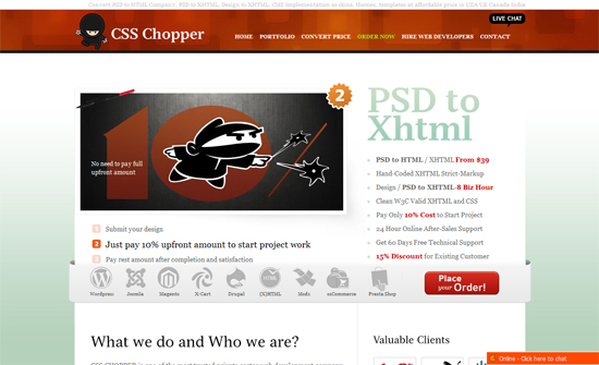
Instead of listing recent work on the page, they surprisingly show up in the flyout menus. This design seems to prioritize keywords over portfolio.

CSS Ninjas

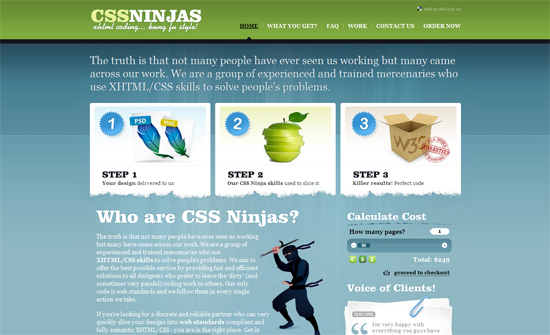
Doesn’t feel too ninja-y, but looks very elegant.

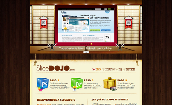
Slice Dojo

Do we have copycats in this list? The carousel integrated into the sliding door panel is clever, but the rope and hanging paper looks almost exactly like the first site featured here, with ninja star icons in the menu as well. Who copied who?

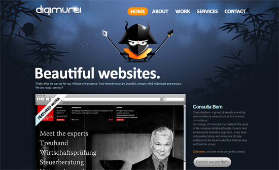
Digimurai

I like how the content area needs no background so the rest of the design shows through without much distraction.

Social Media Weekly

Business – Building the Trunk, First
“Why you should focus on the core of your product.”

Design – 10 Designers Share the Process of Creating Their Amazing Design Work
“In this article you’ll find 10 designer share the process of creating their amazing design work, which I hope can help you to get some inspiration.”

CSS – What’s the Difference Between :before and ::before?
“I had assumed that there would be some difference in the way each functioned, but that’s not the case, as the short and long answers below make clear.”

HTML – Get familiar with HTML5!
“We’ll advise you on how it can fit into your learning right now, even if you are a novice web designer or developer, and we will look at some of the main features of HTML5, so you can see what it adds to the already powerful HTML language.”

CSS – Polka dot background with gradients

Friday Focus 01/14/11: Coffee Break

January 14, 2011 By Sophia Lucero

It’s all about coffee this week on Friday Focus!

Designs of the Week

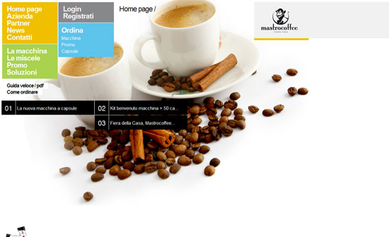
Mastrocoffee

Great modern look. Interesting how the logo is at the top right (instead of the usual left). I like the idea of grouping menu items into related blocks so it’s not just one long list.

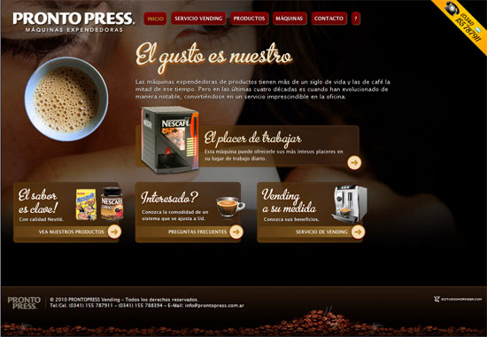
Pronto Press

It’s quite predictable that coffee sites will adapt brown color schemes. What I like here is the fancy script type and the transparency effects. No solid text backgrounds here, probably to make it feel lighter with the already dark color scheme.

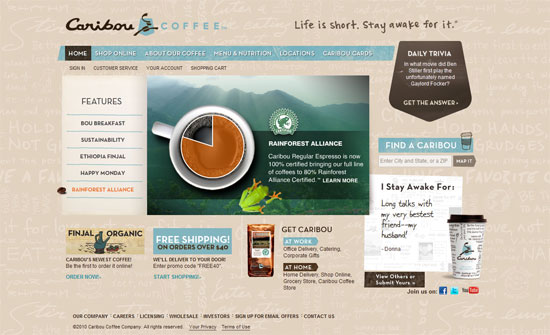
Caribou Coffee

Smart idea for a coffee bean to become the arrow in the slideshow. The use of light blue here is a nice contrast to the browns and neutrals. The background pattern and the “I Stay Awake For” section are also nice ideas.

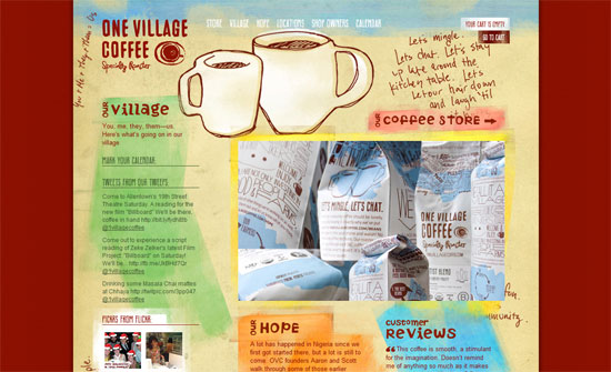
One Village Coffee

This one puts in more than one contrasting color. I like the raw feel to it although I’m still not comfortable with all the uppercase text everywhere.

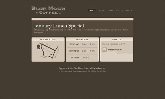
Blue Moon Coffee Lake Oswego

I’m surprised how spartan the homepage is, considering the inside pages have large header pictures while this has none. I also find it a little weird that the slideshow boxes stretch only to the width of the headers, so there’s whitespace to the right at times. I do like text styles used though.

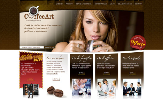
Coffeeart

The Flash animations are good and warranted, the details are polished, but I think the photos in the 3 right columns could be less cliche.

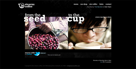
Stearns Coffee

Again, beautiful design with one glaring problem: the hosting banner at the top. I like the split approach on the front page, and it’s very useful to add store hours (and even Wi-Fi availability) info at an accessible spot.

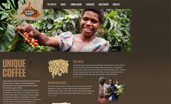
Tanna Island Coffee

The logo box blends well with all the picture headers. I also love the woven mat pattern in the footer.

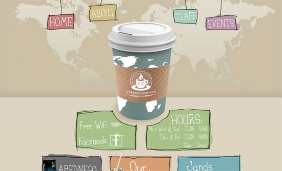
C & C Coffee Company

Love the rough, hand-drawn edges everywhere and the giant cup of coffee right down the middle. However, the world map background is a little odd and I’m not sure if you should be so dependent on Flash for menu navigation.

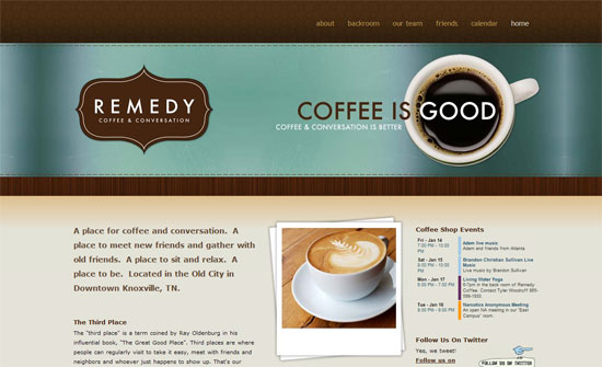
Remedy Coffee

I like the overall look but I noticed that the logo is the same image as the rest of the header. Not sure if it’s such a big issue but the general practice is to have it separately and link back to the the index.

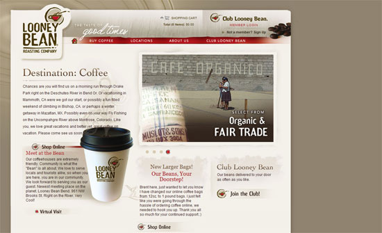
Looney Bean Coffee

Reuse of the logo everywhere is great. All the design touches here look great. I think the only issue I have is the left alignment.

Social Media Weekly

User Experience – How to Make Your Shopping Cart Suck Less
(Note: I wouldn’t call The Oatmeal an authoritative source for web design but from a consumer perspective, it’s insightful enough.)

Web Standards – Seven things I want to see on the web in 2011
“As I’ve been particularly nice all year, I think I deserve to be allowed to have a wish list of things that should change on the web in 2011.”

Web Standards – Ultimate Guide to Microformats: Reference and Examples
“While HTML has a whole bunch of awesome elements by which to convey meaning, a slew of purpose-built microformats (conventions) have been created to better represent the kind of content that exists on the page. This guide discusses popular microformats that can enhance the semantics and interoperability of your website.”

Design – The Photoshop Etiquette Manifesto for Web Designers
“Helpful and *subtle* suggestions for the process of web design in Photoshop, and making the transfer of PSD’s less painful.”

Business – Should I work for free?
(Start in the middle)

How to Handle Customer Complaints

August 5, 2009 By J. Angelo Racoma

You’ve contacted your utility company, mobile phone provider or ISP one time or another. And in these cases, your call, email or online chat was likely to have been answered by a customer service employee, whose tasks include acting on complaints, or referring these to the technical support or other departments as necessary. Big companies can afford this. However, if you’re running a small business or if you are a freelance professional, chances are you run the ship on your own, and this includes handling customer inquiries and complaints.

I run a few online services where I’m the sales guy, the marketing guy, tech support and even customer service rep. The great thing about being all these is that the buck stops with me. With most customer service calls, you get passed to and fro. If your inquiry can’t be addressed by the frontliners, you get passed on to tech support. If it’s about your money, you get passed to billing. If you want a new service or an upgrade, you get passed to sales. I’ve experienced a call in which I was passed around and around. I ended up just listening to the what are probably scripted statements uttered by people who don’t really understand their products and services.

In the event that you get an angry email or telephone call complaining about your service, what do you do?

Understand user expectations. Many of my complaints about my mobile service are better addressed by getting online and searching through forums. Most of the time, when I call my cellphone provider’s customer service number, the staff can only regurgitate scripted information that is most of the time irrelevant and even useless, because they really cannot understand the context of my call. But, if you really use your own product and service, you get to understand it from deep within. You know how to work it, and you know how to hack it, if need be. Put yourself in the shoes of your customer, so you know where he’s coming from. Be your own customer yourself, and see if you appreciate your own product offering.

Get additional information. Sometimes, customers in their anger would just blurt out generic statements like “My email is not working. Please fix it,” or “Your service sucks. I want my money back.” The best thing to do in these cases is to ask for specifics. If you suspect it’s a system-related issue, ask for the operating system, browser, and even the version they use, which could have an incompatibility or known issue. Or you can ask for the exact date and time that their issue had occurred. Or if you run several services from under one brand, you might want to ask for specifics like which product it is they’re complaining about.

You might get additional information from your own records, and this might also be helpful in diagnosing the problem and in your eventual resolution. Whatever the case may be, don’t just take the complaint at face value. Dig deeper. Try to see it from different perspectives. The solution might just be there somewhere.

Act quickly. Most big companies make you go through red tape before you get your complaint acted upon. In some cases, it’s really logistical issues that cause the delay, such as when there are physical repairs needed. But when you’re a small business, you have the flexibility to act quickly. If all it takes to make your complaining customer happy are a few clicks of the mouse, then it would be worth it.

Offer a refund or discount. If you suspect that your customer isn’t really the right match with your service, then be gracious enough to offer a refund. Of course, if it’s a physical product that’s being contested, you would want it returned. But if it’s an online service, a membership, a subscription, or any online material, then it’s probably best to offer a refund without much fuss. Goodwill goes a long way, and you develop good business relationships based on goodwill. Your irate customer might end up purchasing from you again if you treat him well.

If a refund is too drastic, you can offer a discount. The same goodwill concept applies. If a customer sees you’re gracious enough to offer some of his money back for the trouble, then chances are he will stick it with you.

Follow up. After acting on a complaint, check with your customer if the resolution is to his satisfaction. You might want to follow up a few weeks after, just to check on things. Your customer might be able to give you a few insights on how to make your service better.

In the end, when you don’t get to see your customers face to face, there is always the temptation to slack off. But rather than brush aside these calls for help, why not seize the opportunity to prove your worth as a business person. Fix things. Talk to people. Connect. Improve. This is what complaint resolution is all about.

« Previous Page
Next Page »

Code & Tutorials

Which Front-End Development Languages Will Grow in 2017?

Your Guide to Leveraging APIs as a Developer

Bitcoin Processing Website Integration For Web Developers

Website Security For 2016 That All Developers Need To Know

5 Reasons You Need to Be Using jQuery

About Devlounge

Want to read more about Devlounge, or maybe you want to contact us, or even advertise? Oh, and don't forget to subscribe to updates!

The Best of Devlounge

The Passionate Sabrina Dent

Search