This week on Friday Focus: designs that prominently feature user-submitted content, particularly images. How do you prevent monotony and preserve quality on these sites? Let’s find out.
Designs of the Week
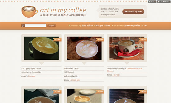
Very homey, and it’s all in the details. Just… look at it.
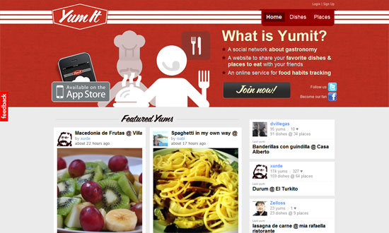
This look is a bit more understated compared to the previous one, but again it’s all in the details giving way to focus on the content. The overlay of info on hover, the color swatches on the sidebar, the visualization of tags by popularity, the use of thin borders for tabbed navigation, and so on.
I feel like the scripty, retro look could be reinforced more, especially in the blurb text, which seems a bit cramped.
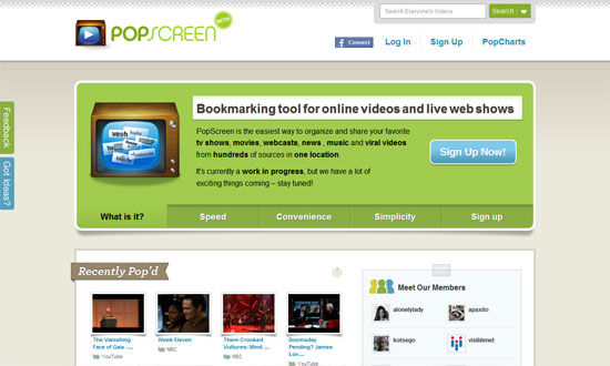
I like the layout here. The All / iPhone / iPad filter is a little too small and up there, but other than that, all the non-gallery stuff are on the right. I also like that the four most recent images are larger than the rest, which breaks the rhythm and calls attention.
I think the middle area could be a little more refined, but I like that even the video player has the paper-like look around it.
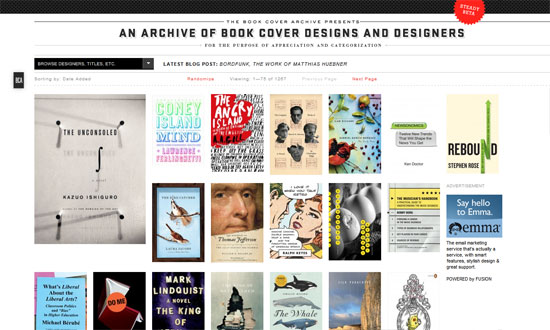
Very underdesigned and I don’t mind one bit. It’s not so obvious but as you browse further, the site is left-aligned, not sure why. I find it interesting that the pixel-style footer, a repeat of the header, is very tall.
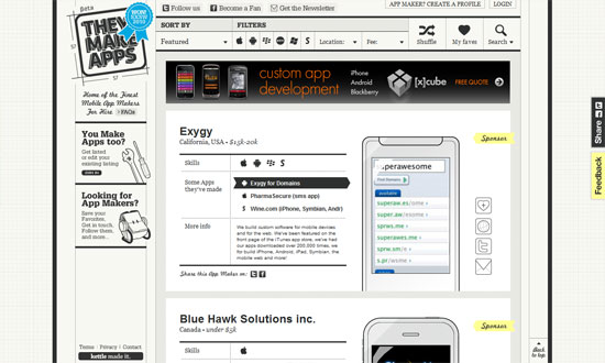
Looks extremely busy but the features are fantastic. The image containers swap according to the type of mobile device being developed for, and practically everything is in black and white so the apps stand out.
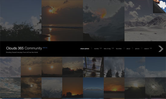
This is actually running on the Fullscreen premium WordPress theme, but I decided to use a live example where it works as a user-submitted community. I love that the layout is unconventional but still effective.
Social Media Weekly
Design – Know When to Stop Designing, Quantitatively
“Efficiency lets you know when you can stop looking for a better design.”
Usability – Horizontal Attention Leans Left
“Web users spend 69% of their time viewing the left half of the page and 30% viewing the right half. A conventional layout is thus more likely to make sites profitable.”
Usability How to Win Friends and Influence People Remotely
“Once remotely located a designers ability to interact with other team members and effect change are funneled through the telecommunication mediums that the team uses to communicate. This article lists the available mediums and analyzes their respective strengths and weaknesses and provides suggestions for their effective use.”
User Experience – Designing with the Elements of Play
“The elements of play, such as points, levels, and challenges, are powerful for application development beyond games.”
