• Home
  • About
  • Contact
  • Advertise

Devlounge

Design, Develop, and Grow

ateşli sevgilisi fantezisini yaşamak istediğini söyler porno ona arkadaşları varken onunla gizli saklı seks yapmak istediğini sikiş söyleyen kız hafta sonu için gelen arkadaşının görmediği bir sikiş açıdan sakso çekmeye başlayınca adamın yarağını bu altyazılı porno şekilde indiremez ve açık şekilde salonda sikişimeye sex izle başladıklarında misafir kızı da bu sekslerine rokettube konuk ederler seks yapacağını düşünmeyerek onun sex izle oyun oynadığını zanneder sabah olur ve herkes uyanır hd porno bu sırada yanında şişme mankenini de getiren sapık erotik hikayeler genç sınav haftası ders çalışan genç adam üvey annesinin sikiş eve gelmesiyle hayatının şokunu yaşar

  • Home
  • Code
  • Design
  • Design Focus
  • Interviews
  • Publishing
  • Strategy
  • Webapps
  • Extras

Friday Focus 03/18/11: Drink Up

March 18, 2011 By Sophia Lucero

This week on Friday Focus, we’re toasting to sites that feature drink products in their designs. Let’s see how they’re featured in each.
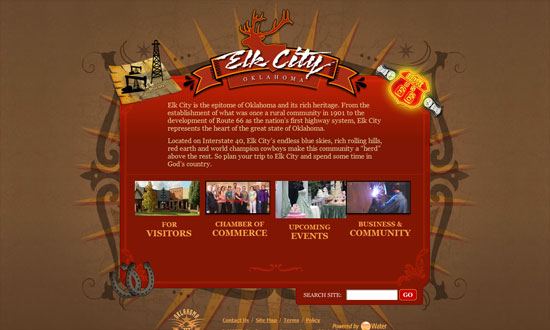
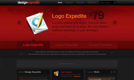
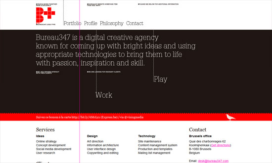
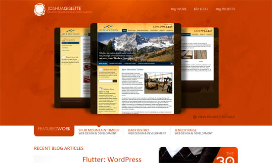
Designs of the Week

Fargo Brewing

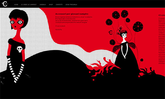
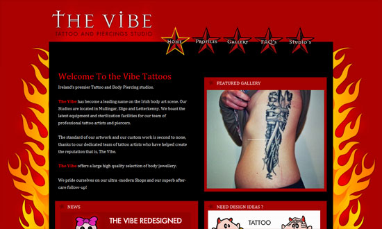
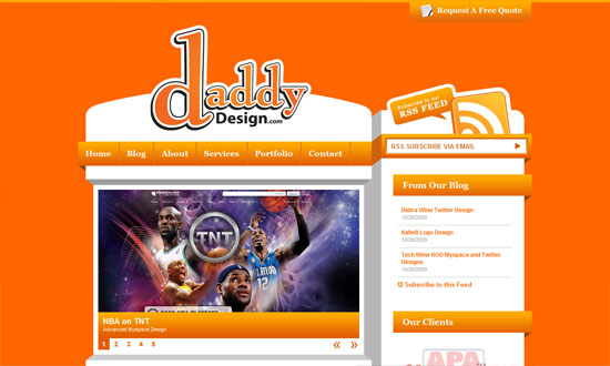
Second time I’ve seen this effect, but still looks great. Not too keen on the yellow text on an orange background but the rest of the type works well.

RueVerte

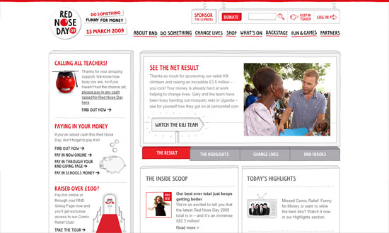
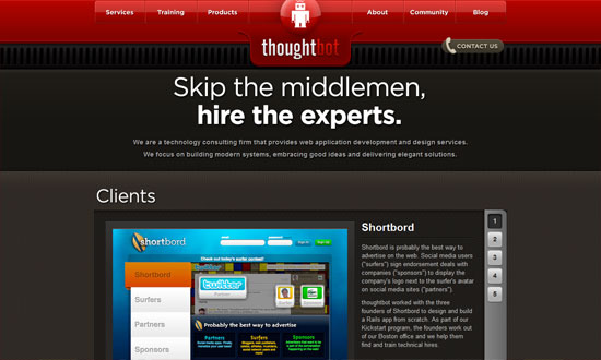
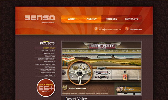
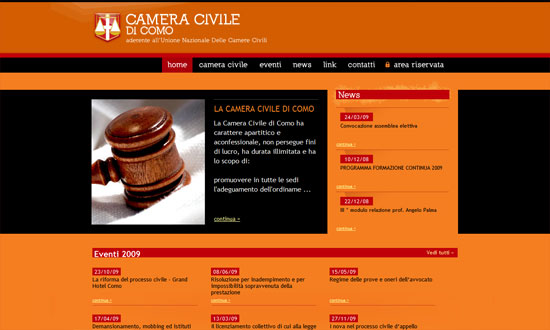
Lovely colors and details all over the page. Mega menus used smartly, nothing looks crowded.

Hungarian Wine Society

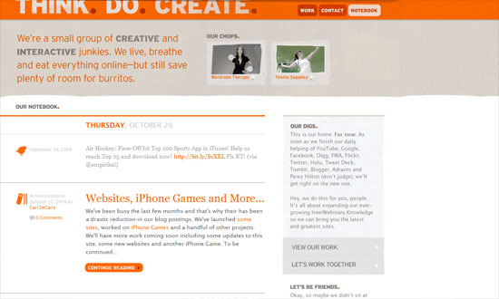
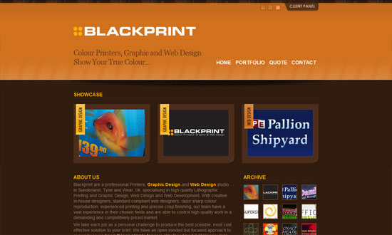
Love the subtle texture and pattern used in the logo, borders, and other places. There’s a lot of content but it’s actually minimized: the search appears at the end of the product listing and there are only three items on the sidebar (which moves along as you scroll).

Jubble Bubble Tea

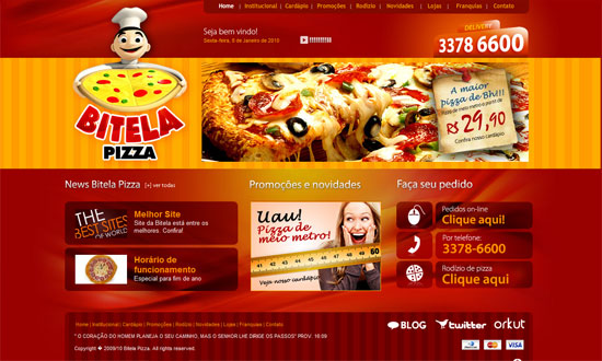
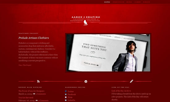
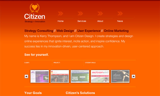
Love the fresh, dynamic look while still keeping the content areas highly readable.

BeerStat

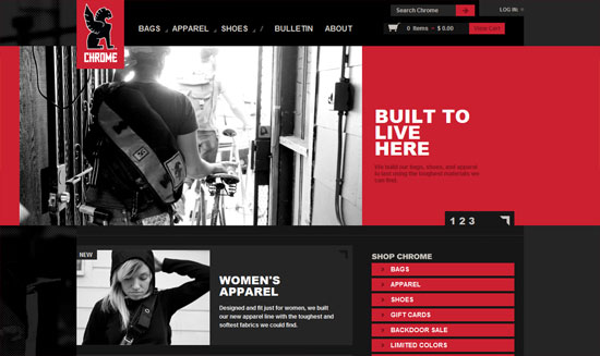
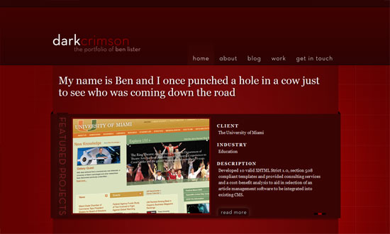
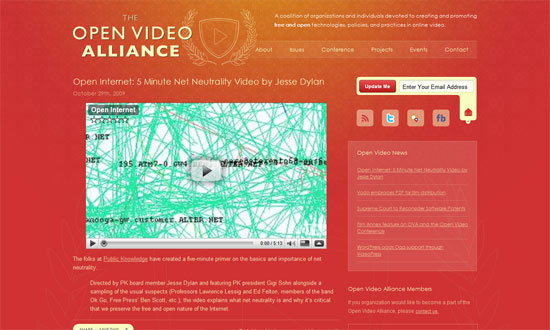
High quality imagery and good type go a long way in making an impact.

Social Media Weekly

Usability – Making Donations Easier
“The lessons from these examples will also help you improve any flow where you are asking people to ‘give up’ something—pledges, petitions, surveys, and more can all benefit from removing impediments to progress.”

CSS – CSS Floats 101
“By learning and understanding float property basics, along with position property basics, you will be able to achieve any layout with confidence.”

HTML – HTML5 Cross Browser Polyfills
“So here we’re collecting all the shims, fallbacks, and polyfills in order to implant html5 functionality in browsers that don’t natively support them.”

CSS – CSS Border Tricks with Collapsed Boxes
“These tricks will help you achieve designs without resorting to the use of images, CSS3 gradient or extraneous markup. By collapsing boxes with zero line-height and height values, we can display content outside of the content box, over borders.”

HTML – The new input types
“On Monday and Tuesday I did some heavy-duty research into the new HTML5 input types and attributes, and I published a desktop and a mobile compatibility table.”

CSS – CSS3 Buttons
“CSS3 Buttons is a simple framework for creating good-looking GitHub style button links.”

Intellectual Property – OpenAttribute
“A suite of tools that makes it ridiculously simple for anyone to copy and paste the correct attribution for any CC licensed work.”

HTML – HTML5 sectioning elements, headings, and document outlines
“I’m not entirely sure that I have understood the specification fully, but if I have, I think the new outline algorithm requires you to think carefully when using the new sectioning elements (article, section, nav, and aside) if you also want a coherent document outline without untitled sections.”

Friday Focus 07/30/10: Centered Seals

July 30, 2010 By Sophia Lucero

Sites usually place logos at the top left corner of the page, but nudge them to the center and it makes quite an impact, as a red wax seal does on a white letter envelope. Let’s check out sites with centered logos on this week’s Friday Focus.

Designs of the Week

Min Tran's Journal

Love all the patterns and pastels.

Catered By Kate

Nice torn effect on the navigation and echoed throughout the rest of the site. I also like the subtle adjectives in the background.

G2 Geogeske

There’s some weird layering going on when you scroll up and down, but I like the impact of this look.

Word Refuge

The text length in the inner pages is too wide, and the script feels a bit much. Still, I like the textures and the old style illustrations.

Le 28Thiers

I like the curved header navigation coupled with an ornate background pattern. The boxes of text are nicely framed, and the buttons are equally elegant.

Barley's Greenville

Interesting idea to put all the beer labels as a collage for the header. There’s also a bit of a split design going on, and the use of curly braces as arrows.

Ośrodek Wypoczynkowy Zielona

Not-too-distracting animations above the logo in the footer, and not-too-overwhelming use of wood including menu items and buttons.

New Hampshire Distributors

I find the “featuring” slideshow highly effective. The use of red, on the other hand, may need more tints and shades. What I really like is the glowing hover effect especially in the three boxes below the slideshow—simple idea but it works.

Steinway & Sons

Two things that grab me: seamlessly elegant carousel of featured pianos, and the use of piano strings in the background as a stylized sunburst effect.

Usable Efficiency

I wish for a little more polish on the RSS and collapse/expand buttons, but I like the openness of this layout.

Clover Cottage

It’s great that the wood texture isn’t your typical bright brown but one that actually fits the theme of the site. The form elements in the booking box is excellent.

Six11Ink

I really love the stylized buttons in the header navigation, and I wish it were applied to every other button on the site. Old style illustrations also used here, but what’s great with this site is that it explains (in a collapsible area) what the they symbolize.

Sky's Guide Service

I think the wood could be a little lighter to distinguish the red on the logo, but overall this site has an excellent design from typography to illustrations to form elements.

The Eagle Rock Yacht Club

Using a wave pattern as divider is both whimsical and smart. I love the splashy sea photograph background in the footer navigation.

Paul Bennett

Subtly textured, clean, yet feels perky.

Cloudania

Nice gradient on the main blurb, which breaks the blockiness of the text and gives an ethereal effect. The floating folded paper background on the video, which is an echo from the logo, is a nice touch too.

Social Media Weekly

Accessibility – Ten Common Accessibility Problems
“This document outlines ten common accessibility issues I have encountered which could result in a site’s failure to fully comply with WCAG 2.0. The document includes links to some of the WCAG 2 advisory Sufficient Techniques provided by the W3C for addressing each issue.”

Design – Create Stunning 3D Text Free With SketchUp
“Today I’ll teach you how to create some awesome 3D text using only Photoshop and a free app from Google.”

Design – Tips for Designing for Colorblind Users
“We’ll take a look at what colorblindness really means and how you can tweak your designs based on a few simple principles.”

CSS – Start Experimenting With CSS3 Keyframe Animations
“For this reason they’re used sparingly, in a lot of cases for experimental purposes or as ‘hidden gems’, but that doesn’t mean you should shy away from getting stuck in.”

Programming –

Friday Focus 02/05/10: Lightly Textured

February 5, 2010 By Sophia Lucero

Subtlety is the name of the game this week on Friday Focus. We’re featuring designs with light hues and textures for a relaxing, elegant feel overall.

Designs of the Week

Information Highwayman

Love the texture on the blurb itself, not just in the background. And the use of rotated spades as bullets? Lovely.

Cooper Graphic Design

I really like the asymmetrical elements in this design. And it feels organic and warm as opposed to loud and bold—a different take on what design firm websites typically look like.

The Croquis

Airy, open design. What I could call a “pretty much perfect”!

Design Shack

I’m not sure what the reasoning behind a left-aligned design is, but it’s interesting to see that isn’t completely extinct. Also interesting: the ad placement on the left side.

Ligonier Ministries

Everything’s so nice and wide, including the neat dropdown menus.

Syster

I really like the way the edges of the “paper” layout have thumbprints on them, aside from the shadows and watercolor paint below.

Lisa Bun

The repeated use of the curly brace as a design element is a great touch.

Pampaneo

Animated elements in headers are getting more popular too. I just think I want the navigation to have bit detail to it.

Small White Bear

The only thing that bothers me is the way the button is designed. It’s very striking, yes, but I think it could be done better.

Galin Simeonov

Love the stack of images that each comes to the front upon hovering.

Hello I'm Tom

Note how there’s not a whole lot of links in the header, and that they’re all big clickable things, which makes the visitor’s browsing choices dead simple.

Verbalized

A straightforward enough layout (it’s a tumblelog) but the background at the top makes all the difference.

U Andersena

Another watercolor-y approach, but you won’t tire of the details all over.

Rainbeau Mars

I think my favorite part here is the sidebar!

Social Media Weekly

Accessibility – Is Web accessibility a human right?

CSS – 47 Amazing CSS3 Animation Demos

Design – 5 Well Designed Icon Tutorials

Friday Focus 01/08/10: Red

January 8, 2010 By Sophia Lucero

Who’s in the mood for some red designs this week? Let’s start the show!

Designs of the Week

Carmilla la Vampira

A bit of parallax going on in this horizontally scrolling site. Love the illustrations, which are interconnected through color.

Red Nose Day

I love that practically everything looks hand-drawn! But everything still looks tidy, and therefore readable.

Bitela Pizza

I think my only nitpick here is the use of Flash for the top menu, and the lack of rounded corners in the pizza graphic. Other than that, this site is making me hungry for Brazilian pizza.

Chrome Bags Store

I like the not-quite-centered layout and the little nicks and cuts to the content boxes. Edgy, that’s what I think they call it.

Dark Crimson

I’m a sucker for these 3-dimensional, folded elements (is there a name for this yet? I really want to know). And the shades of red in this site are quite appealing. I just have a tiny issue with the top and bottom padding in the Featured Projects box—should’ve had more.

The Vibe Tattoos

Now this is one of those sites that put me on the fence when it comes to looks, but I like how striking it is. Plus the quirky icons below? It captures how left-of-field tattooing is.

thoughtbot

I like the whole industrial feel with a bit of a plastic-y twist in the menu and buttons. It makes browsing the site that much more exciting.

Aaron Shapiro

Beau.ti.ful. You can go a long, long way when you get the typography down pat. And whitespace is your best bud.

Elk City Chamber

I really like the animated neon sign and oil rigs, dresses down the whole grand look of the site with its ornate borders and background.

Design Expedite

This site’s bordering on very low contrast, but it’s still readable.

Bureau347

There isn’t as much red in here as the other sites but it makes since a very bright shade of red was used. I have to point out that something brilliant is going on in the contact page: the map of their company office is a live Google Maps spread which spans the whole background. Neat!

Social Media Weekly

Branding – Breadline Design’s Company Naming Machine
Just for kicks.

Design – A UI Design and Prototyping Treasure Chest
“Having these close by will save time and speed up your design and prototyping work flow. Here is a collection of these types of elements that should be a big help to you.”

Programming – 16 Different Clones You Can Build with Drupal
“So, if you’re thinking about building your next big site, here are a few ways that you can take existing modules and turn a project quickly, without needing to make any custom modules.”

Friday Focus 10/30/09: Orange for Halloween

October 31, 2009 By Sophia Lucero

We have some pumpkin-colored sites this week on Friday Focus, just in time for All Hallows’ Eve. Enjoy!

Designs of the Week

Joshua Giblette

The top half is all about the work, while the bottom half contains supporting information from other sections of the site.

Daddy Design

I never tire of this blocky, 3-dimensional style. The “request a free quote” tab at the top is a nice touch.

Senso Studios

I love the navigation buttons in the header. The dark flowery wallpaper background is a bit weird though. But overall, I like the ample use of textures here.

Think. Do. Create.

Clean and light with just a touch of grungy textures. Lovely.

Citizen Design

The use of hovers to switch between different chunks of text in the portfolio carousel was confusing at first, but it’s all good.

Joe Nyaggah

I enjoyed this website. Modern and airy with a touch of warmth thanks to the orange and the owl. The text only needs to be a notch larger.

Open Video Alliance

I really like this color scheme! Plus the whole translucent and outlined graphics.

Camera Civile Como

Orange, red, and black—I don’t think there’s any stronger color combination than that! Since it looks like this is a legal site, it’s great that the designers made sure the text is easy to read.

Blackprint

The best part of this site is that you can actually rate each item in the portfolio. Then in the client panel at the top, they’ve got the top rated designs and some great articles for resources.

Social Media Weekly

Design – Happy Haunting: Halloween Hits On the Web of Design

Icons – 200+ Truly Useful Free Halloween Icons for Everyone

Themes – Top 10 Free Halloween WordPress Themes

Next Page »

Code & Tutorials

Which Front-End Development Languages Will Grow in 2017?

Your Guide to Leveraging APIs as a Developer

Bitcoin Processing Website Integration For Web Developers

Website Security For 2016 That All Developers Need To Know

5 Reasons You Need to Be Using jQuery

About Devlounge

Want to read more about Devlounge, or maybe you want to contact us, or even advertise? Oh, and don't forget to subscribe to updates!

The Best of Devlounge

5 Reasons To Reconsider Hiring A Web Designer

Search