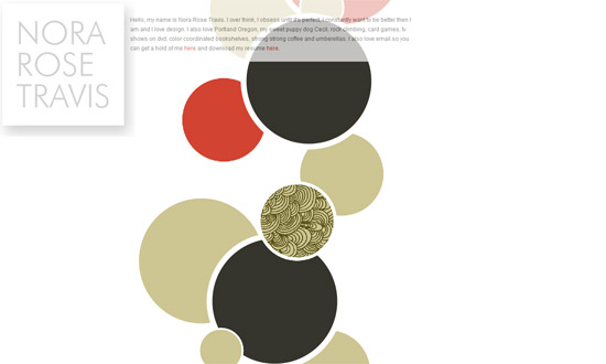
This week on Friday Focus, we have websites that feature circular shapes prominently in their designs. Time to break out of the boxiness and round things up!
Designs of the Week
Excellent concept and presentation, I love it! The only problem here is the way the site was coded: old-school mouseovers and preloaders.
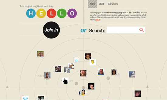
I like that instead of the usual rounded-corner buttons we have circular buttons here. Another freeform layout.
I really like the navigation boxes right below the header, and how everything’s side by side, without borders. I also like the color palette here. It’s very professional, but not your cliche combination of hues.
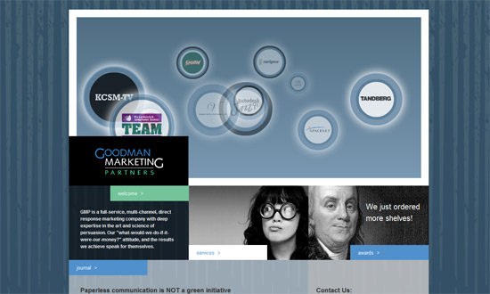
Another pro site, but this time the circular photos give just a touch of hip. I just wish the elements were repeated in the inner pages.
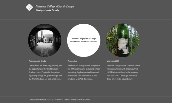
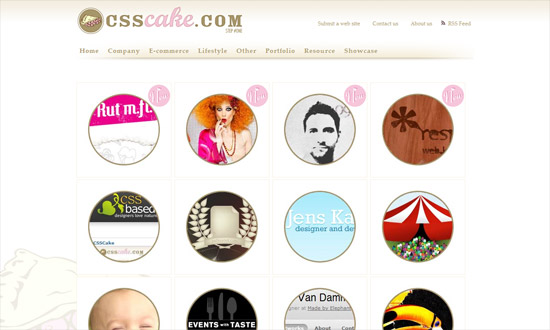
How often do you see galleries with images masked by circular borders? It changes things up quite a bit, doesn’t it? I would have liked a bit more detail here, but since it’s a showcase site anyway, putting the focus on the featured sites is fine.
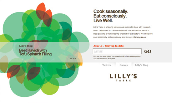
I really wish this were more than a landing page, because I’m curious how they’d implement the design on a full site, which unfortunately doesn’t carry over to the blog. Maybe next time.
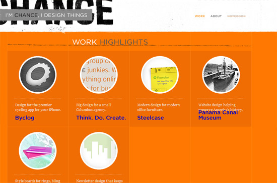
So well done. The grungy details don’t look tiresome; the circles inside boxes makes everything look different; and the orange and gray combination just leaps out at you.
Social Media Weekly
Design – 16 Great Photoshop Light Effect Tutorials
Typography – 10 Great Font Resources
Programming – Best CAPTCHA Solutions
Programming – 10 Top-Notch CSS Editors
