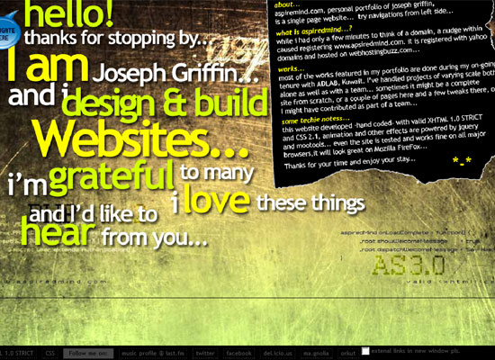
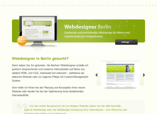
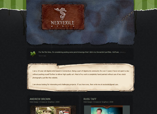
This week’s Friday Focus features designs that use smart, stunning slideshow techniques that are sure to inspire you. Take some notes!
Designs of the Week
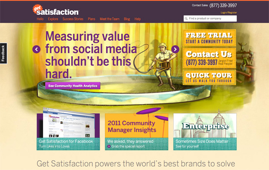
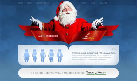
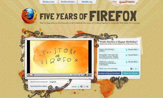
The circus theme combined with the sketchy, painted feel looks great. Everything’s bright and cheerful.
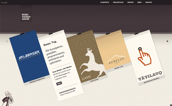
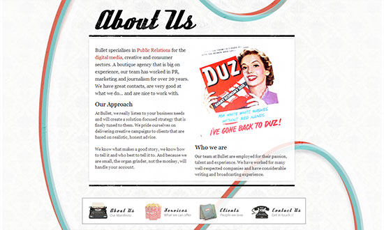
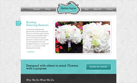
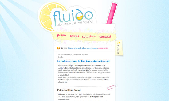
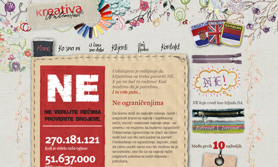
Minimal but packs a punch with the clothesline effect. Nice integration of Google Translate for language localization, and the header matches each project color/pattern.
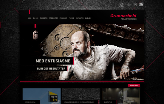
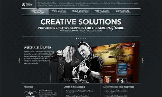
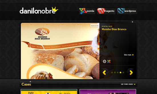
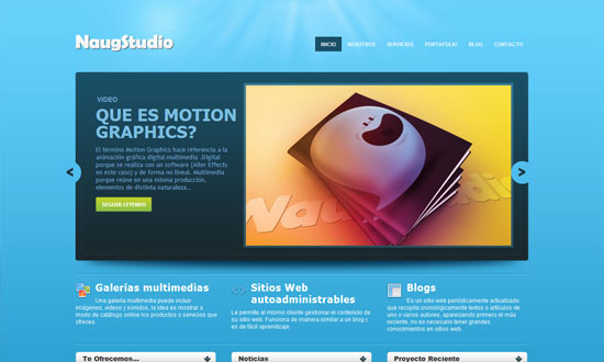
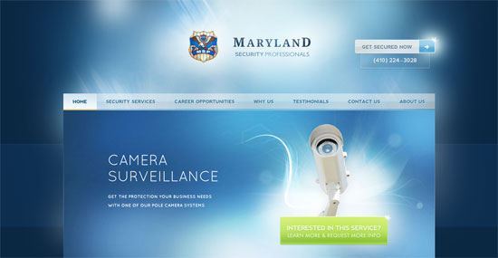
Nice little thumbnail tabs to the right for navigating through the slides, and a nice dark overlay to the left for blending into the background.
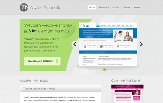
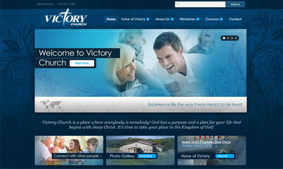
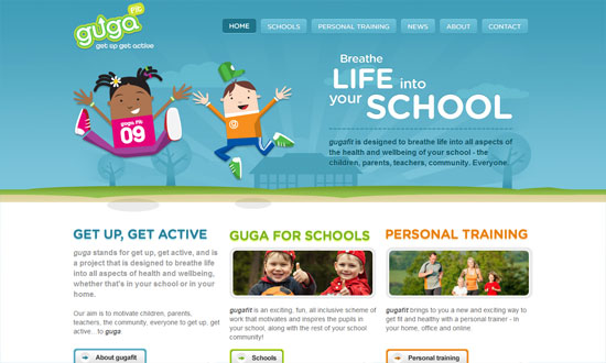
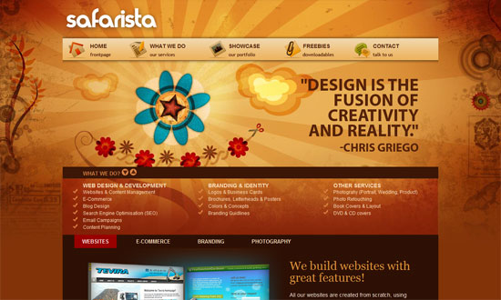
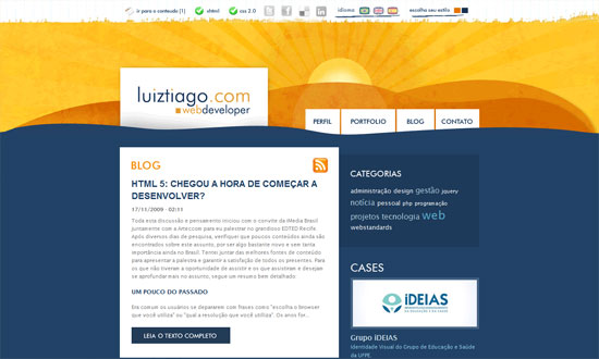
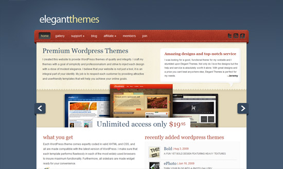
A more conventional look, but I like how the text and image areas are separated with a nice curvy cut, breaking the typical rectangular silhouette of carousels.
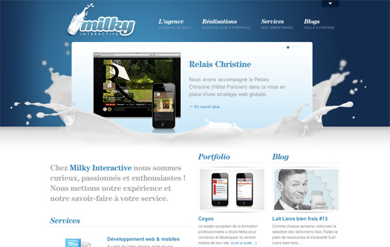
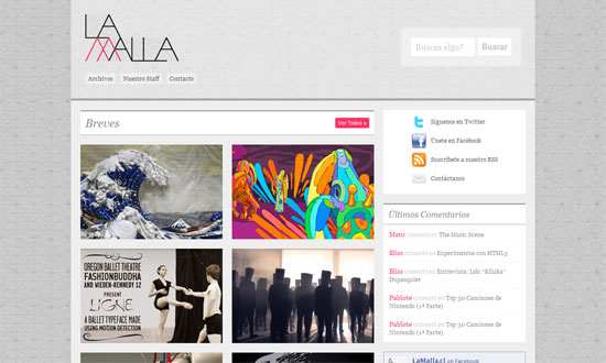
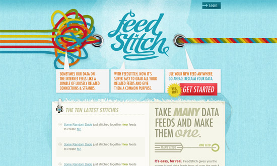
The splash of milk makes all the difference. This site’s filled with content but it still feels light and nicely organized.
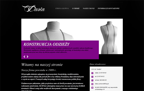
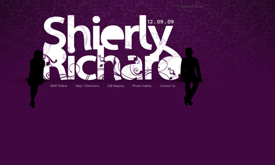
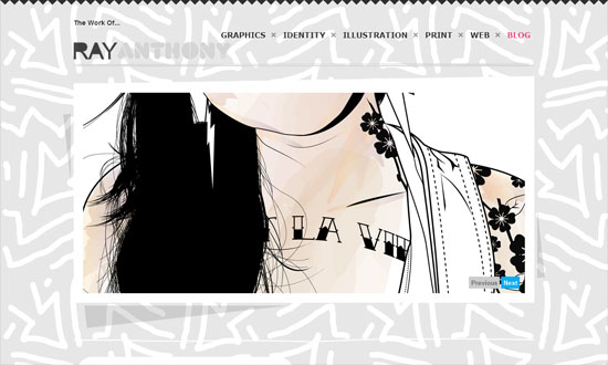
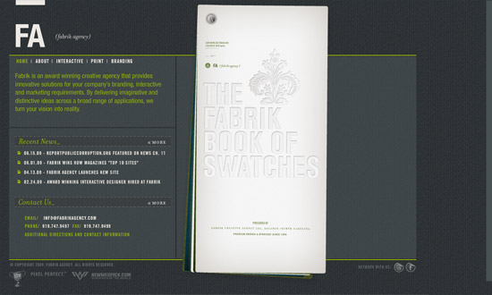
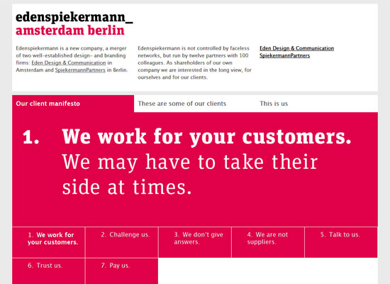
Keeping the color scheme in grayscale to let the purple pop is an interesting technique. Although using black text on it isn’t very readable. So is using italics for majority of the site.
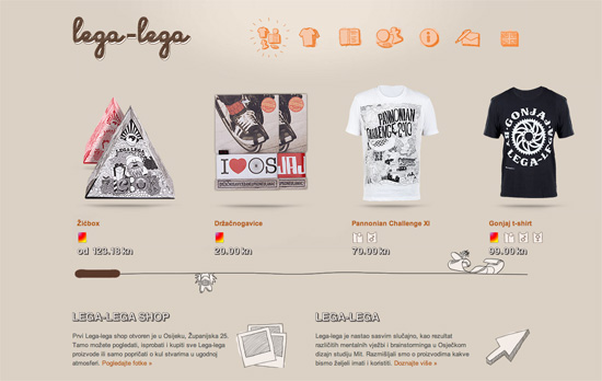
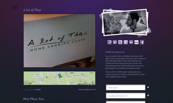
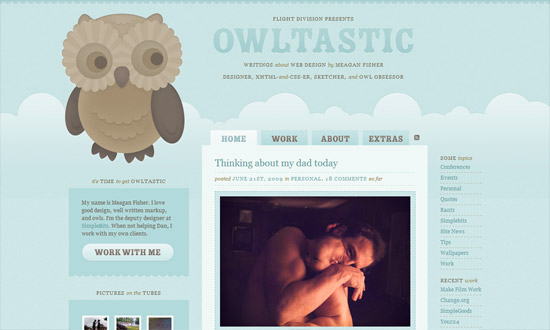
Fun sketchy illustrations everywhere—even the icons for meta information are custom. It also helps that there are tooltips in case they look a little vague. I like the treatment to the scrollbar although maybe some arrows or a change in cursor type would help more.
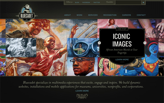
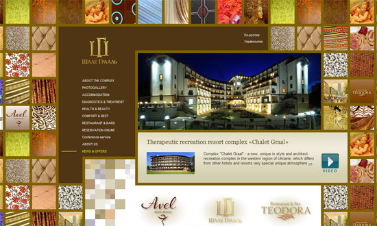
Love or hate the vintage, classical look, the details on this site are to die for. But really, it’s the main slideshow that’s the best part, which comes together in such a pleasant way.
Social Media Weekly
Accessibility – Web Accessibility Toolbar
“In honour of Jim Thatchers important and continuing contribution to making the web a more accessible medium, I have worked on an update to the Web Accessibility Toolbar for Internet Explorer, which includes new features that he has developed.”
HTML – New HTML elements and surrogate <div>s
“What else can we do to move forward without polluting our documents with non semantic wrappers?”
User Experience – Effective Developer Experience
“Platform product owners must be concerned with assisting developers in accomplishing this if end users are to have a good user experience overall. Attention to these details is called developer experience (DX), and enabling app developers to be successful through better DX will create a more successful UX for the platform product.”
