This week’s Friday Focus features designs with pretty little birds in them. (No, this isn’t another collection of Twitter-related sites—only two of them are.)
Designs of the Week
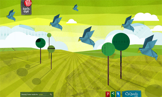
Illustrations are inspired by origami and papercraft, animations are done purely in JavaScript. Pleasant and brilliant.
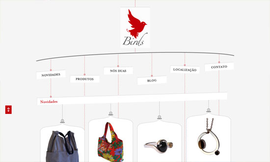
I love the mobile motif here—everything is hanging onto something until the very end of the page. Great concept for an online shop.
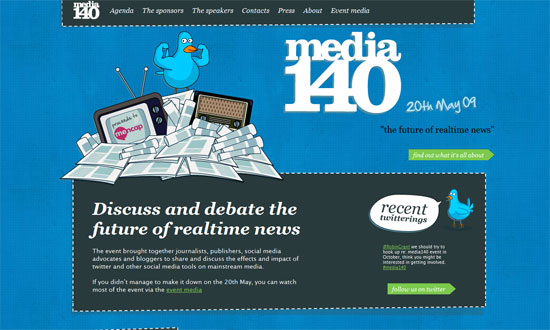
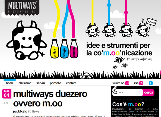
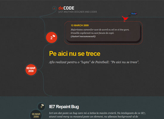
I like the illustration style here because it’s more cartoony instead of delicate and craft-y. And it seems dotted and dashed lines are all the rage these days.
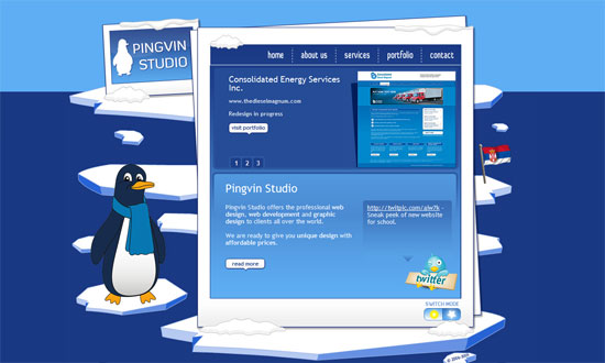
I like it when sites go all out on a metaphorical design. This one has the content floating on ice!
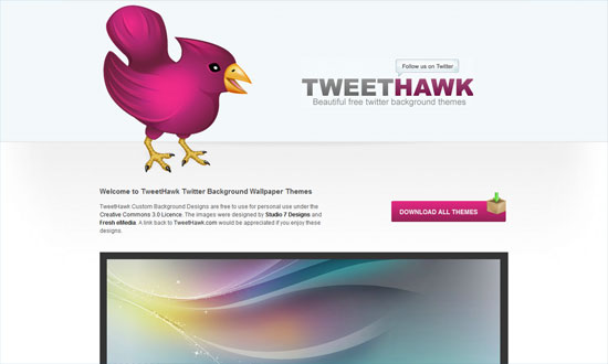
Two things about this site mask how simple it looks. First, the hawk looks stunning—big, bright pink, and detailed. Second, the illustrations (aka Twitter backgrounds) listed on the site speak for themselves—if you’re designing a portfolio, do the same thing.
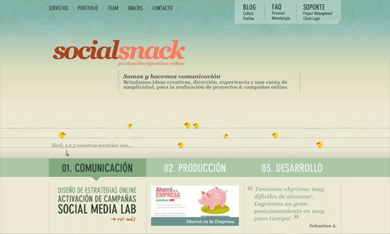
Some of you might have to squint to see the birds, but I appreciate the subtlety while still paying attention to detail—you can play hangman (or is it hangbird?) on the site! They’re all over the place, though, so you will enjoy their company.
Social Media Weekly
Typography – Web fonts — where are we?
Freelance – Freelance Design Contracts and Templates for Designers
Programming – How to Debug PHP Using Firefox with FirePHP
