Happy October and Friday Focus! This week we’re looking at designs that incorporate illustrations you see in old books, which give a quirky yet nostalgic effect.
Designs of the Week
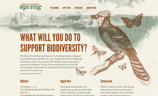
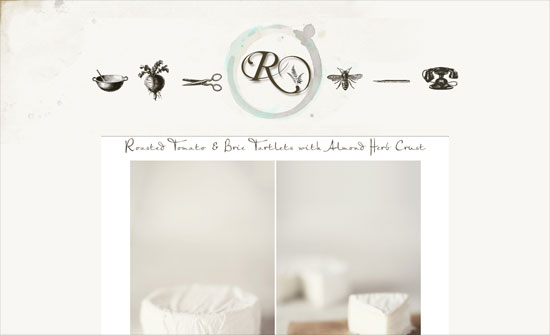
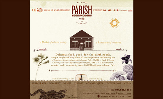
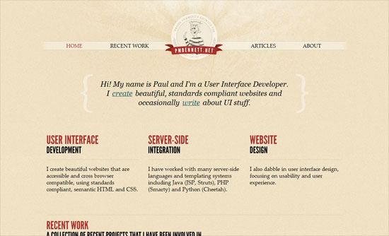
I like how even the logo is distressed; a nice confined design.
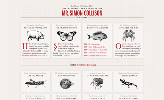
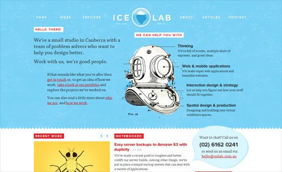
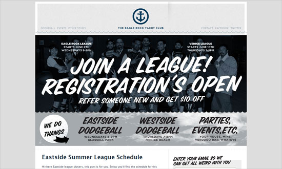
In embracing an old style look you’ll probably adopt an old style manner of copywriting as well, or at least a quirky one that contrasts against the serious black and white pictures.
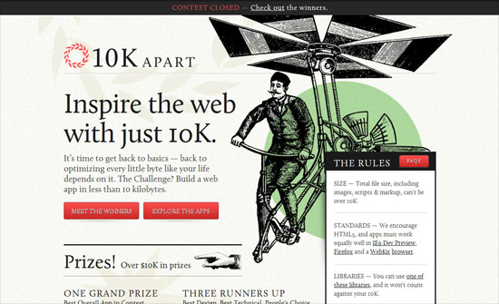
With all the interest in poster-style web typography these days, I can only wish the introductory text on this page weren’t an just image.
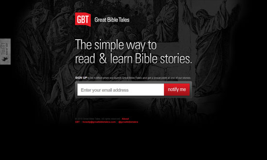
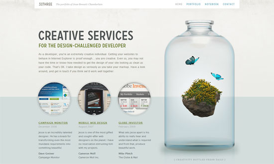
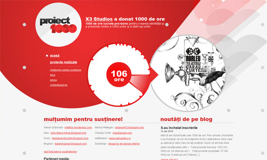
The site hasn’t launched yet but you can glean from this screen that the design is mostly modern and the illustration stays in the background. I hope that’s not the case when it launches because there’s much potential there.
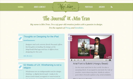
This is a fascinatingly ornate design. I’m most delighted by the search, subscribe, Twitter, and Facebook graphics on the sidebar. Makes you want everything else, like the archives list, to have the same touch. The use of sans serif for the post text also kind of breaks that feel a bit.
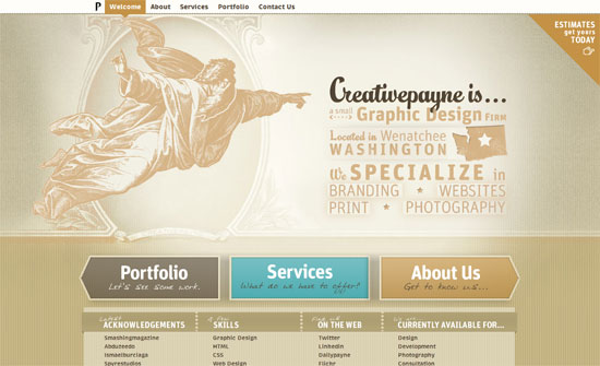
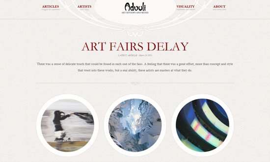
There are a couple ofrules that this design seems to break: no descriptions for the menu icons (not even tooltip text) and center aligned body text. Perhaps the site owner actually wanted it that way, but still.
Not many illustrations here, so they don’t feel that well-integrated. But the animation on the logo, both in the header and footer, is a nifty touch.
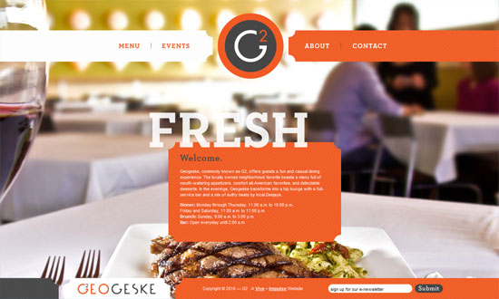
Sometimes you wonder why a design uses a particular illustration. In this case, you’ll get it once you reach the footer. What I really like here is the almost-missable effect below the buttons and images.
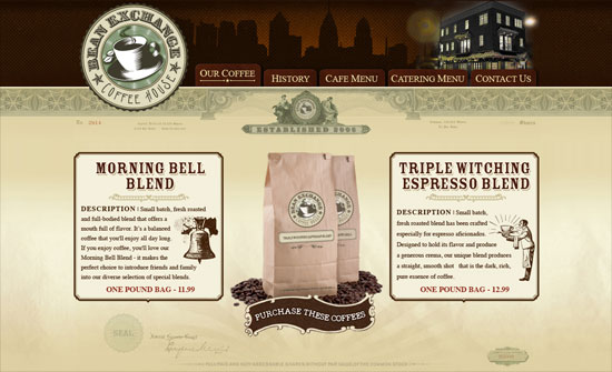
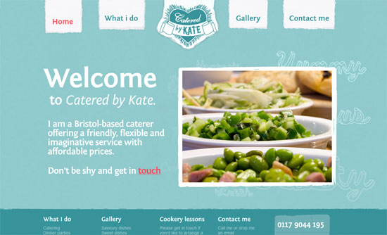
The border below the header is as refined as the designs on dollar bills. The patterns are not what you see everyday or on stock image sites. The bottom border of beans, however, isn’t as well done; I think it could be a little taller and denser so it looks more appetizing.
No illustration spared here. It’s not too clear which ones you can click on, a usual problem with this look, and some areas can be styled even further, but the site makes you want to keep scrolling.
Social Media Weekly
UI – UI Pattern Ideas: List with Functions
“Last week I asked people to participate in a group design project on a specific design pattern: a list with functions.”
CSS – An (Almost) Complete Guide to CSS3 Multi-column Layouts
“One of the defining features of print design is the ubiquity of multi-column layouts. And there are a couple of good reasons why this is the case.”
HTML – HTML5: The Facts And The Myths
“…A lot of what people call HTML5 is actually just old-fashioned DHTML or AJAX. Mixed in with all the information is a lot of misinformation, so here, JavaScript expert Remy Sharp and Opera’s Bruce Lawson look at some of the myths and sort the truth from the common misconceptions.”
CSS – clearfix Reloaded + overflow:hidden Demystified
“This short article is about enhancing the first method and shedding some light on the real meaning of the second.”
