This week on Friday Focus, we’re looking at some sites that employ subtle, unobtrusive animation in their backgrounds.
Designs of the Week
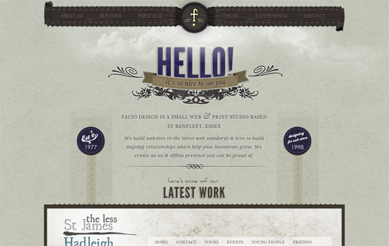
I like the mix of textures going on here, from the scan lines to the paper backgrounds to the pixel waves. Too bad the moving clouds don’t happen on every page.
Excellent illustrations and cheerful vibe. Interesting choice to put the navigation items at the top right rather than the usual top left. I kinda wish the “launch video” could keep playing as the launched site loaded!
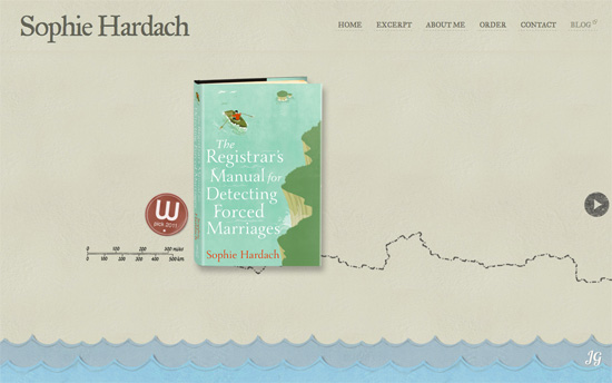
The map/nautical theme is getting more and more popular. The best part of this site has to be the contact form, particularly the way you submit by affixing a stamp to the postcard.
Social Media Weekly
CSS – Simplify Your CSS With the any() Selector
“This structural nesting makes it considerably more complex to target groups of tags in CSS.”
Typography – WhatFont Bookmarklet
“You can easily get font information about the text you are hovering on.”
Programming – What skills do self-taught programmers commonly lack?
“Or, to put it another way: What should a self-taught programmer study to get up to speed with his/her formally-educated peers?”
Design – The Cicada Principle and Why It Matters to Web Designers
“When you notice a distinctive feature — for instance, a knot in some woodgrain — repeating at regular intervals, it really breaks the illusion of organic randomness. Maybe we borrow some ideas from cicadas to break that pattern?”


