A day late and a buck short, mostly because we spent yesterday tweaking out the extras page and working on some other site related issues. Sorry for the minor delay.
Sites of the Week
Sites that caught my eye in css galleries over the past week, now with brief overviews of why I like them. Clicking the screenshots will take you to the entire sites.
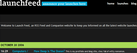
Without a new web based application crossing our radar again this week, we decided Launchfeed can serve as both a featured design for the past week, and an application. Launchfeed is a site designed for announcing new site or product launches in various forms – beta, alpha, final, etc. The design is simple and clean, and clicking on launch titles brings you to a screenshot and review / comment area.
While most of the site is not in English, you do get a calming feeling by the use of a three column layout and pastel colors. Not to mention some of the content is pretty hot.
Semtex Mag is a online independent music magazine that news, reviews, and interviews. I liked the design because of it’s simple layout and clear purpose. Reminds me of what my original intentions were for soundchronicle before I sold it off last summer.
Digg Weekly
My personal favorites of the weeks most dugg articles in both design and programming.
Design – Build a Simple Liquid Layout
Article that goes into detail about creating the html and css required for a pure liquid, cross browser layout “done right”.
Programming – My Rails Toolbox
An article outlining some of the best in Ruby tools, such as servers, deployment, plugins, libraries, and more.
Weekly Opinion
This weeks weekly opinion has been stirred up by a conversation followup to one of my designs posted at Mintpages. When designing, do you try to perfect mocks to the absolute exact as they will appear following completion, or do you do most of the tweaking later on in the process, after the client has approved the mock?
Everyone is different, but I myself spend way less time on mockups then I used to. Before, mockups had to be perfect, because that was the site, simply cut up and turned into table-filled html. With the use of css, you can accomplish many tweaks later on in the process. Because of this, I myself tend to spend less time concerned over little discrepancies which can be fixed at a later time in development. Still, there are many who get their mocks to absolute perfection. Which one are you? Please share.


