Adding a color-changing effect is a neat way to instantly make your site more dynamic and fun.
Designs of the Week
Need help in promoting your site? INeedHits has been in the search engine marketing since 1996!

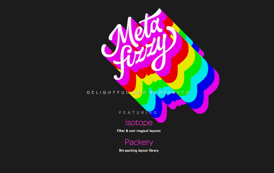
The default state has an uber long text shadow, which is what changes colors, then when you hover it gets these psychedelic rainbow stripes. Even better is that the headers of the links below also change to match the gradiented streaks with complementary colors.

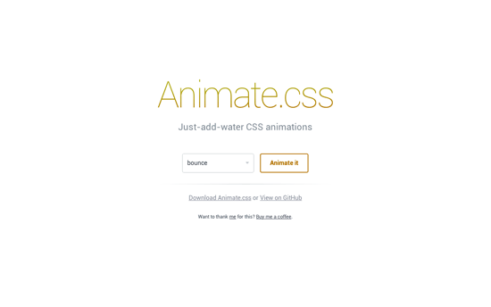
This one’s even more subtle and you might miss it if you don’t stay on the page for very long. It has a bit of the iOS 7 influence, with the colorful gradient color combinations, the thin lines (although not the Helvetica), and the bordered (instead of filled) buttons. Even the hover colors match the current display color.

Besides the changing solid background color on the landing page that keeps the rest of the site under wraps, which is in shades of blue and green, there are a couple other trends at play: the vertical column layout that scrolls horizontally, a sprinkling of statistics in between portfolio and team shots, and particularly large social media buttons arranged top-down at the far right end.
Social Media Weekly
Want your site to be as good-looking and inspirational as these? Start by choosing a well-designed theme from ThemeForest.
CSS – Magic of CSS
“CSS is a mess. We all love it, but it’s a mess. I liken it to English: there are a bunch of rules, and you can learn them. But sometimes you’re better off just trying shit and seeing what works and what doesn’t.”
Responsive Web Design, Email Design – Responsive Email Patterns
“A collection of patterns & modules for responsive emails”
Web Development – Web Development History Is Amazing
“What is meant exactly by tiered site architecture? The three aspects of any site are presentation, logic, and data. The further you separate these areas, the more layers, or “tiers,” your system has.”
