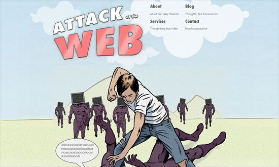
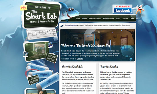
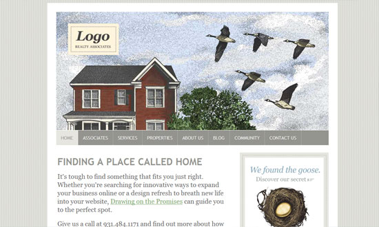
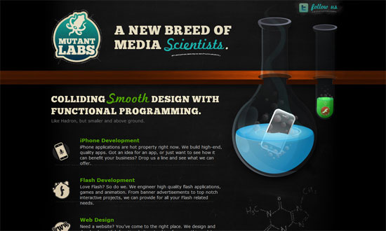
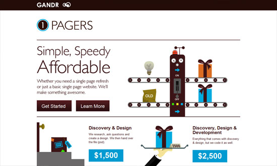
This week’s Friday Focus shines the spotlight on designs with comic book-inspired aesthetic, each with its distinct take on the kick-butt art form. Check ’em out after the jump!
Designs of the Week
Get solid WordPress themes, plugins, and web design training from iThemes.
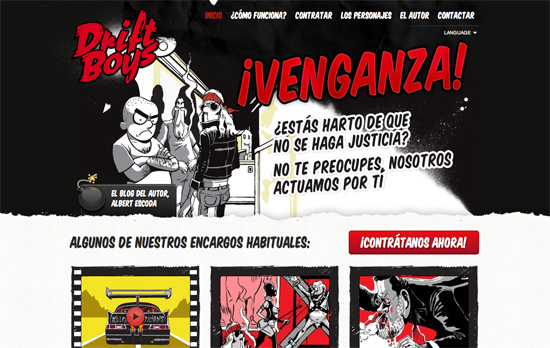
Stylized elements everywhere, from the splatters and tears to the comic book fonts, plus a bold red-black-white color palette for maximum impact. On art portfolio sites it’s always a good idea to showcase your work as much as possible, so using a variety of them in the header of each page, as well as a different character for the contact link that slides in when you reach the bottom, all works out nicely.
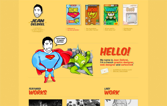
I really like the choices done on this site; it’s clean and simple looking but still carries a lot of personality thanks to the illustrations. Using comic book covers with superhero insignias in the top navigation menu is genius. The striped shadows everywhere are also a neat subtle touch and highlights the attention to detail that went into the design. The yellow, of course, is to cap off the energetic vibe that comes with comic book titles.
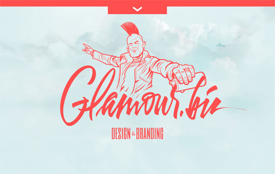
You get a minimal homepage but on the inside, it’s jam-packed with illustrations from corner to corner, also highlighting the foreground-background interplay with blurring and shadow treatments, even overlapping the pull-out menu. The text, meanwhile, is split right in the middle for a two-column layout.
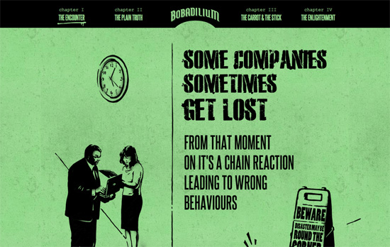
A bit much of the all-caps text (and Courier) for my liking, but a nice storytelling approach going on here, with small animations sprinkled all over the place. It’s also cool how the top menu changes color to match each section. It’s like a masked text with the background peeking through, although upon inspection it’s faked using sprites.
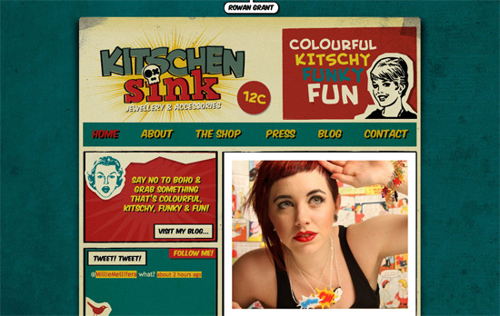
Here’s another popular color palette especially for vintage comics. Comic book panels applied to websites also lend themselves to compartmentalized, bento layouts.
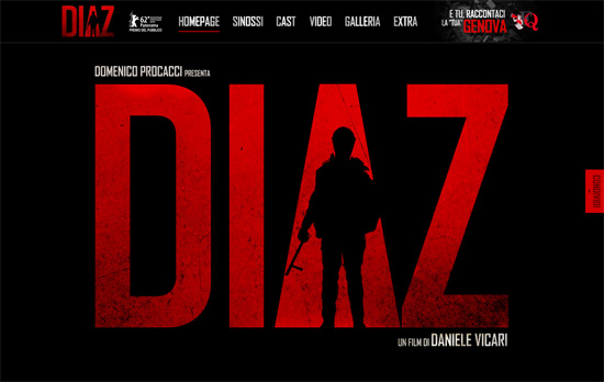
Some people may be tired or no longer impressed with the parallax effect but it’s still interesting to see what others come up with (e.g. here there’s a broken glass graphic element that turns up in the Cast section). The site also feels like one long movie poster.
Social Media Weekly
Search Optimized, Turn-Key Designs, Unlimited Everything. Start building with the Genesis Framework today.
CSS – Cross-Browser Debugging CSS
“CSS has an underlying design and when you work with it, with the natural flow of how CSS is meant to be used, you will find you have a lot less bugs.”
Mobile Web Design – A non-responsive approach to building cross-device webapps
“The general approach involves classifying your visitor’s device into the right device class, and serving the appropriate version to that device, while maximizing code reuse between versions.”
Web Design – You’re not at the cutting edge and that’s fine
“Feeling like you’re falling behind with the pace of technological change? Don’t worry too much, the cutting edge of any industry moves faster than you can and web is no different.”
