Digitally recreating light is a pretty challenging task, and this week we’re going to look at websites that manage to use this effect brilliantly.
Designs of the Week
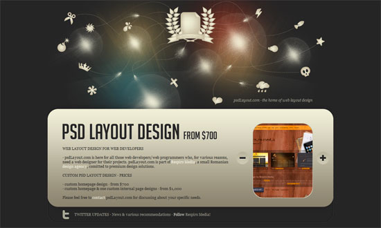
I’m not exactly sure what the orbs of light are on the header but I’m pretty sure I haven’t seen anything quite like it, and I love it. Especially when combined with the little stringed icons flying all over the place. The effect also carries over to the icons in the lower sections of the homepage, which is great.
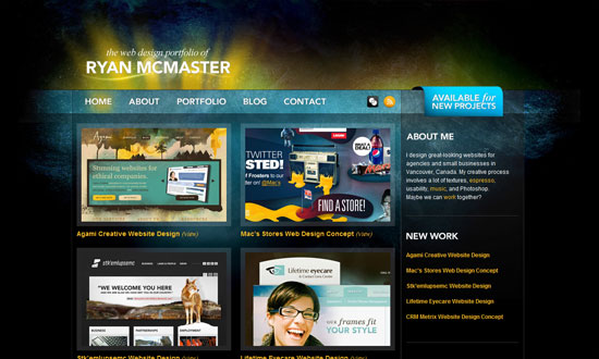
The lighthing here is a little darker, but it does have an ethereal quality to it. The arrangement of the portfolio items and the left sidebar is not really groundbreaking but it’s effective and well executed.
Sunbursts and grunge—now there’s something I don’t see everyday. I would’ve liked a little more attention to detail particularly in the sidebar and footer elements, but I like this treatment. It’s grungy, but an elegant sort of grunge (if that’s even possible!).
Speaking of sunbursts, here’s nicely done one. My only beef with this site is that it’s got great personality at the top, but it kind of disappeared on the lower half.
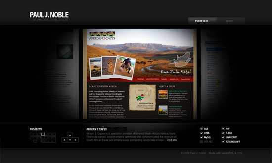
I really like the spotlight concept here. I also think it’s great that you can navigate using the keyboard, but mouse navigation shouldn’t have been limited at just the footer. Still, a simple and effective portfolio.
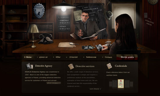
So this is one of the more obvious and literal ways of recreating light, but man is this design lovely. The level of detail everywhere—and I mean everywhere—is amazing.
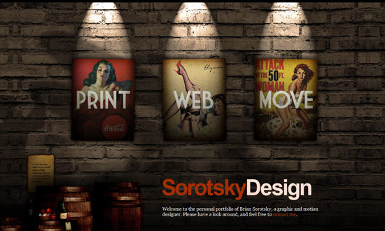
Here’s a less subtle implementation of the literal spotlight effect, but it does match the gritty feel of this site. Love the use of vintage posters for navigation.
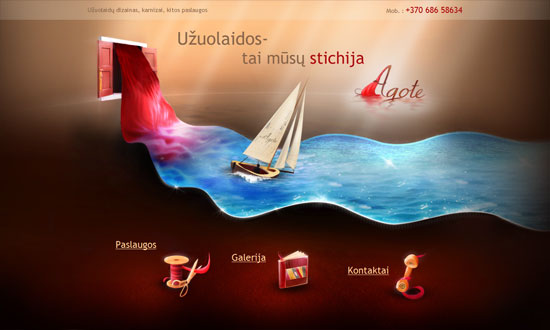
Not your usual layout, or imagery, for that matter, but it’s certainly eye-catching. I like the soft rays of light at the top and how the icons are glowing. And of course the cloth turned sparkling sea. Leaves me wanting more!
Social Media Weekly
Design, Development – 40 Free and Essential Web Design and Development Books from Google
A massive list of design & development books, all found online!
Design – Taming the Elephant: Design Critiques With Non-designers (plus a printable cheat sheet)
Why and how to critique, in blog post and printable forms.
HTML, XHTML – Misunderstanding Markup: XHTML 2/HTML 5 Comic Strip
A comic strip adaptation of Jeremy Keith’s clarification on HTML5 and XHTML 2.
9 Version Control Hosting Options – 9 Version Control Hosting Options
Get into version control systems with these hosted solutions.
