• Home
  • About
  • Contact
  • Advertise

Devlounge

Design, Develop, and Grow

ateşli sevgilisi fantezisini yaşamak istediğini söyler porno ona arkadaşları varken onunla gizli saklı seks yapmak istediğini sikiş söyleyen kız hafta sonu için gelen arkadaşının görmediği bir sikiş açıdan sakso çekmeye başlayınca adamın yarağını bu altyazılı porno şekilde indiremez ve açık şekilde salonda sikişimeye sex izle başladıklarında misafir kızı da bu sekslerine rokettube konuk ederler seks yapacağını düşünmeyerek onun sex izle oyun oynadığını zanneder sabah olur ve herkes uyanır hd porno bu sırada yanında şişme mankenini de getiren sapık erotik hikayeler genç sınav haftası ders çalışan genç adam üvey annesinin sikiş eve gelmesiyle hayatının şokunu yaşar

  • Home
  • Code
  • Design
  • Design Focus
  • Interviews
  • Publishing
  • Strategy
  • Webapps
  • Extras

Friday Focus 09/24/10: The One Page Experience

September 24, 2010 By Sophia Lucero

Some of the most interesting interactions I’ve seen done on websites utilize the one page format. Is it because there are fewer pages, fewer elements that should be easier to manipulate? Enjoy these one page wonders on this week’s Friday Focus.

Designs of the Week

Maxtron Media

I love how the navigation is a floating chunk of land consisting of various buildings (and the robot mascot) but uppercase everywhere is a bit much.

Pline Studios of Architecture

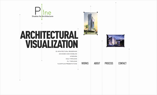
The lines that play off of the logo work great. Looks freeform but still follows a grid. Uncovering each image in the stack scrolls the page down little by little—I don’t know if that’s intentional but it’s a nice subtle effect.

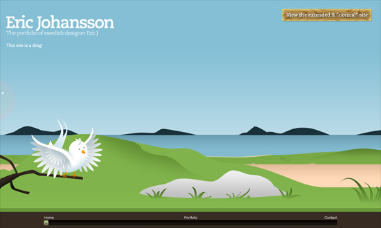
Eric Johansson

Sliders would be a lot nicer if they could be controlled via the mouse wheel. But it does make sense in this design.

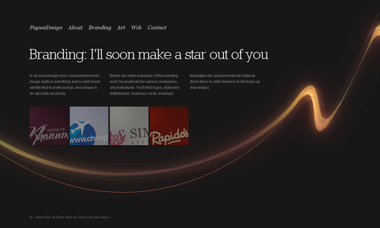
Psynai Design

The zoom on hover effect on the images is a good touch that hasn’t been overdone (yet). The continuous line running throughout the design, though, is a familiar technique for horizontal scrolling.

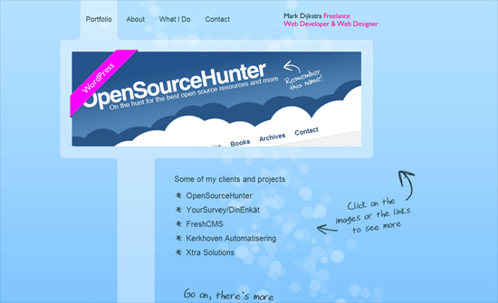
Mark Dijkstra

I like how all the sections are connected this way, and the connecting lines align with the top navigation. That’s actually really smart.

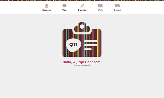
Genocom Media Group

The use of rainbow stripes gives just the right amount of color to the design without looking too overwhelming. I have to wonder though: should this site have a footer, or is this enough?

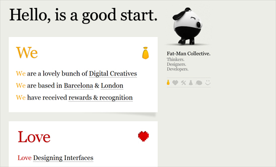
Fat-Man Collective

Another thing I wonder about: does it make sense to still have an indicator of which section the page is currently at, considering they’re clearly demarcated and everything? Anyway, I like the big text and bold colors, as well as the photo tooltips. And the walking fat man of course!

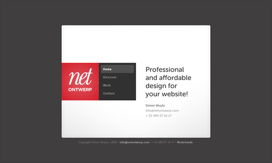
Netontwerp

Now this approach feels so close to a brochure. It’s very simple but still feels quite novel.

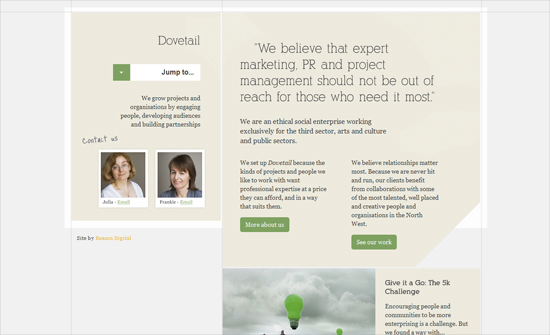
Dovetail Together

This one feels a bit similar to previous in “experience”. Love all the subtle lines and shapes in the background. Additional props to their blog being designed the same way, because lots of one page sites have completely different looks for their blogs.

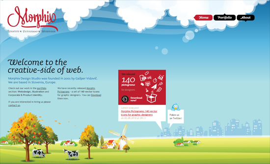
Morphix Design Studio

Beautiful illustrations despite the overdone sky-to-underground style, although the typeface almost steals the show for me. Somehow Trebuchet looks really good on this page!

Social Media Weekly

Design – Defining User Experience as Brand Experience
“Whether or not you realize it, user interface (and by extension user experience) is as much about the branding of the business as it is about the logo, product, or day-to day business.”

CSS – CSS3 Support in Internet Explorer 9

CSS – Are CSS Frameworks Evil?
“From what I can tell, designers and agencies that work with frameworks on a regular basis tend to use either Blueprint CSS or 960 Grid System (often abbreviated to 960gs). Yahoo!’s YUI Grids is also a popular one. These were the three frameworks I experimented with.”

Friday Focus 03/19/10: Left-Aligned

March 19, 2010 By Sophia Lucero

Here’s an old-school pattern that hasn’t gone the way of the dodo: left-aligned designs. Symmetry is great, but asymmetry? Even better. Welcome to this week’s Friday Focus!

Designs of the Week

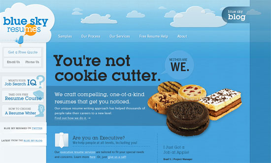
Blue Sky Resumes

Going left-aligned isn’t just about “being different”, sometimes the design really calls for it, like this one does. It also has a fixed area—those two seem to go hand in hand for a lot of sites, don’t they?

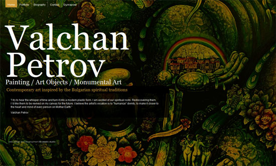
Valchan Petrov

Utterly simple formula (photographic background + minimal graphics) but it works!

points n' pixels

This one’s the polar opposite of the previous design: a calmer look, Flash for the photographic background transitions, and custom fonts.

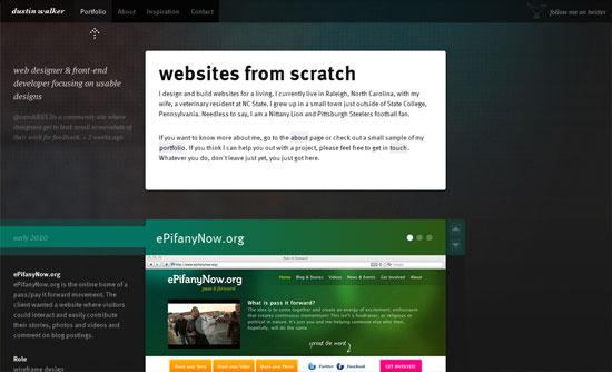
Dustin Walker

Do your users hate long-scrolling pages? Make people love ’em—this site makes it easy with the up/down arrows. I also like that the heading backgrounds match the portfolio color schemes.

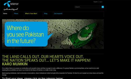
Karo Mumkin

Not shown, but I like the treatment of the posts in the lower half. Another example of matching by color (and by icons), and also breaking the boxiness away.

FantasyCreative

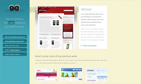
I love elegant, subtle designs. Interesting portfolio technique: display nothing but a full-size screenshot of your work for each client page. That way people experience the designs as close to the real thing as possible. Lightboxes and other solutions usually resize down.

Social Media Weekly

Design – Free Icon Search Engine – FindIcons.com

CSS – CSS Font Shorthand Property Cheat Sheet
“I’ve prepared a printable cheat sheet that you can download and hang next to your computer, which will come in handy in case you decide to use this property yourself, or are forced use it in a stylesheet from an inherited project.”

CSS – The Right Frame of Mind: Applying the Lessons of CSS Frameworks
“The purpose of this article isn’t to debate whether or not you should use a framework, but to examine why the need for such solutions exists. We’ll take the processes used (and lessons learned) in their creation, and try to show how they can be applied to your own style sheets.”

HTML – HTML5 structure—div, section & article
“These elements are replacements for the common ad-hoc semantics we applied before HTML5 with @class and @id, for example <div class="sidebar"> or <div class="nav">.”

Tips on using CSS Resets

October 12, 2009 By Lorraine

Because web browsers are notorious for displaying things differently from each other, for many web designers it sometimes feels like so many browsers, so little control. But there are ways around this- and one of my favorites is a little something called a CSS reset. A CSS reset can be anything from a single definition on your stylesheet to an entirely new stylesheet that you link to. For example, many designers like to add this to the beginning of their existing stylesheets:

* {margin:0;padding:0}

This, a very basic reset, "resets" all elements (signified by the asterisk) to have zero margin and zero padding. Here's an example of a more advanced reset:

html, body, div, span, applet, object, iframe,
h1, h2, h3, h4, h5, h6, p, blockquote, pre,
a, abbr, acronym, address, big, cite, code,
del, dfn, em, font, img, ins, kbd, q, s, samp,
small, strike, strong, sub, sup, tt, var,
dl, dt, dd, ol, ul, li,
fieldset, form, label, legend,
table, caption, tbody, tfoot, thead, tr, th, td {
margin: 0;
padding: 0;
border: 0;
outline: 0;
font-weight: inherit;
font-style: inherit;
font-size: 100%;
font-family: inherit;
vertical-align: baseline;
}
/* remember to define focus styles! */
:focus {
outline: 0;
}
body {
line-height: 1;
color: black;
background: white;
}
ol, ul {
list-style: none;
}
/* tables still need 'cellspacing="0"' in the markup */
table {
border-collapse: separate;
border-spacing: 0;
}
caption, th, td {
text-align: left;
font-weight: normal;
}
blockquote:before, blockquote:after,
q:before, q:after {
content: "";
}
blockquote, q {
quotes: "" "";
}

The above is one of the most popular CSS resets out there, made by CSS guru Eric Meyer. You use it the same way- either add it to the top of your existing stylesheet, or put it in a separate "Universal reset" CSS file and link to it from your pages. The advantage of doing the latter is that if you want to make changes in the future, you only have to edit one stylesheet.

It's important when using any CSS resets that you make sure to define certain styles that have been reset. For example, if you don't define padding-bottom and/or margin-bottom for your paragraphs, you won't see any space between your paragraphs.

You can, of course, write your own reset- in fact, if you've done a reasonable amount of web design with CSS, you probably already have a certain baseline framework you work with. When developing your own signature reset, it's a good idea to get to know the various browser defaults that exist, and perhaps the best way to do this is to view your non-css-resetted HTML page in as many browsers as you can get your hands on.

Finally, if you'd like to learn more about the various CSS resets available, and get more tips on rolling your own, here are some links I recommend:

  • Reset Reloaded
    Eric Meyer's uber-popular reset, with his explanations.
  • YUI Reset
    If you've used Yahoo!'s YUI grid system, you already know about their reset.css stylesheet. Another very popular one.
  • Tripoli
    It's called a "CSS Framework", not a reset, but Tripoli essentially does the same thing- and more: it resets everything, then provides definitions according to their idea of "optimal legibility and well-structured text presentation".
  • Don't want to use CSS resets? You're not alone. Read Jonathan Snook's No CSS Reset or Warpspire's Why I don't use CSS Frameworks.

Do you use CSS resets?

Code & Tutorials

Which Front-End Development Languages Will Grow in 2017?

Your Guide to Leveraging APIs as a Developer

Bitcoin Processing Website Integration For Web Developers

Website Security For 2016 That All Developers Need To Know

5 Reasons You Need to Be Using jQuery

About Devlounge

Want to read more about Devlounge, or maybe you want to contact us, or even advertise? Oh, and don't forget to subscribe to updates!

The Best of Devlounge

Should You Start a Business or Remain Independent?

Search