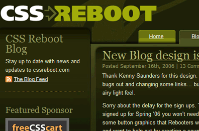
This weeks Friday Focus is a special edition dedicated to the November 1st Reboot that occurred a few days ago. Our weekly “Sites of the Week” has turned Reboot flavored, and I’ll also be going over some “trends” I noticed with this years November reboot.
Sites of the Week
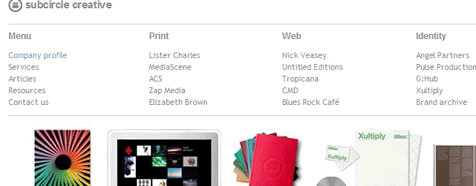
As always I’m a sucker for simple and clean designs, especially with work portfolios because it presents a clear and distinct message. That’s what I felt I was getting with Subcircle in their November reboot.
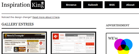
The clean Inspiration King layout previously featuring the use of tans and whites has also been updated to a two color palette of white and black. I actually prefer the previous look better.
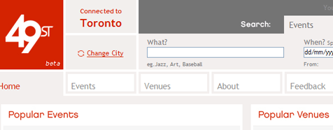
While I was at IK I noticed this gallery entry called 49st. While I don’t think it was rebooted – it’s just a new site – I couldn’t help falling for the color scheme and boxy look.
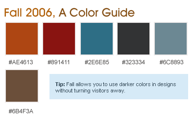
Known for following the November and May Reboot patterns, Kineda was updated with the use of a really nice looking subtle background image along with some other touches. Looks like a shiny after party site for celebs.
Digg Weekly
Design: The 35 Sexiest Designed Websites You’ve Forgotten
Fellow 9ruler Phil Renaud reviews 35 designs you may have forgotten about that he considers to show some all time sexiness. This is part three of an article series he has been running.
Programming: API Search (Fast AJAX Resource)
An amazing resource that allows you to search for functions, styles, classes, tags, and more in php, ajax, ruby, and many other programming languages. The ajax search is extremely fast – a real time saver!
November Reboot: Response
The November reboot (both cssreboot and standards reboot) has come an gone, allowing us the chance to sit back and talk about the results. I myself found this November’s reboot to be very unexciting. Upon viewing the galleries of both reboots, nothing really jumped out at me as really groundbreaking designs.
It also seemed like many rebooted designs were enclosed with the latest design trends, and they aimed to match what’s considered a “web 2.0 look” far too much. For example, I saw many designs containing that “layer look”, where the top is lighter or darker than the bottom of the page, looking as though another page is stacked on top. I also ran into some designs that looked nothing more than blog templates that were slightly modified here and there.
There could have been many factors contributing to the lack of anything truly “innovative” this November, one possibly being how late the Reboot seemed to form this year. CSSreboot was on hiatus for a while, and I think by the time it reorganized, it was a bit too late. When word did come out that CSSreboot was taking on submissions, some people probably rushed out an “updated” design, even if it wasn’t very updated at all just to get an extra traffic boost. On the other side of things, Standards reboot was pretty successful for it’s first year, but it’s disappointing to see many designs in the gallery that didn’t even bother to validate their xhtml before submitting.
Hopefully things will come around in time for the spring reboot.

